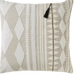
Here are my favorite AllModern and Wayfair items* in each room in my house! HAPPY SHOPPING! I hope you LOVE these products as much as I do! And this SALE is the best it gets guys — better than black friday sales AND INCLUDES FREE SHIPPING!!!!!!
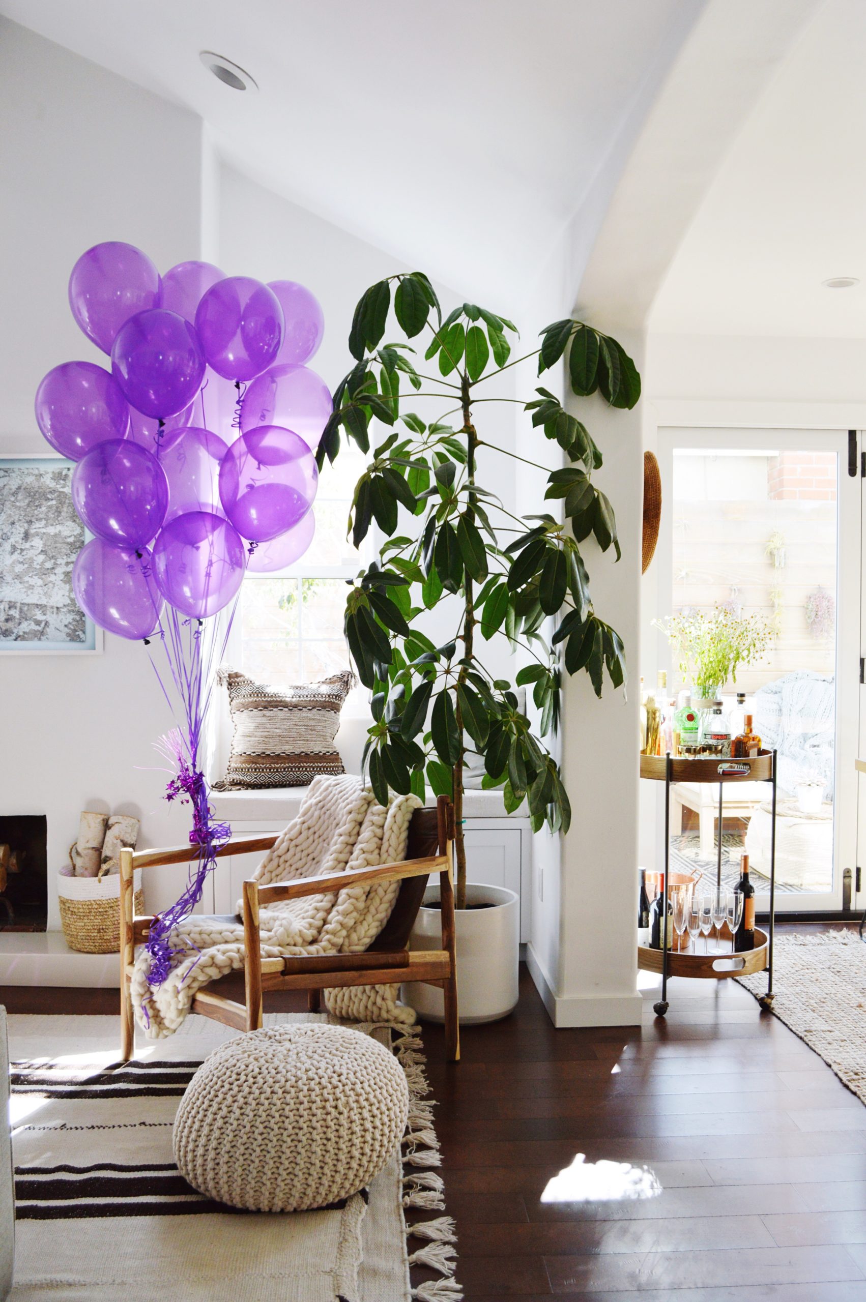
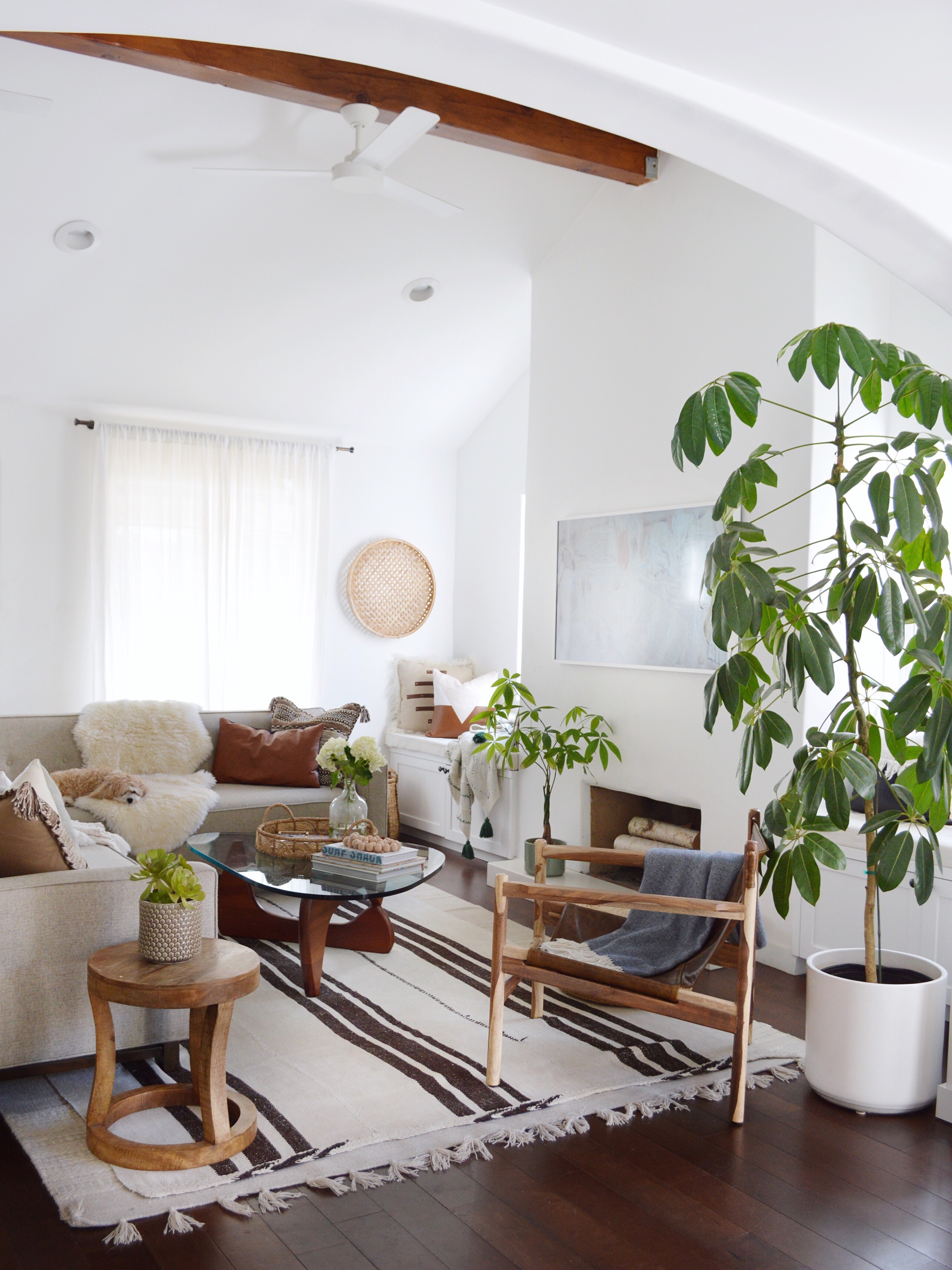
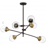
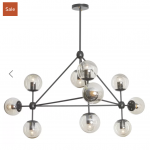
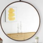
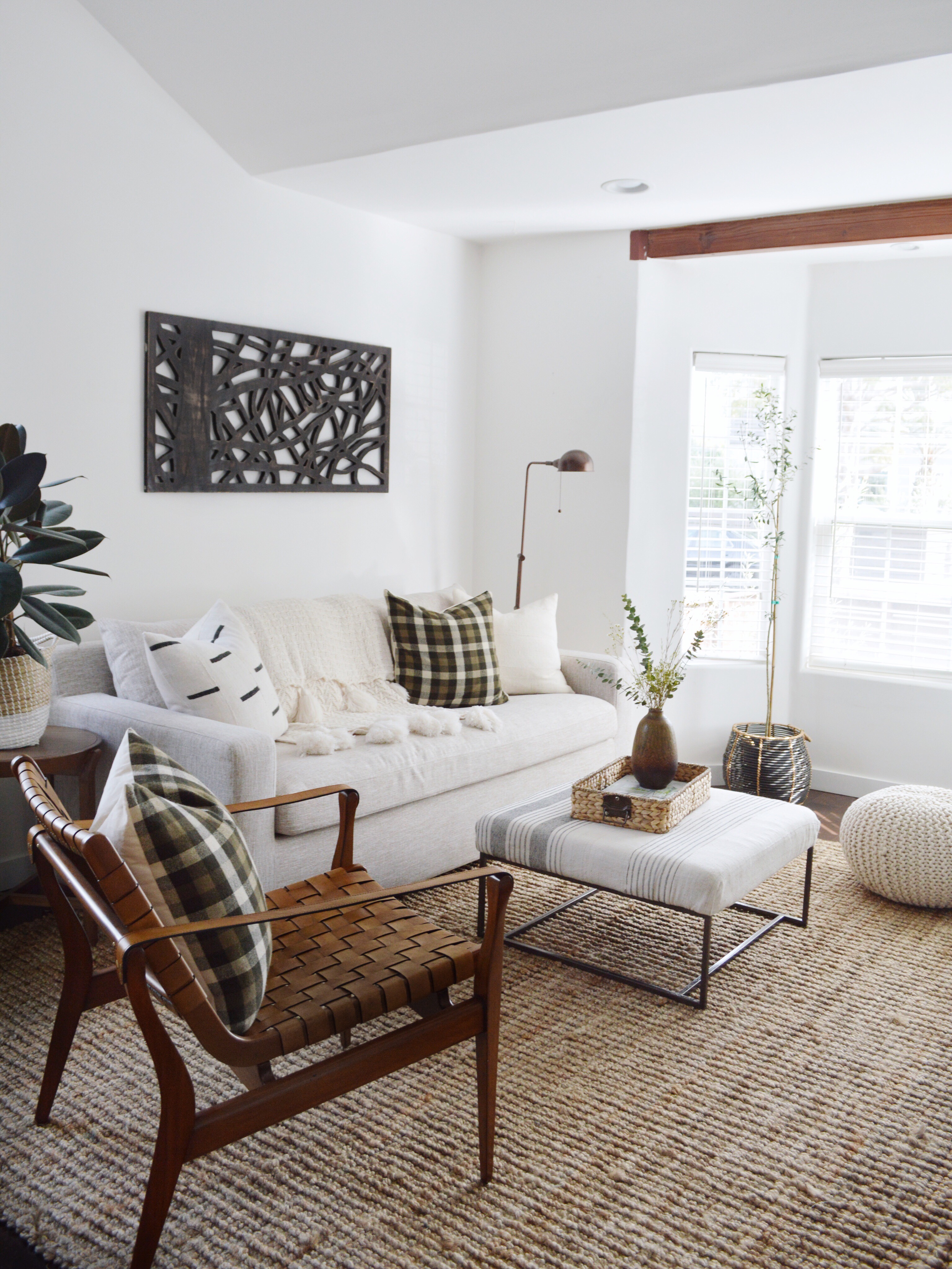
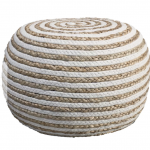
My LIVING ROOM:
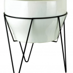
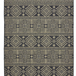
My AllModern/Wayfair items (click on pic for link):
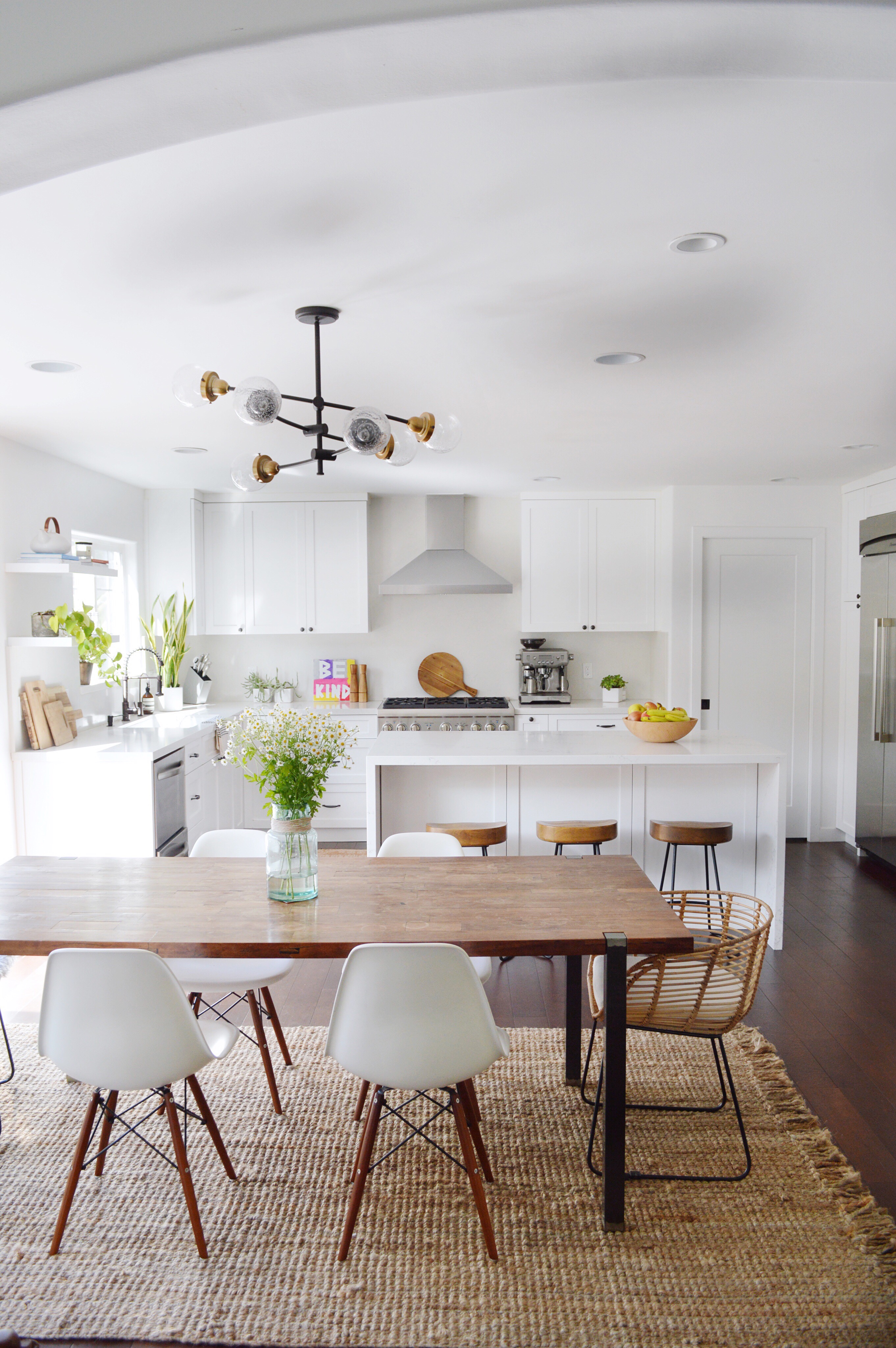
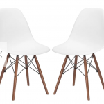
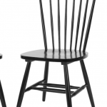
MY KITCHEN/DINING ROOM:
Sop my dining/kitchen looks (click on pic for link):
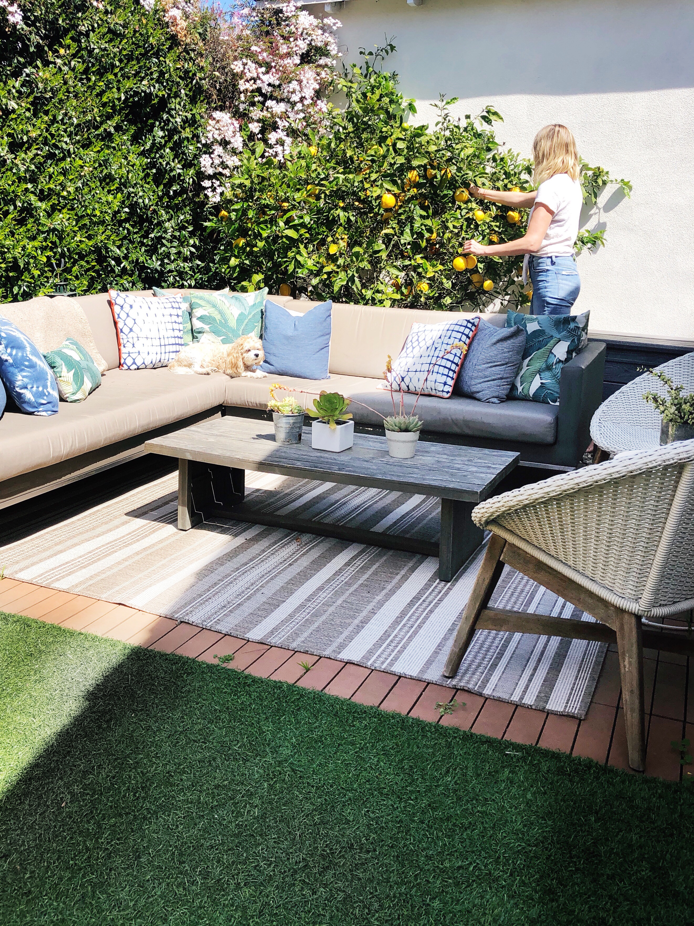
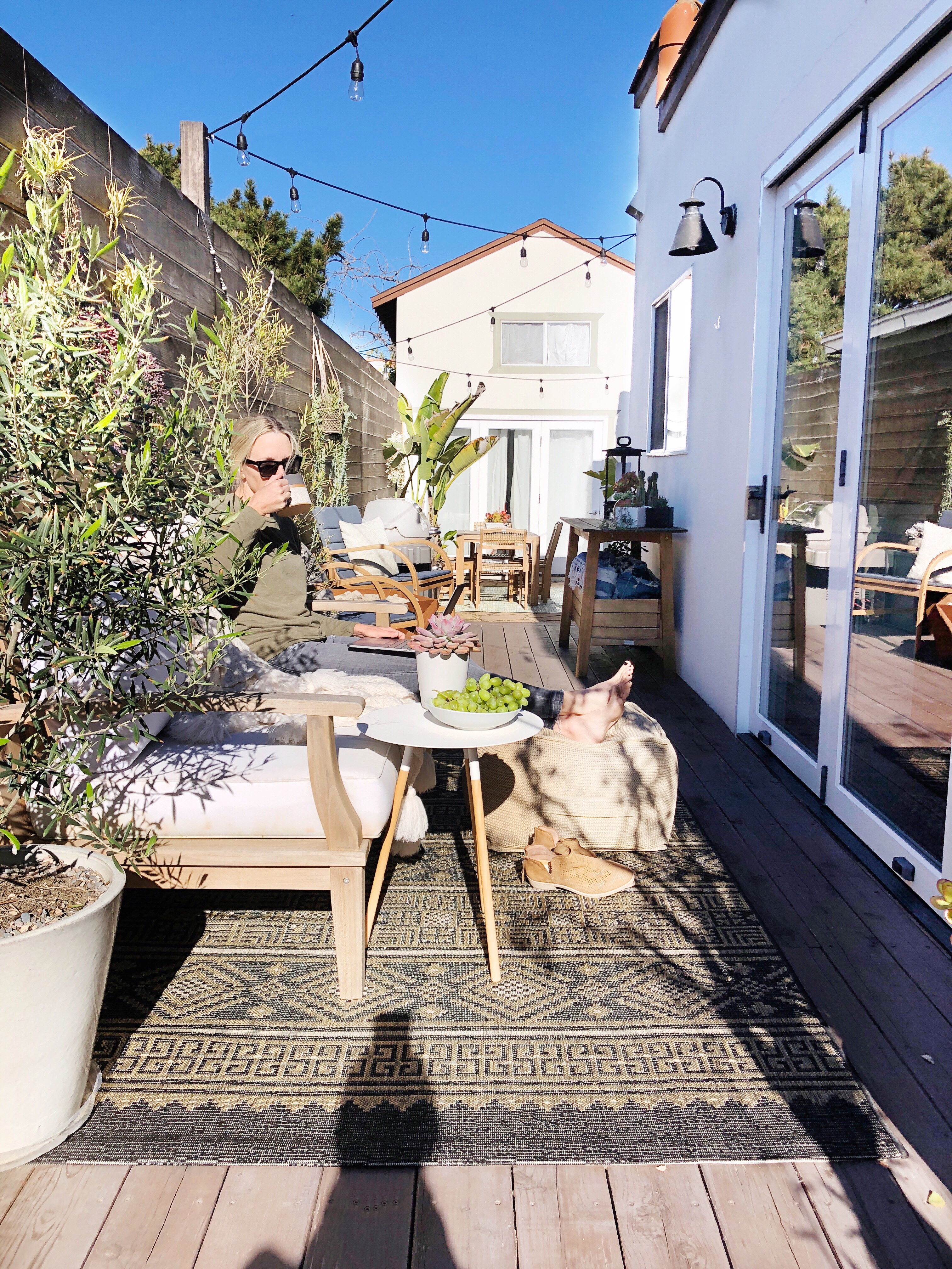
MY OUTDOOR FURNITURE:
Shop my outdoor looks (click on pic for link):
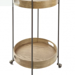
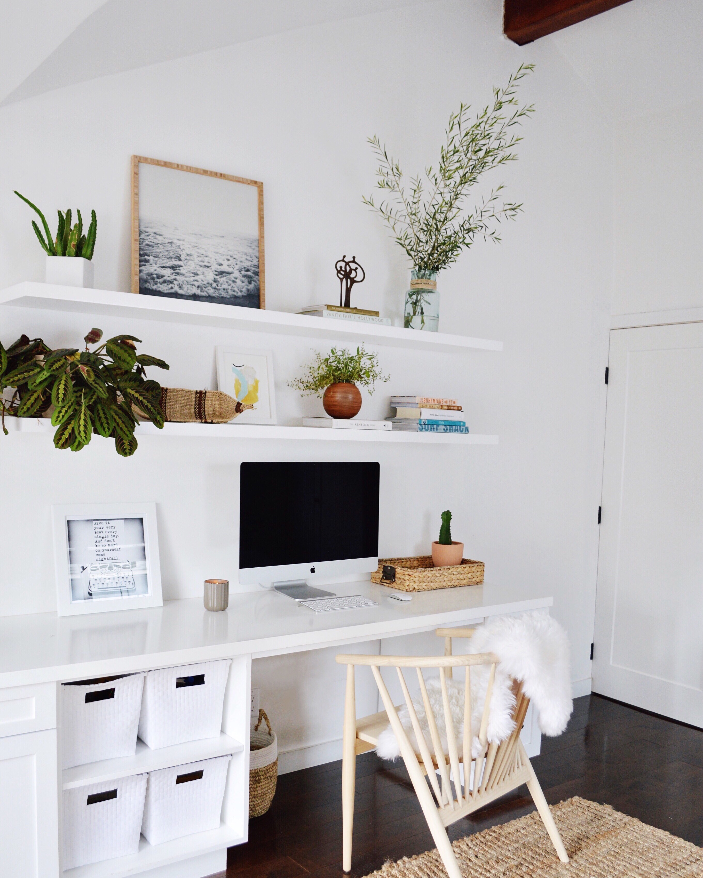
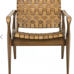
MY FAMILY/OFFICE ROOM:
Shop my family room (and office decor) (click on pic for link):
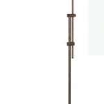
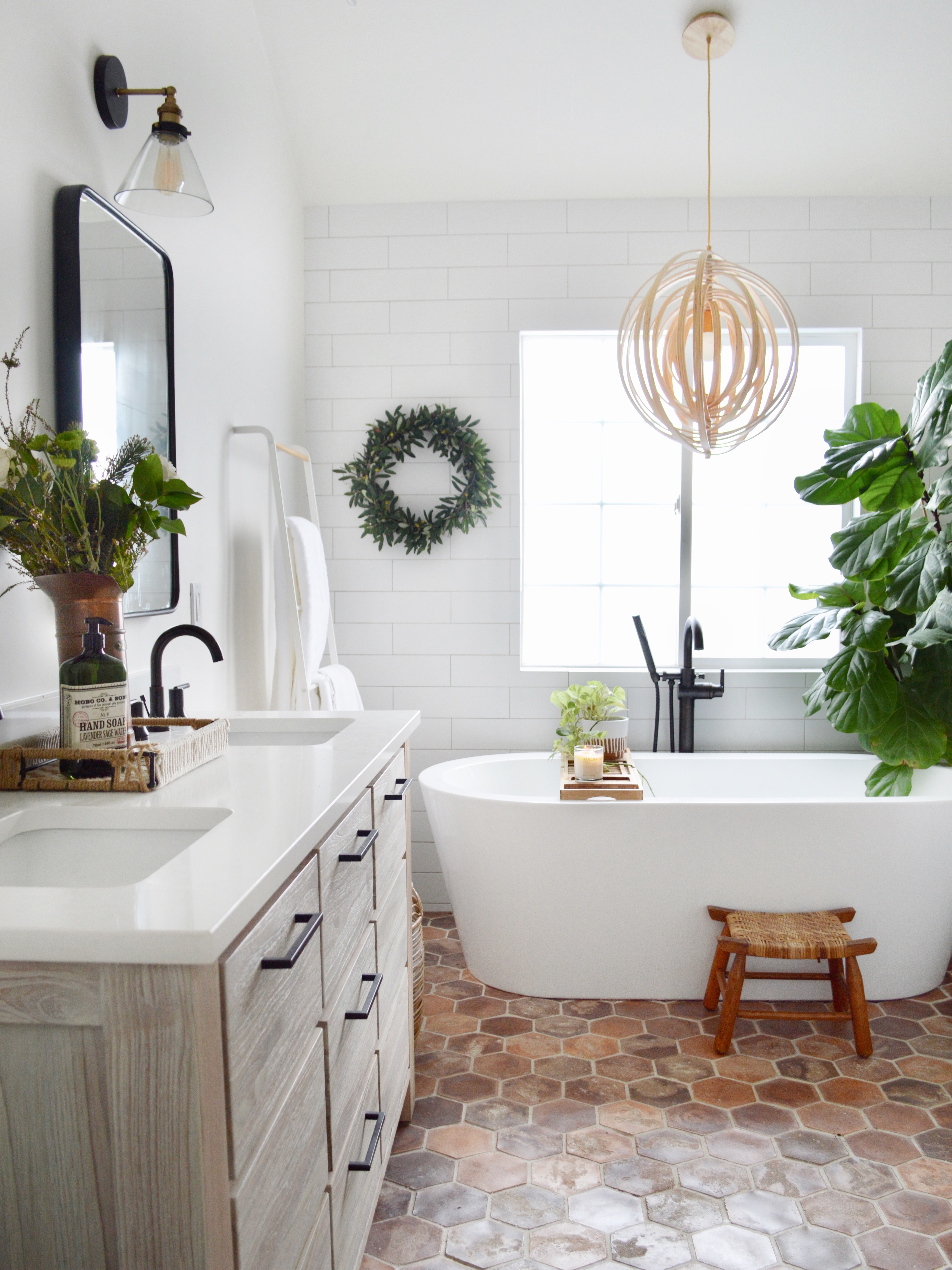
MY MASTER BATHROOM Tub and Cabinet Hardware:
shop tub & hardware:
I HOPE THIS HELPS AND HAPPY SHOPPING FRIENDS!!!!
xoxo,
Kristin
*The links are affiliate links, which means you pay the sale price and I get a small kick back for bringing them to your attention. 🙂
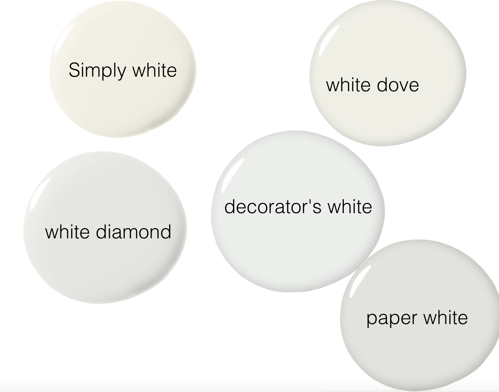
At least once a day I get asked about my white paint. Isn’t it funny that white paint is such a dilemma. There are SO many different brands of paints and SO many different shades of white paints. I personally love Benjamin Moore because they have eco-friendly zero VOC paint for the environmentally conscious . . . and, in my experience, it is possible to paint and move in the next day. There is no smell. So, here are some of my favorite Benjamin Moore “whites” and why I like them. I use Benjamin Moore’s “Aura” brand because it has zero VOC and no smell.
(1) “Simply White” by Benjamin Moore
We painted our entire house with this paint. I love that it looks white — not too cool and not too warm (no yellow undertones). But at the same time, it doesn’t feel sterile. For us, it is the “just right” white.
(2) “White Dove” by Benjamin Moore
This is also a crisp white that isn’t too cold or too modern and used a lot in more traditional settings. It is a timeless white paint color.
(3) “White Diamond” by Benjamin Moore
This white seems to have a slight blue undertone, which is perfect for a beachy feel or for someone who likes to use pops of blue in their decor. For example, I read on Emily Henderson’s blog that her old living room was this color… she said it went more cool than warm with no yellow or cream tones but had a slight blue undertone, which clearly worked well especially since a lot of her pops of color in her decor were some shade of blue.
(4) “Decorator’s White” by Benjamin Moore
A true white that lots of designers use because it’s crisp and another true white.
(5) “Paper White” by Benjamin Moore
This is a white with a slight grey undertone that would look nice with a home with black, dark wood and marble accents.
I recommend getting all of the above samples of white (and whatever other white paint samples look good to you) and testing them on a wall in your brightest room and your darkest room. Choose the one that looks the best in both of those rooms. I hope this helps!
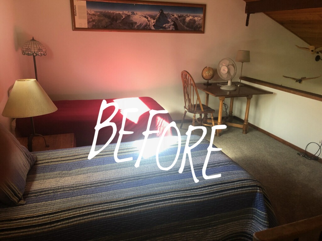
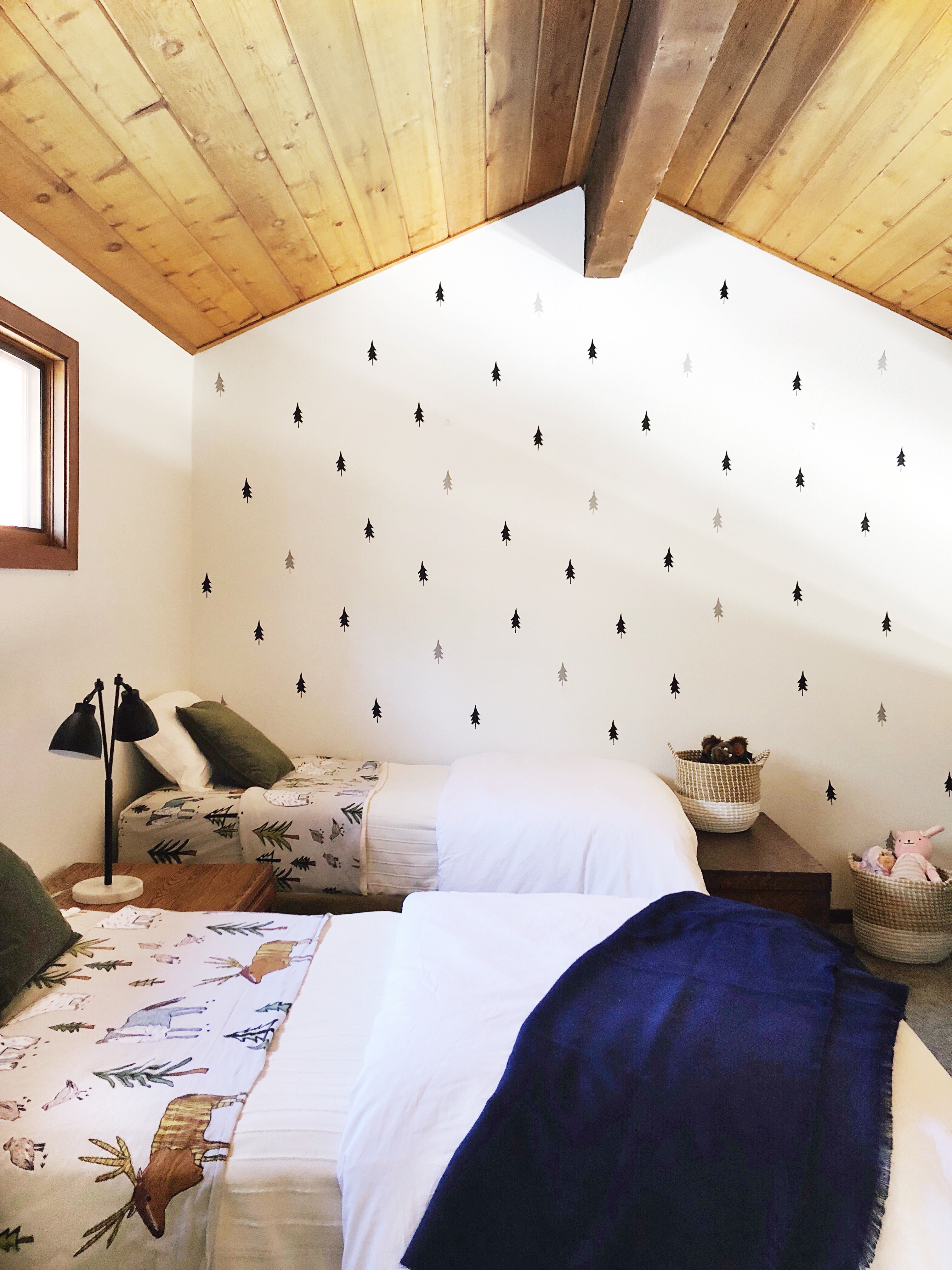
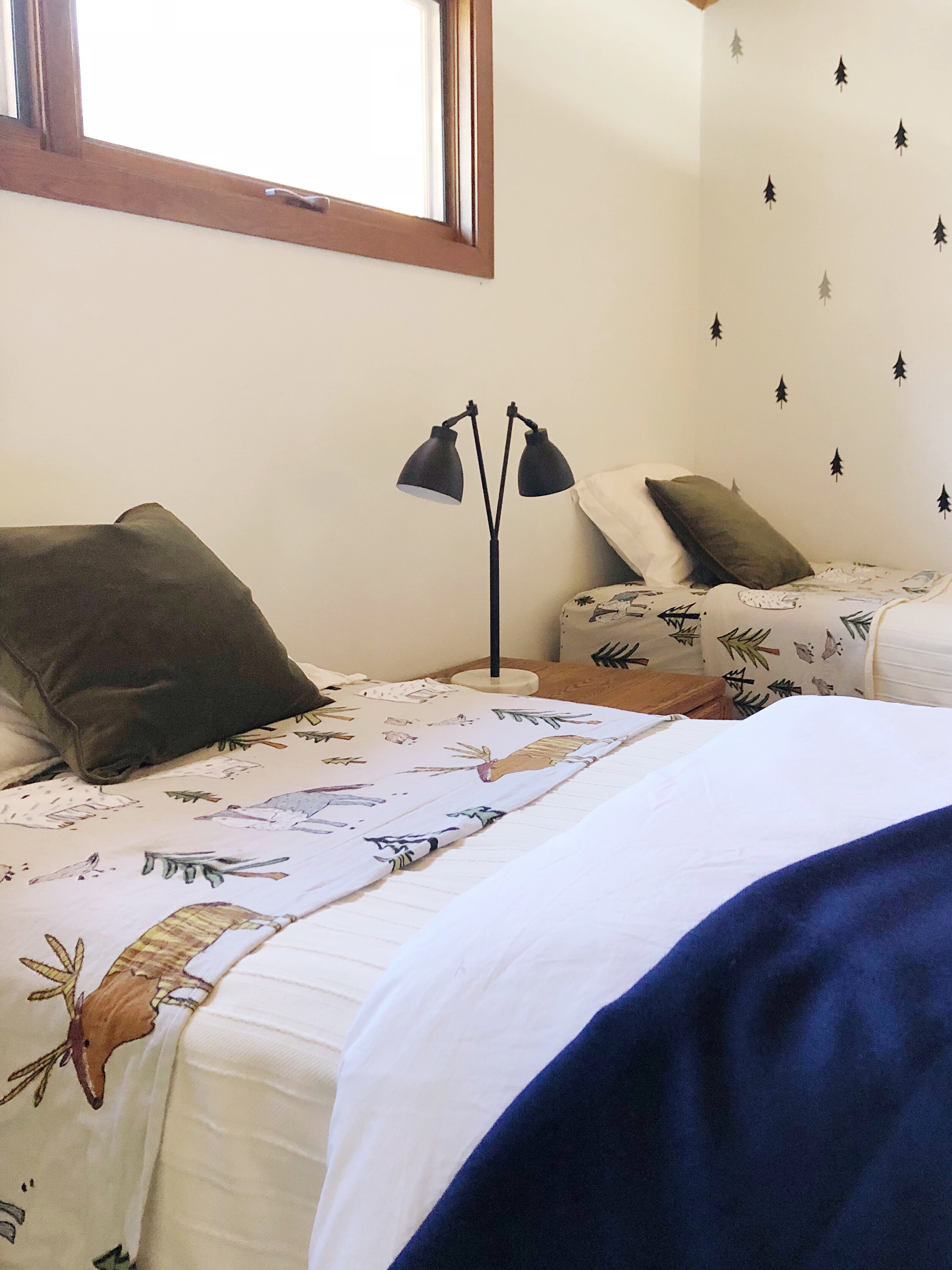
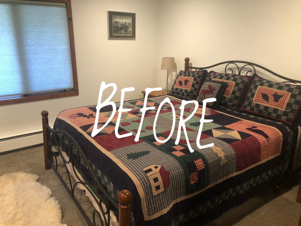
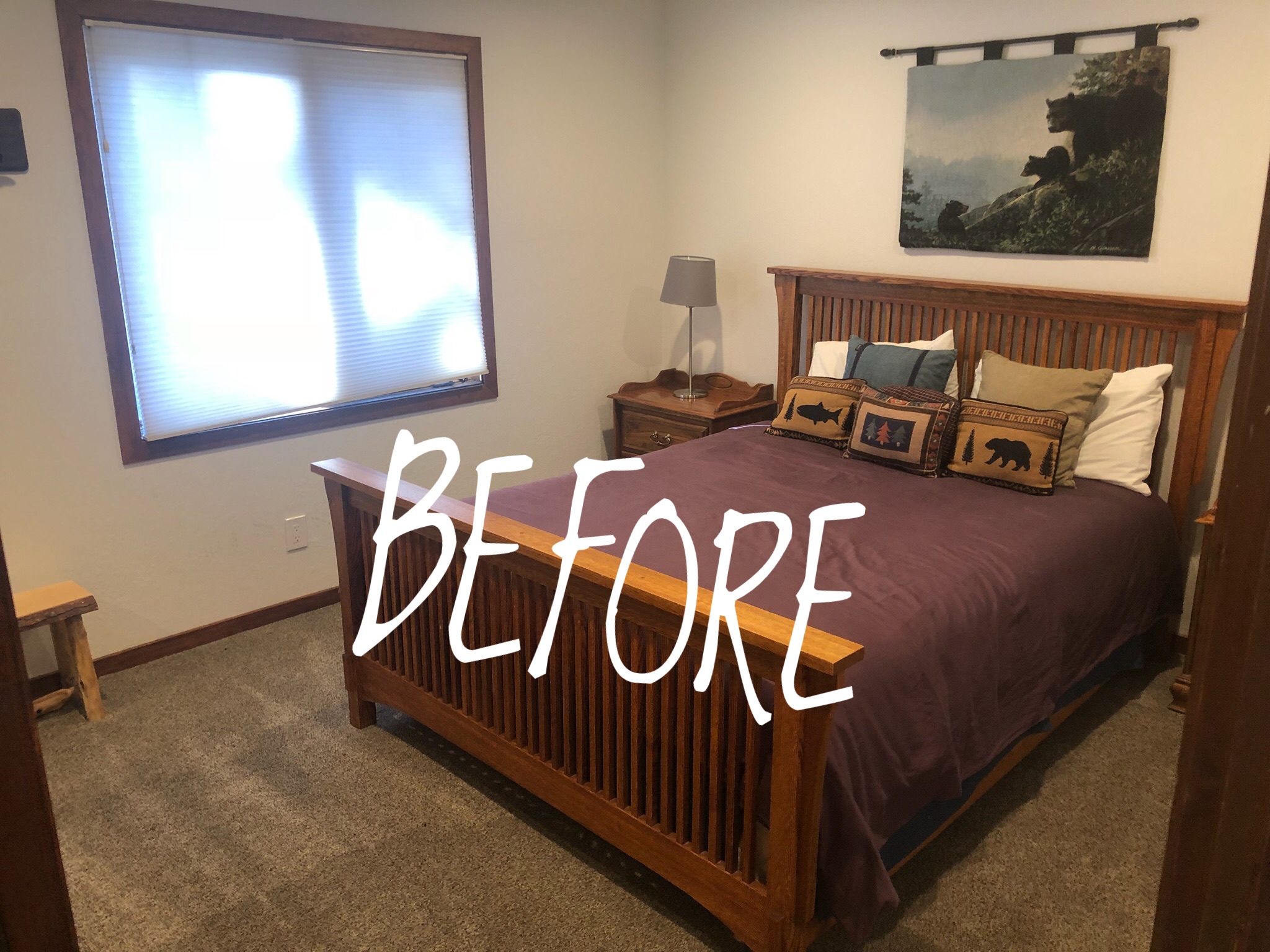
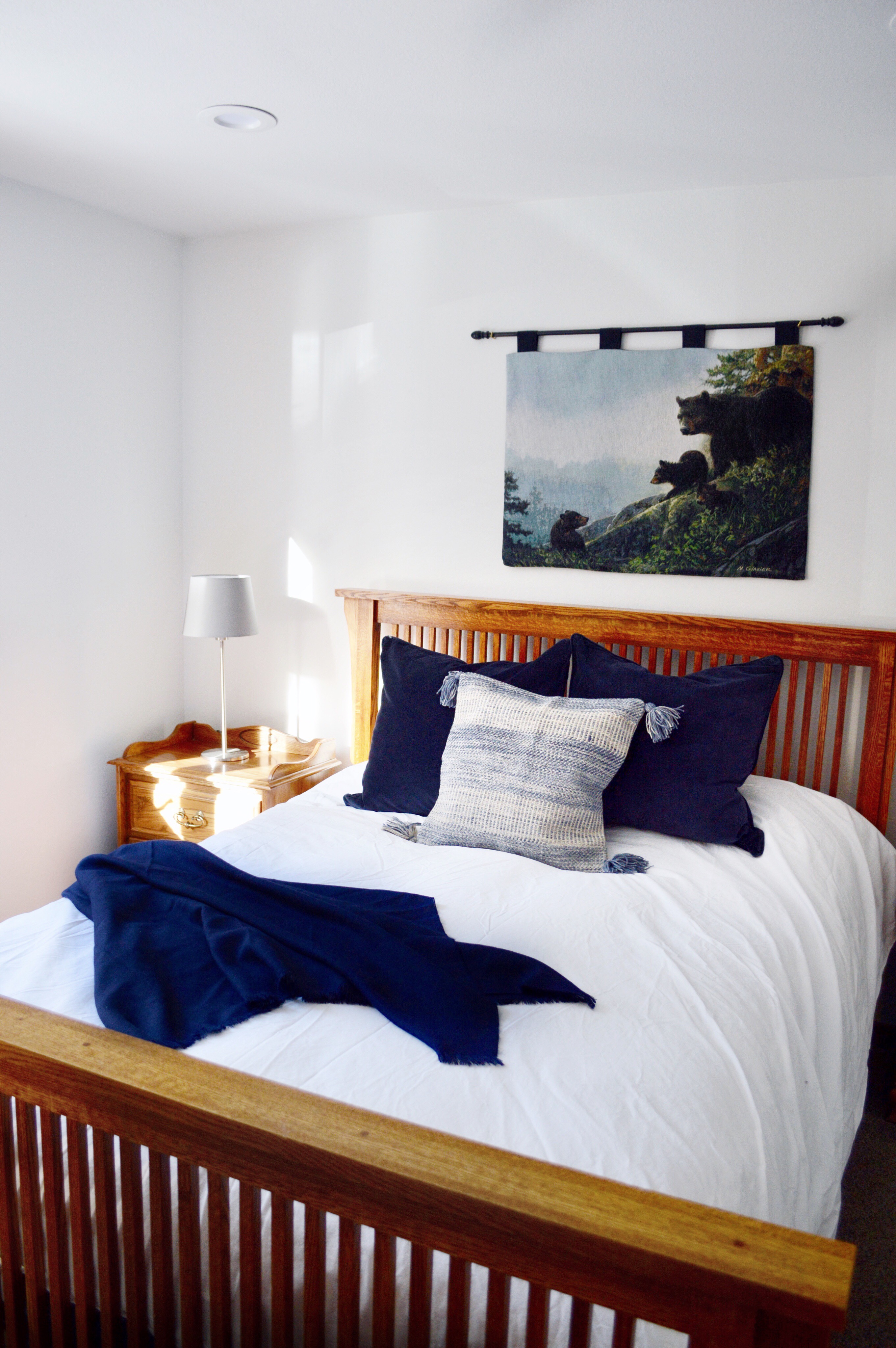
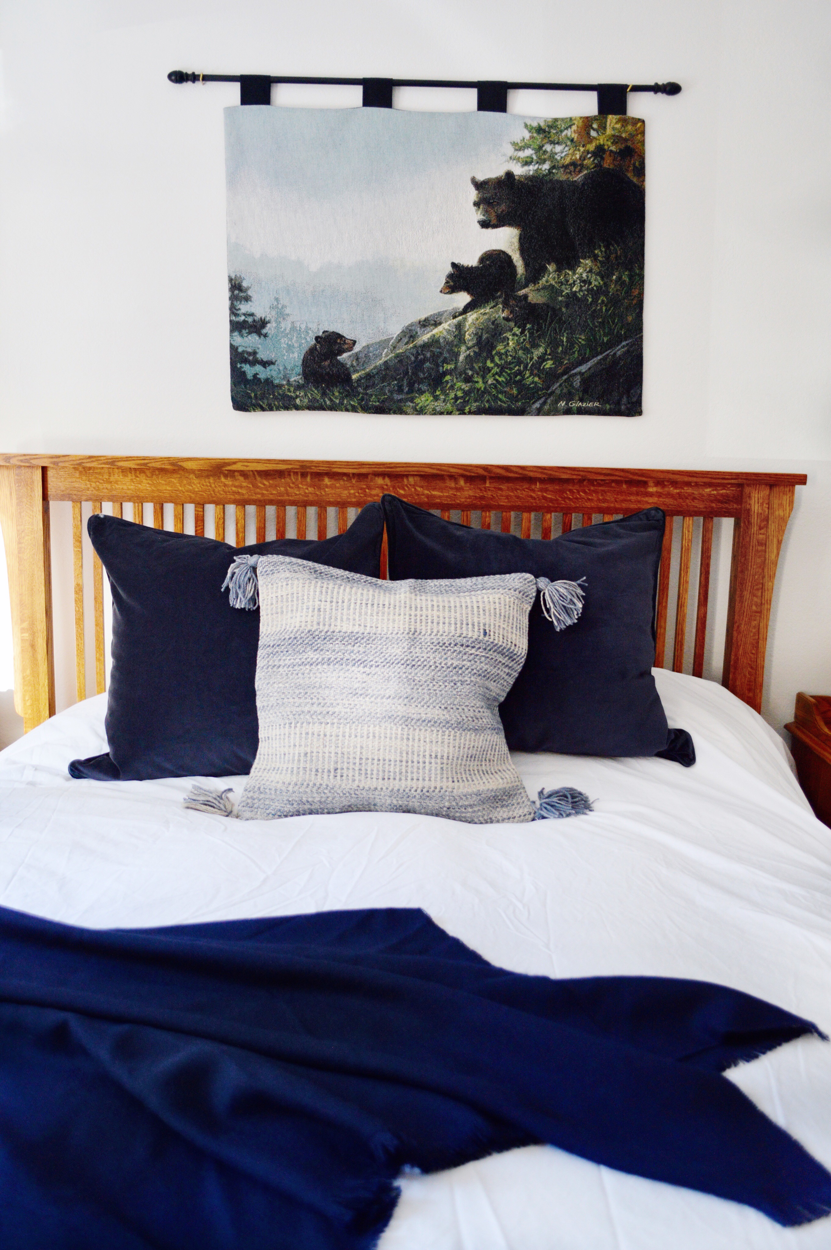
We rented a ski condo in Mammoth Lakes, CA for the winter months (Dec – March). We drive up there most weekends because our kids are enrolled in a ski program and we LOVE to ski. Our rental is perfect for our needs but the bedrooms were a little blah. Thanks to the Company Store (click here), and sponsored by the Company Store, we transformed the bedrooms by changing the bedding to make them feel fresh and clean. Pictured here is a before and after of the kid’s loft:
Before picture of the loftAfter transformed by bedding (and decals)
I don’t know about you guys, but when I stay in an airbnb or a hotel, I prefer if the bed has a duvet cover that is washed in between guests. When I see a quilt, I assume it wasn’t washed and strip it off the bed immediately. I guess I’m a bit snobby when it comes to bedding and potential germs. So, here is what I chose and why:
(1) I picked out duvets and duvet covers for each bed. For our condo, I chose white because we will have a lot of guests in and out and white is easy to clean and bleach if necessary. Plus, it feels so fresh and brightens up any room!
(2) I chose white sheets for the master and guest bedroom for the same reasons as above. GOOD choice because my dad has already spilled coffee on his sheets twice and it was easy to detect and get rid of on the white sheets. For each bed, I also chose a blanket for added warmth and texture.
(3) For the kids’ loft, I chose flannel mountain/animal themed sheets because they will keep them warm and they are fun. Kids love a theme! I also bought cheap pine tree decals on amazon to brighten up the wall in their room. I also added a lamp — from the Company Store (yes they sell more than just bedding). I will include all links below.
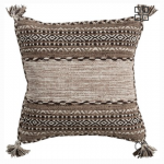
(4) I picked accent pillows to compliment each room. The master already had a sheepskin rug on the floor, so I chose neutral pillows and a shaggy pillow to compliment the look. The guest room seemed like blue would be a good complimentary color so I picked out navy velvet pillows (to add some texture) and a tassel pillow for contrast.
Before/after of the master bed with a bedding refresh:
after bedding refresh
Here is the guest room before and after the bedding refresh:
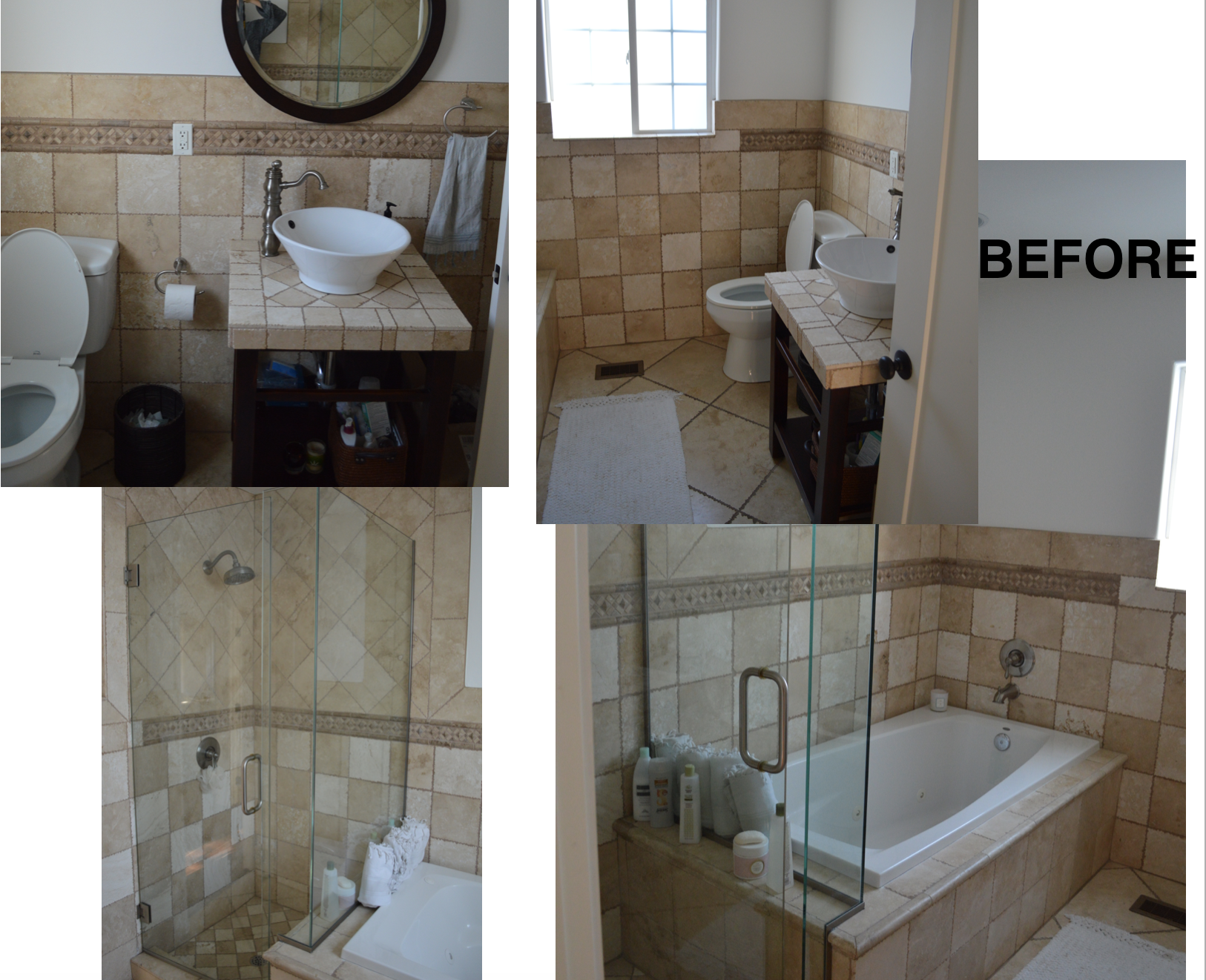
We remodeled our guest bathroom and took out the bath tub and added laundry!! You might be asking WHY would she take AWAY a tub??? Well, here are all the deets.
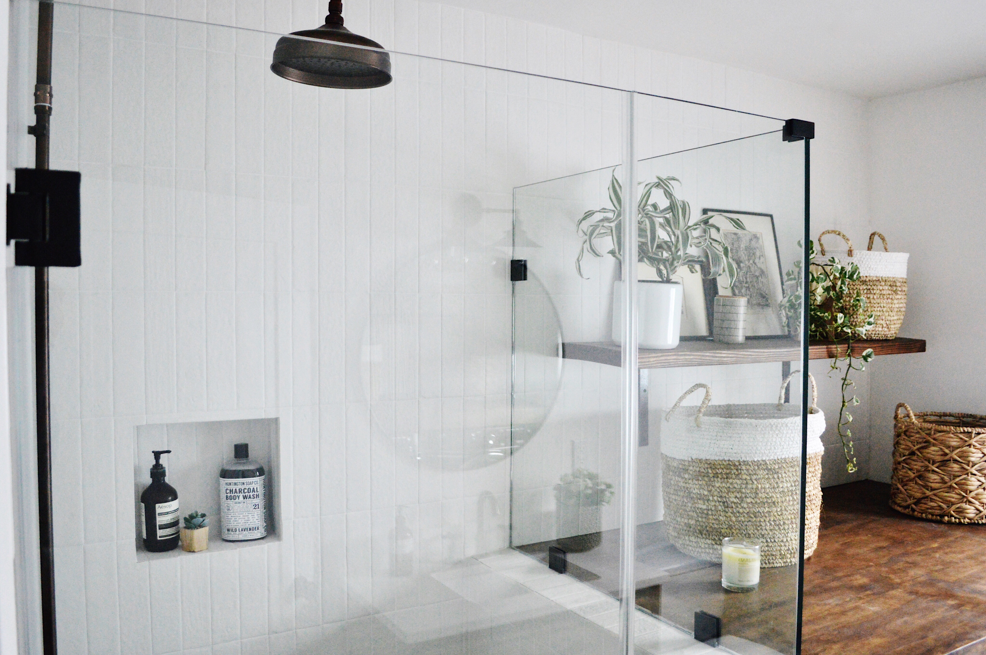
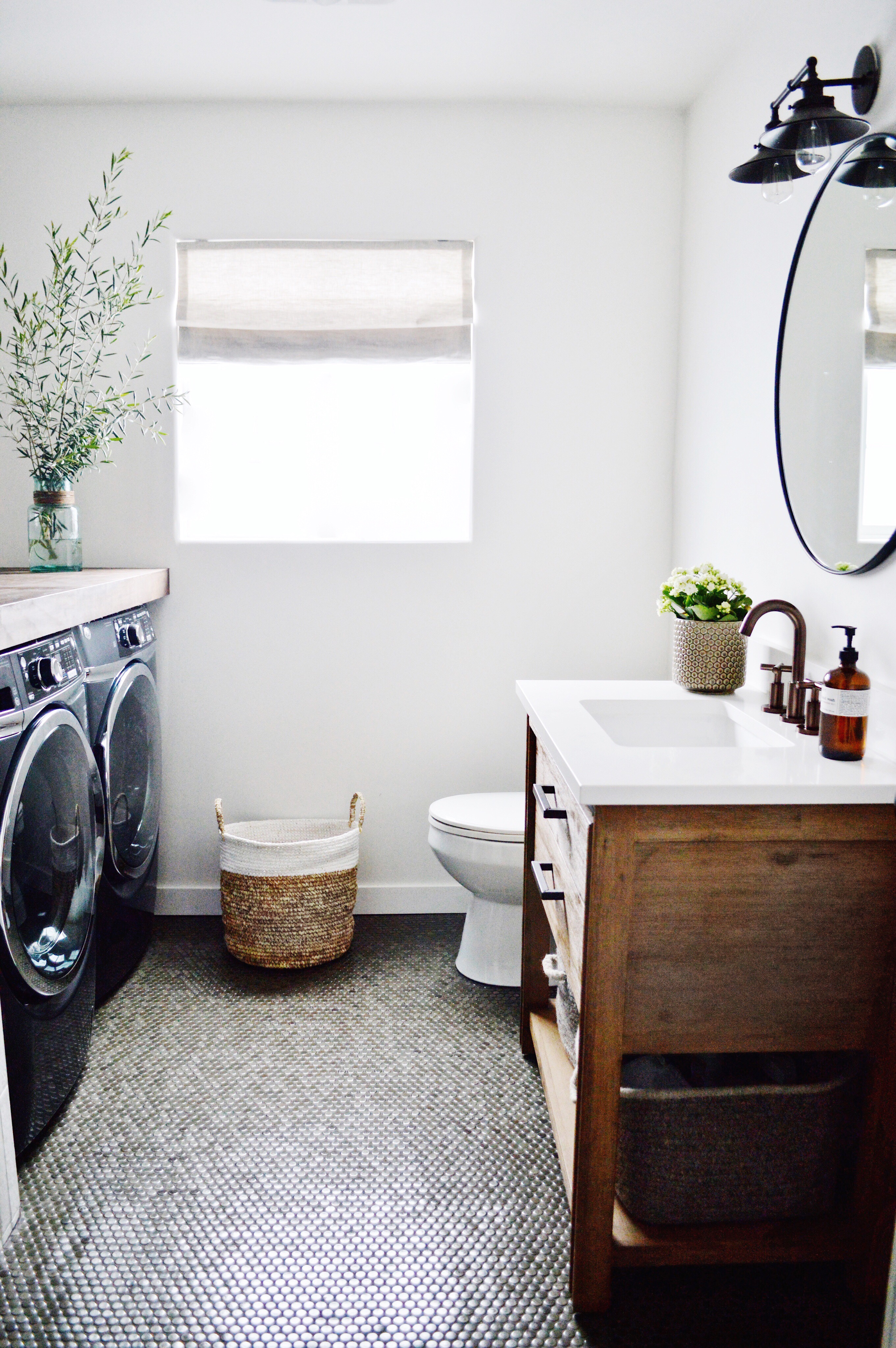
We are fortunate to have 3 good sized full bathrooms in our small’ish (less than 1900 sq ft) home but after living here for 10 years, we realized that nobody ever bathes in the guest bath tub. And we are ALWAYS doing laundry in the small closet opposite this bathroom. SO? Yep, I swapped out the tub for laundry and I LOVE it. Pictures are first and then ALL of the details (even the grout colors) are below.
Here are some BEFORE pictures of the guest bathroom with the bathtub we never used —
When planning the bathroom, my first priority was functionality. We wanted laundry, a shower, sink and a toilet all to work in that room. A close second priority was aesthetic. I wanted this bathroom to match the rest of our house. Earthy, modern and bright. So I knew I needed to incorporate whites, earthy colors, wood and plants.
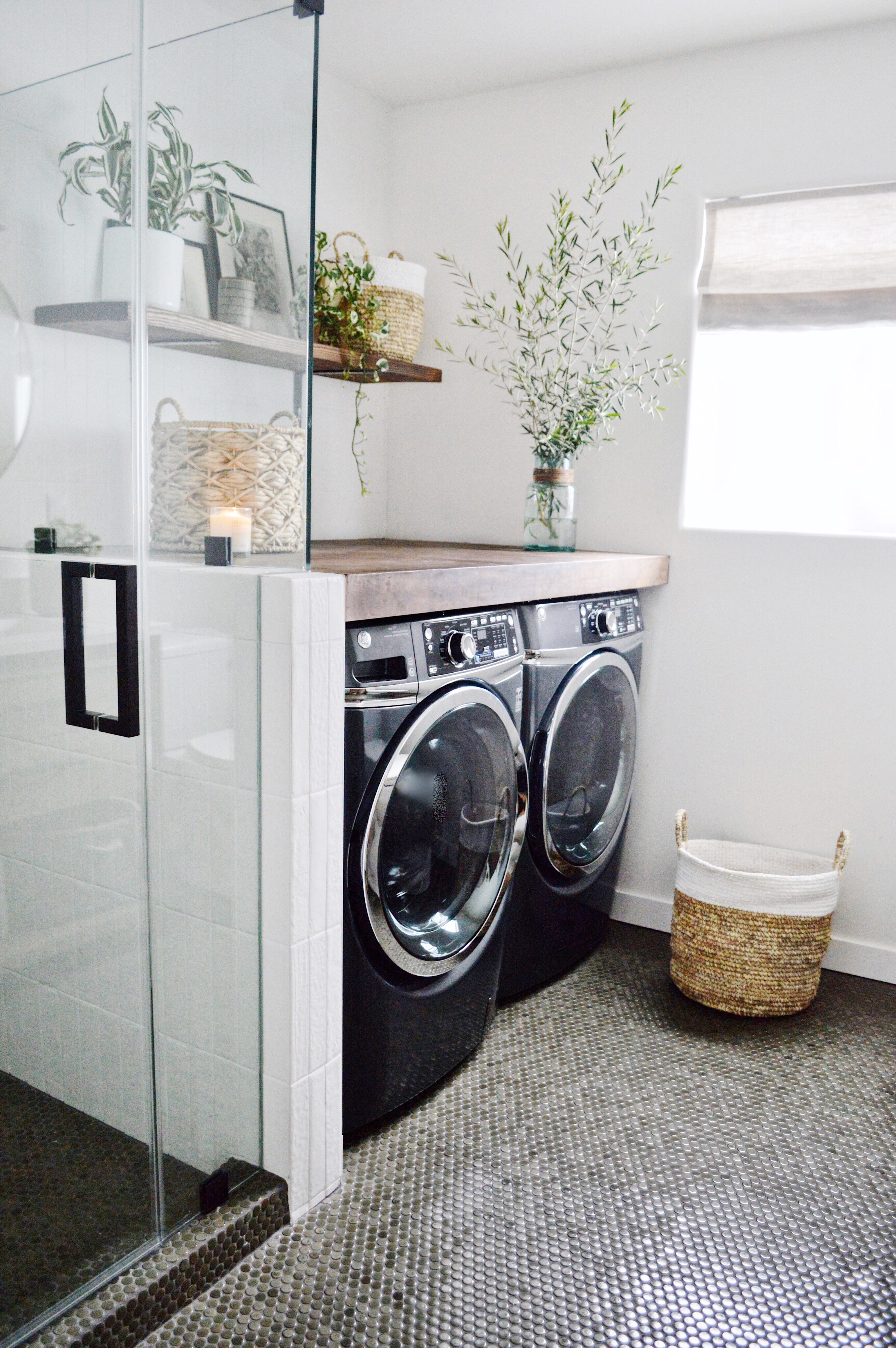
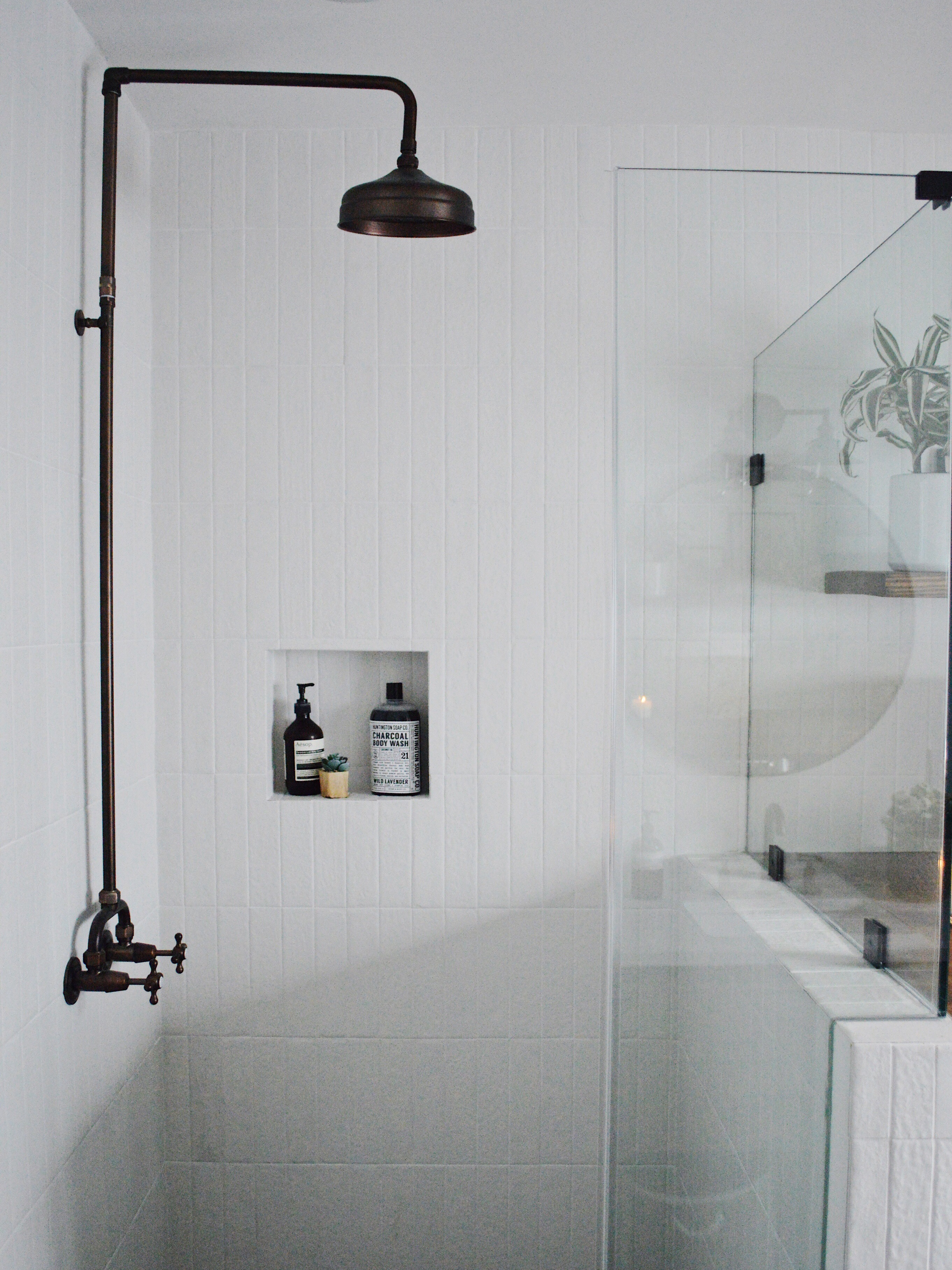
And here it is now – our remodeled bathroom/laundry:
laundry: GE appliances and Bedrosians penny tile in shaleshower: Bedrosians tile and Signature Hardware faucet
shower: bedrosians tile and signature hardware faucet
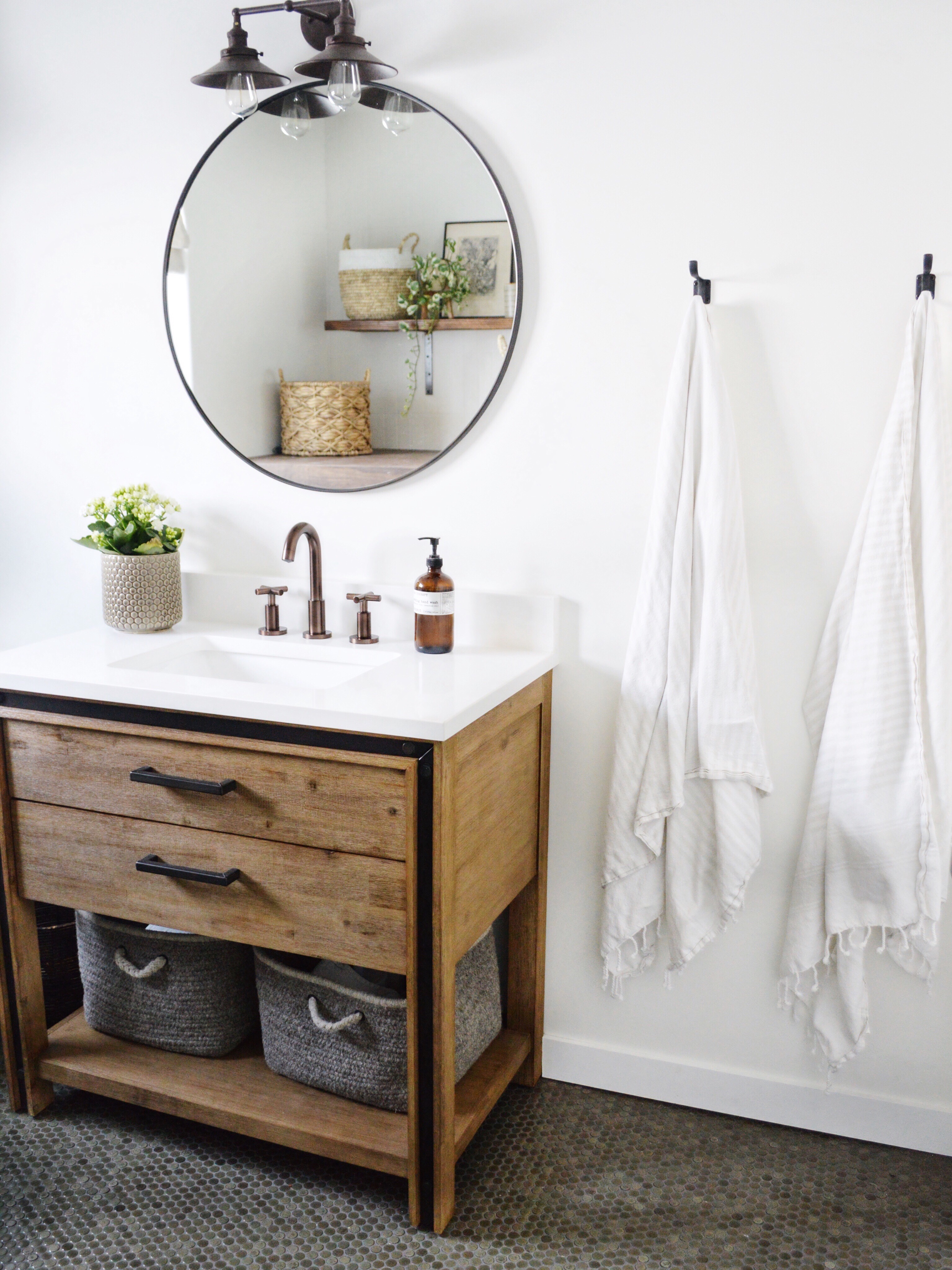
bathroom remodel: Bedrosians tile, Signature Hardware vanity, Rejuvenation mirror, RH sconce, Barn & Willow roman shadevanity: Signature Hardware vanity, sink and faucet, Bedrosians tile in shale, Rejuvenation mirror and RH sconce
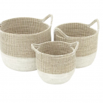
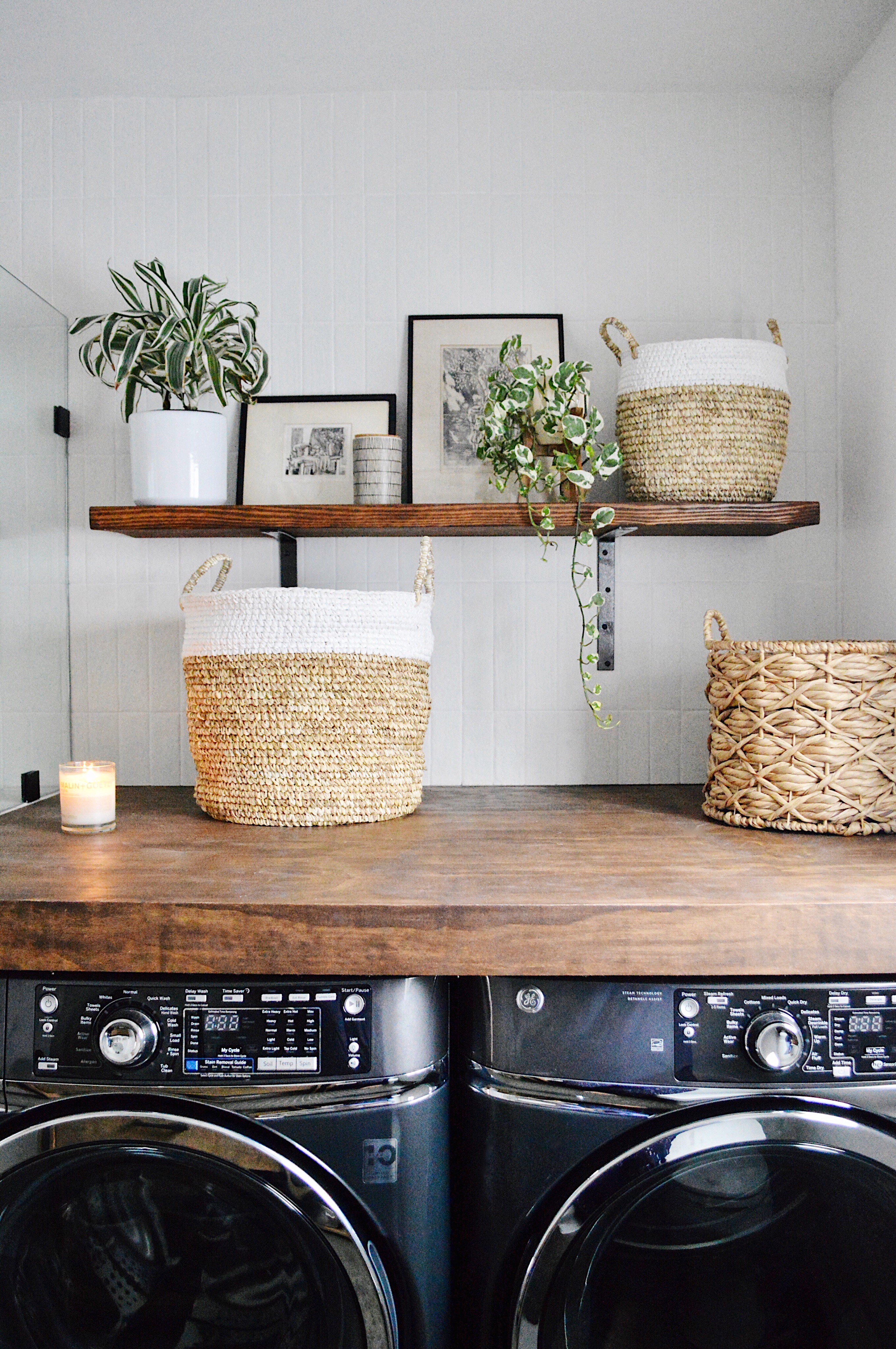
laundry space: DIY plywood and shelf, GE appliances, Bedrosians tile, AllModern baskets and thrifted art
First, I want to talk about the tile. I wanted the shower tile to run along the entire wall but I wanted something white and textured. I partnered with Bedrosians Tile & Stone and found these amazing white textured tiles for the wall and shower. It’s their “Urbanity” tile in white (size is 2.5″x10″). Click here for the link (note- tiles are whiter in person than picture). Click here for the grout. Given the white walls, which is a consistent theme through-out our home, I wanted the floors to pop in an earthy color. I chose a lovely penny tile from Bedrosians in shale. Click here for the link. I am obsessed with it. It’s such a gorgeous penny tile — each little tile is unique. I used a dark grout color, which blends beautifully with these unique penny tiles. Click here for the grout.
I partnered with Signature Hardware for the vanity (which comes with a counter of your choice and a sink), the amazing exposed pipe shower faucet and the sink faucet. I am thrilled with the quality and look of everything! The vanity adds the perfect pop of wood to that side of the room. And, I love how the oil rubbed bronze finish of the faucets pops off the white. Click here for vanity, here for shower faucet and here for sink faucet.
I partnered with GE Appliances for the GORGEOUS charcoal grey washer and dryer. I love how they blend nicely with the floor and look so rich in the room. And you GUYSSSS — these machines are a dream. They are huge and work so well and quietly! Click here for the washer and here for the dryer.
I partnered with Barn & Willow and chose the gorgeous natural roman shade that adds the perfect amount of organic texture to the window/white wall. Click here for the link. And enjoy 10% off any product with this code BWxKDIONDESIGN.
The wood counter over the washer and dryer is a dream come true for me. I now have a convenient place to fold laundry and it looks pretty too, The BEST PART? It is a plywood hack. I looked into buying butcher block for this space but it was going to cost over $1000. My contractor helped me create this butcher block look with plywood and we stained it exactly how we wanted it (harder to do with butcher block which often comes pre-stained). The wood shelf is also a DIY. Simply buy wood at home depot, cut to desired size, stain and hang with brackets (spray paint to desired color. Here is what you will need: (1) wood for shelf (buy a 2in x 8in x 8ft and cut down to size and stain it desired color (2) bracketsand (3) spraypaint.
The shower glass and hardware is by a local company called NoHo Glass and their email is nohoglass@gmail.com. I also used them for our master bathroom. They are professional, quick and super easy to work with. I highly recommend them if you live in SoCal.
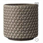
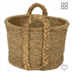
After the construction, I had a fun time styling the bathroom. Thanks to AllModern, I chose the following products to style the bathroom. For the woven baskets (great for hiding laundry and detergent), click here. For the lovely “penny tile” inspired planter, click here. For the baskets under the vanity, click here.
I sourced the framed pictures at a thrift store for a few dollars each. Click here for the mirror and here for the sconce.
I’m working on the perfect rug and will keep you posted.
Thanks for stopping by and I hope you like this reveal! While this post is sponsored by all companies mentioned above, all the thoughts and opinions are my own.
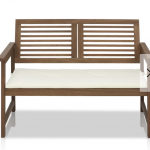
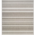
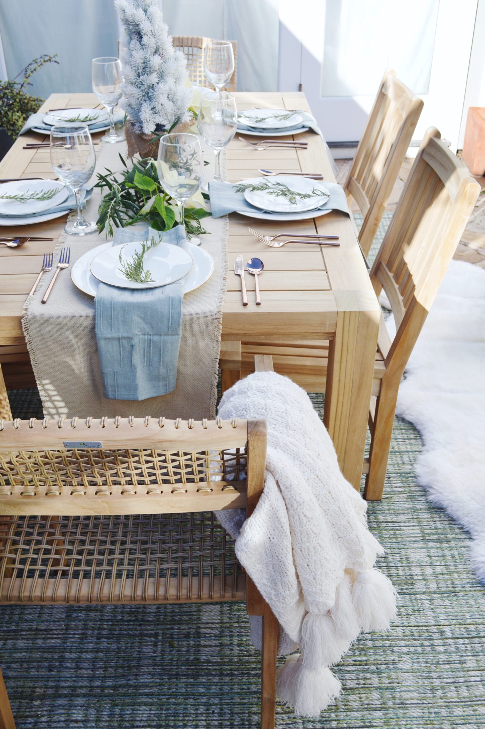
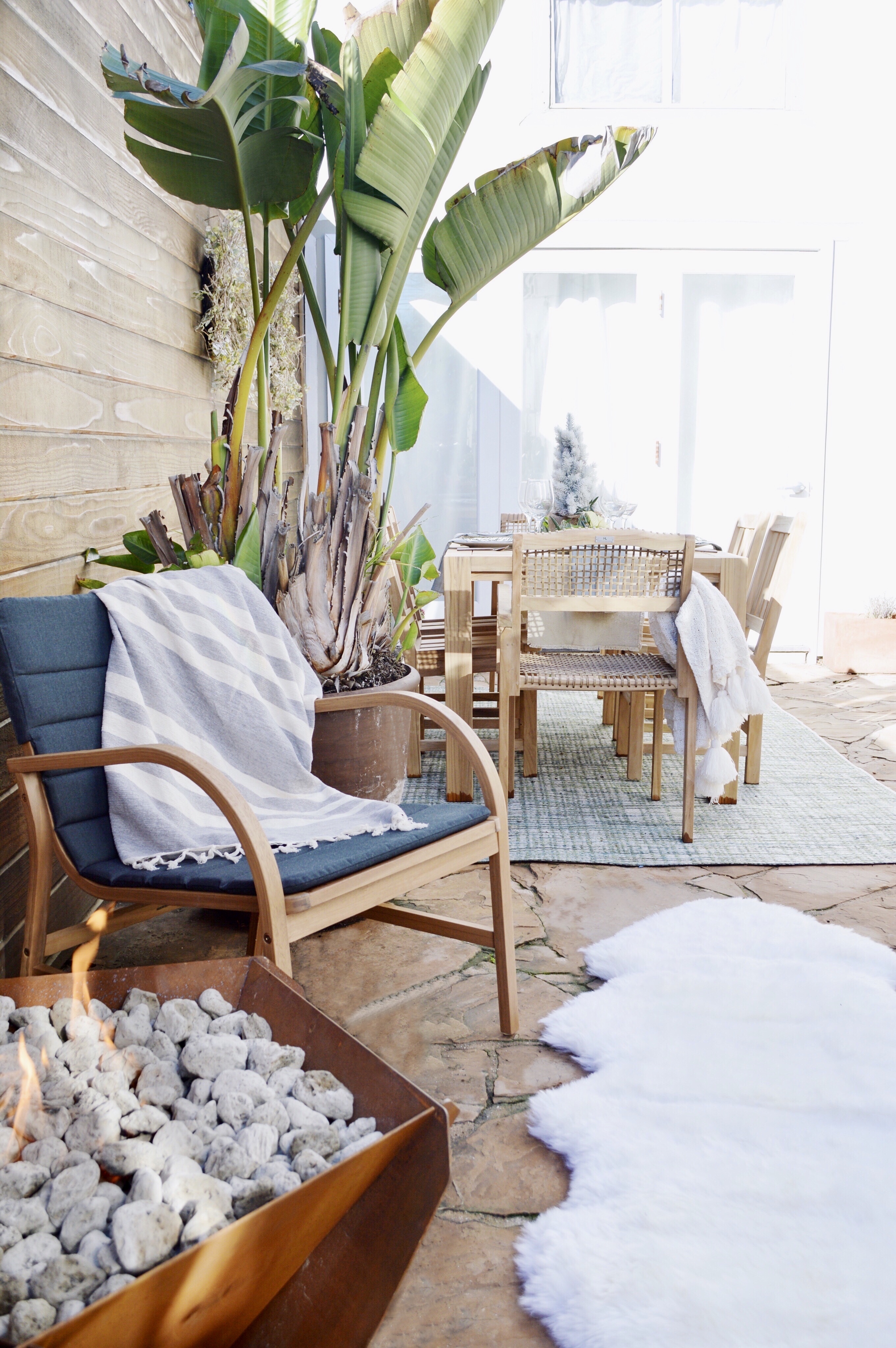
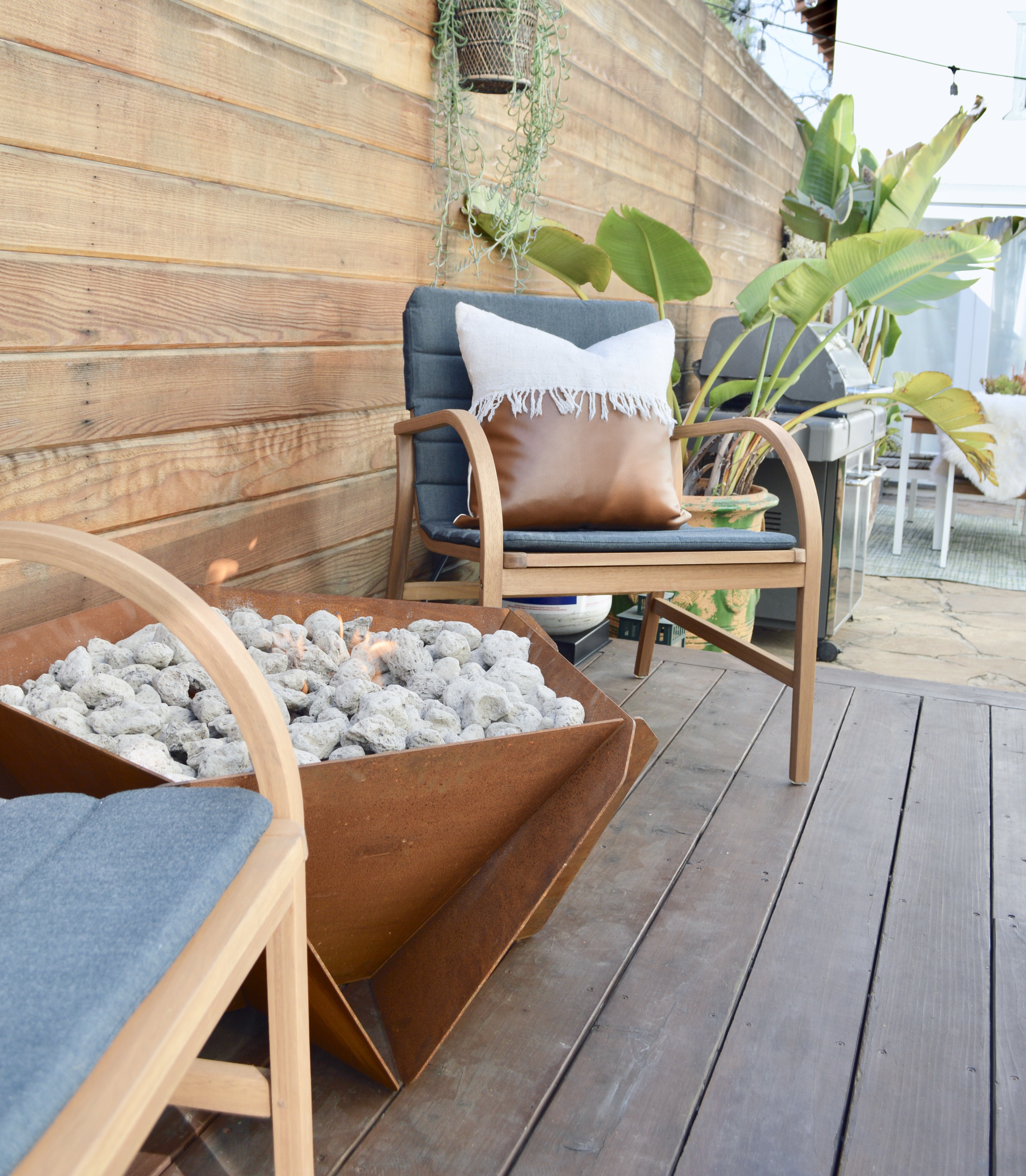
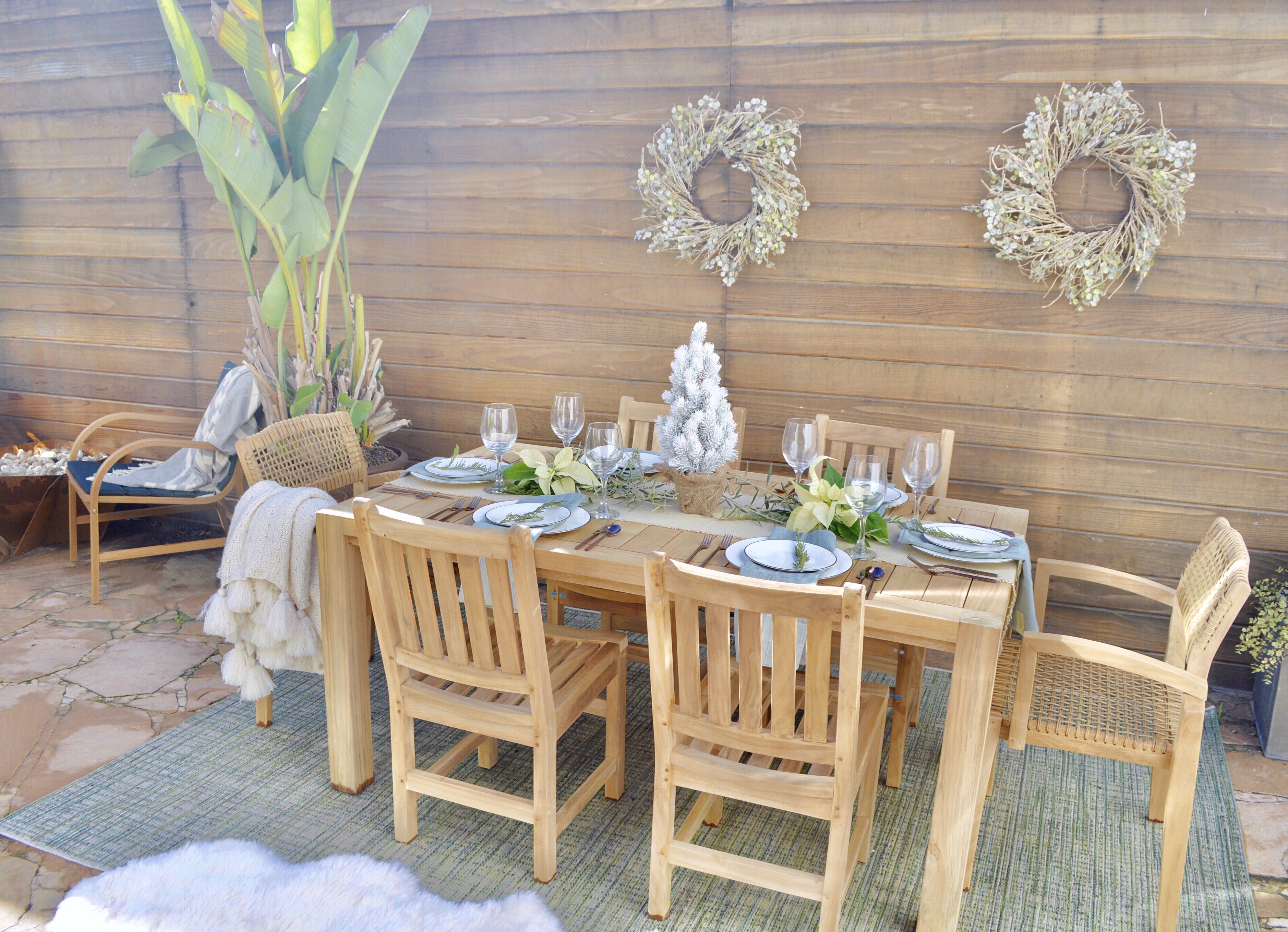
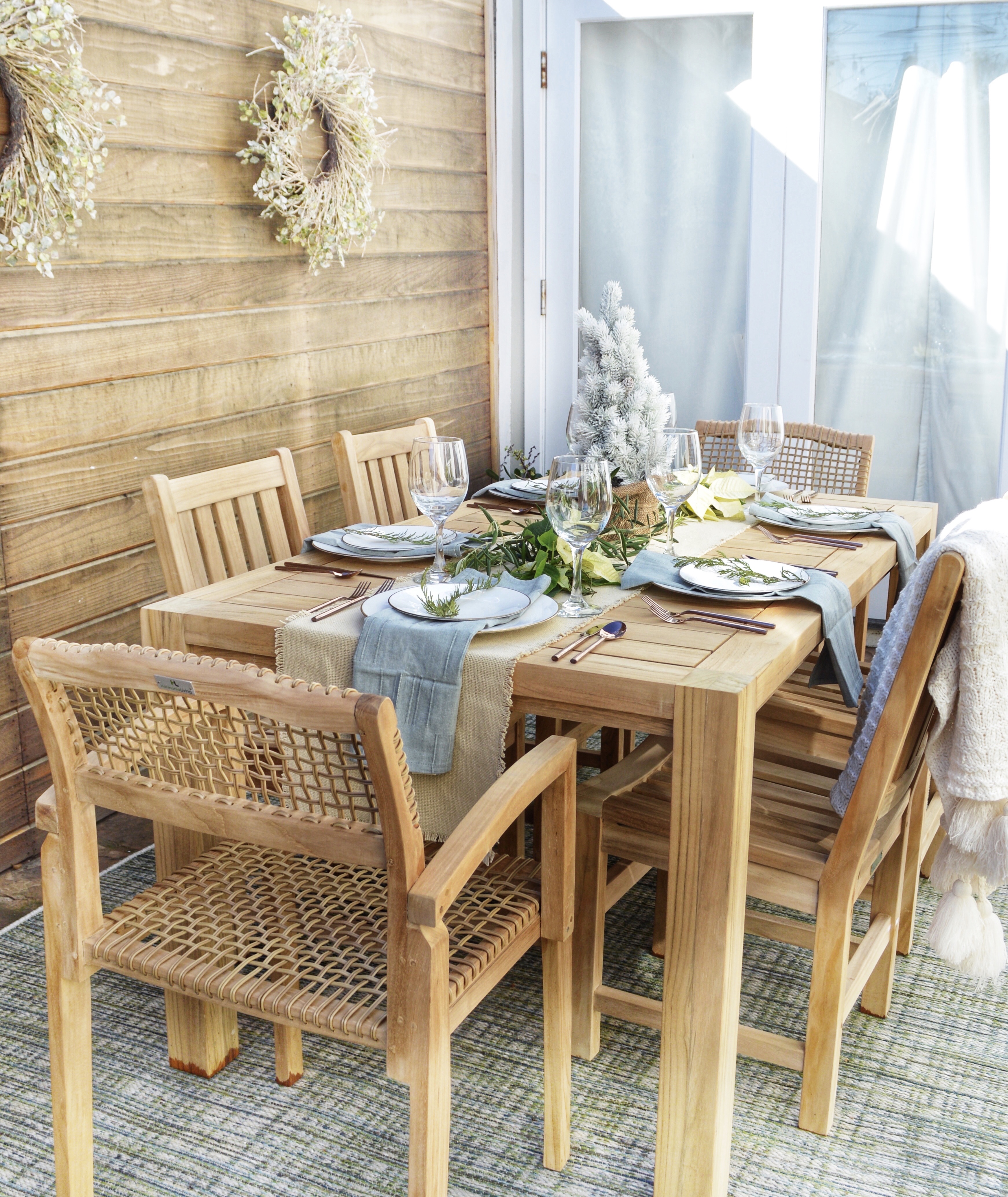
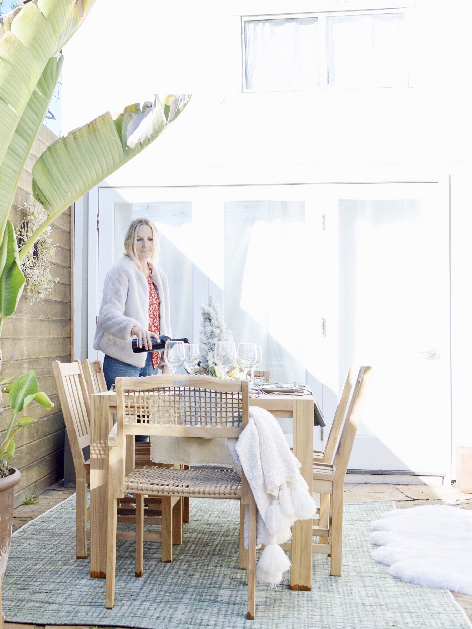
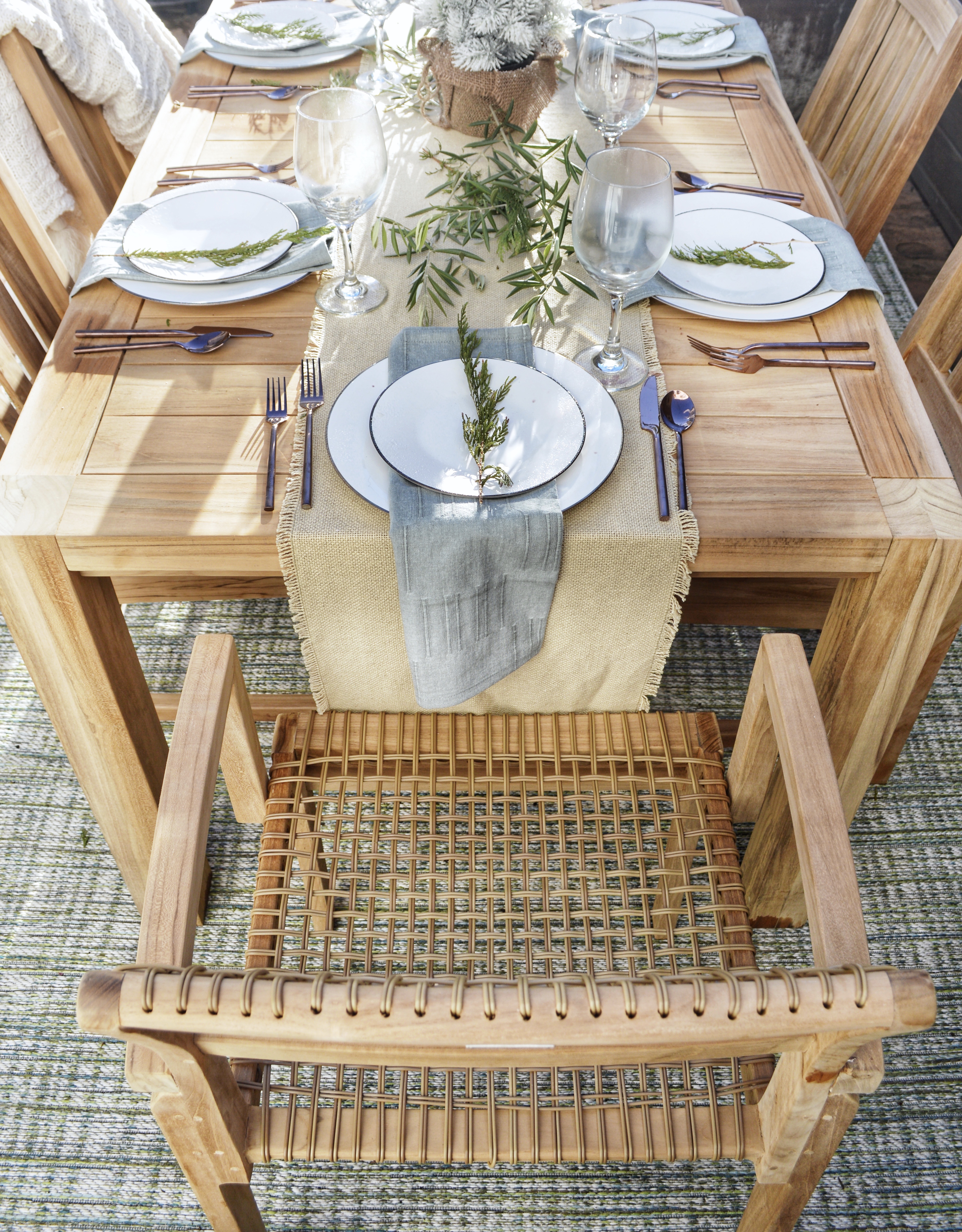
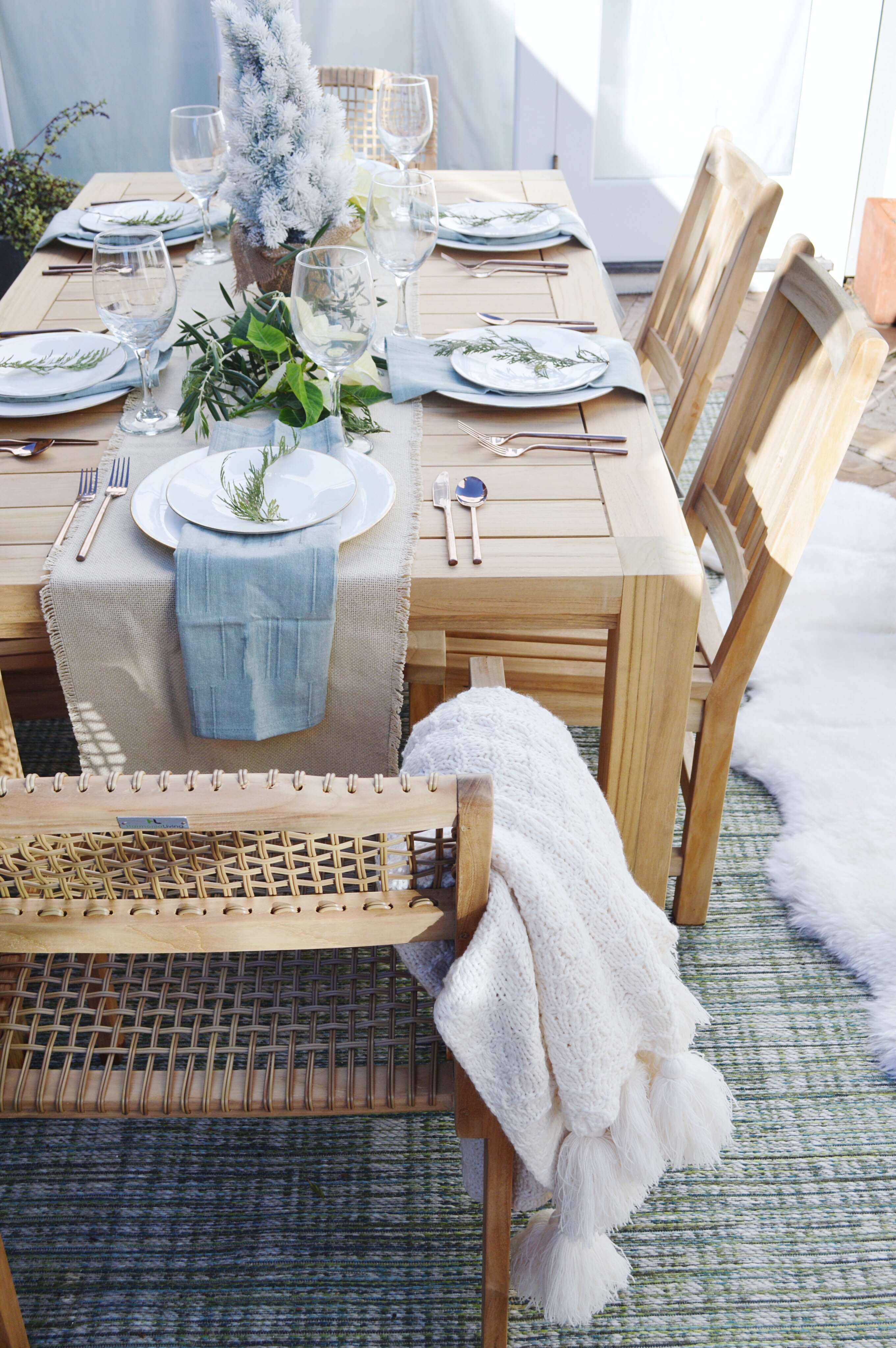
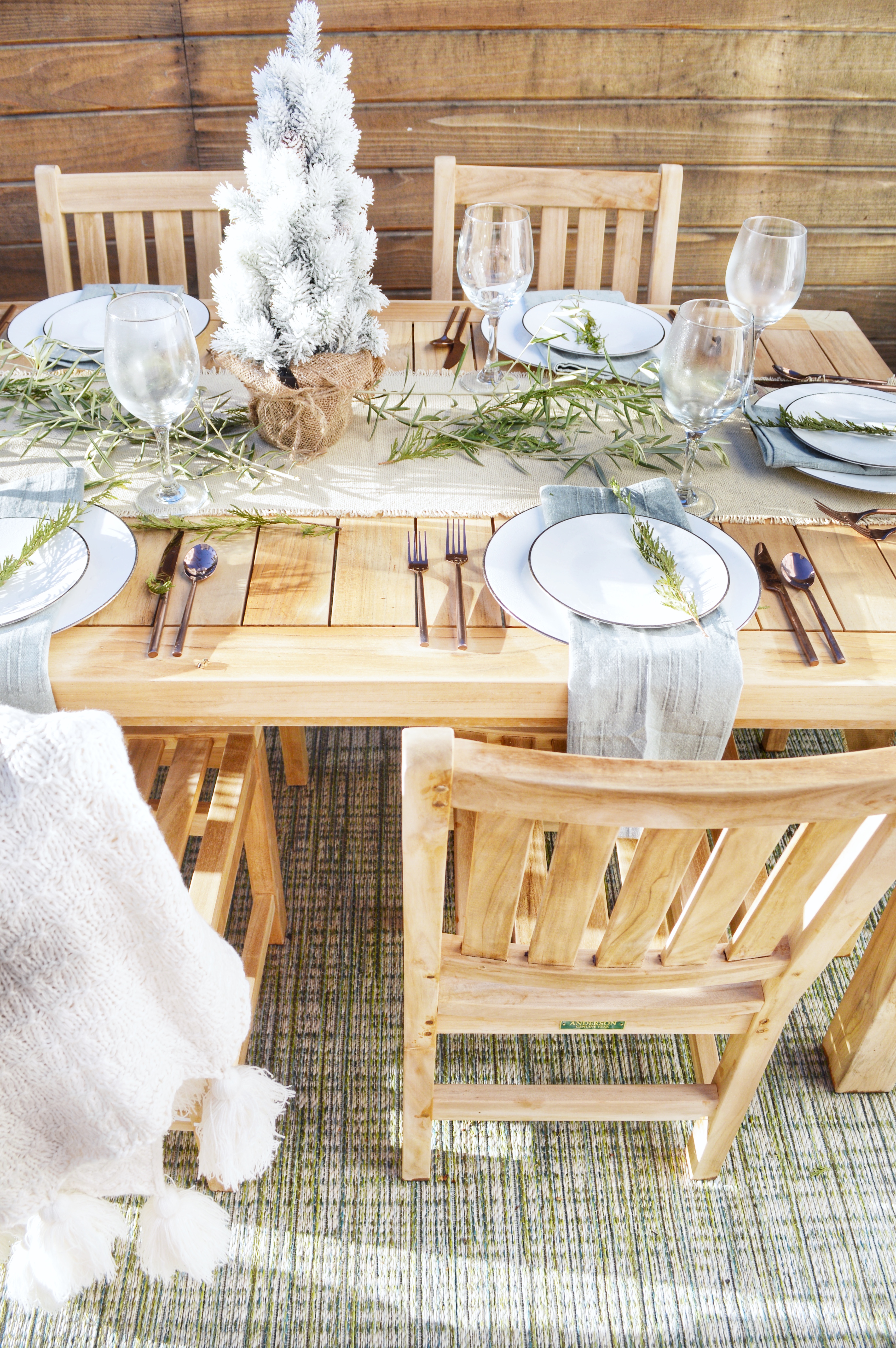
This holiday season, I partnered with Hayneedle to update our outdoor space. I was SOOOOO happy with their amazing selection of outdoor furniture. Our table, chairs, outdoor rug, accent chairs and fire pit are stunning – both aesthetically and in quality. We could not be happier! We also LOVE all of their accessories — I chose some wonderful blankets, wreaths and a flocked xmas tree centerpiece to complete our space. Here are all the details! Click HERE for Hayneedle’s big holiday sale! Let’s start with the firepit and accent chairs —
The accent chairs are such a good deal, comfortable and good looking. Click here for the link. The fire pit has already provided HOURS of ambience for our evenings of conversation and wine outside. I LOVE how it blends in with our deck decor. Click here for the link. Moving on to the GORGEOUS table and chairs.
Click here for the table, here for the end chairs, here for the side chairs, and here for the rug.
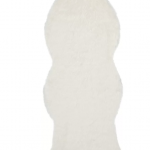
Now… moving on to the styling accessories. I used our plates and clipped greenery from our garden and trees. But the napkins, runner, faux tree, wreaths, sheepskin rug and blankets are ALL from Hayneedle!
Click here for the napkins, here for the runner, here for the faux tree, here for the wreaths, here for the sheepskin, here for the tassel throw, and here for the striped throw.
This post is sponsored by Hayneedle but I chose and love every item pictured! Please let me know if you have any questions.
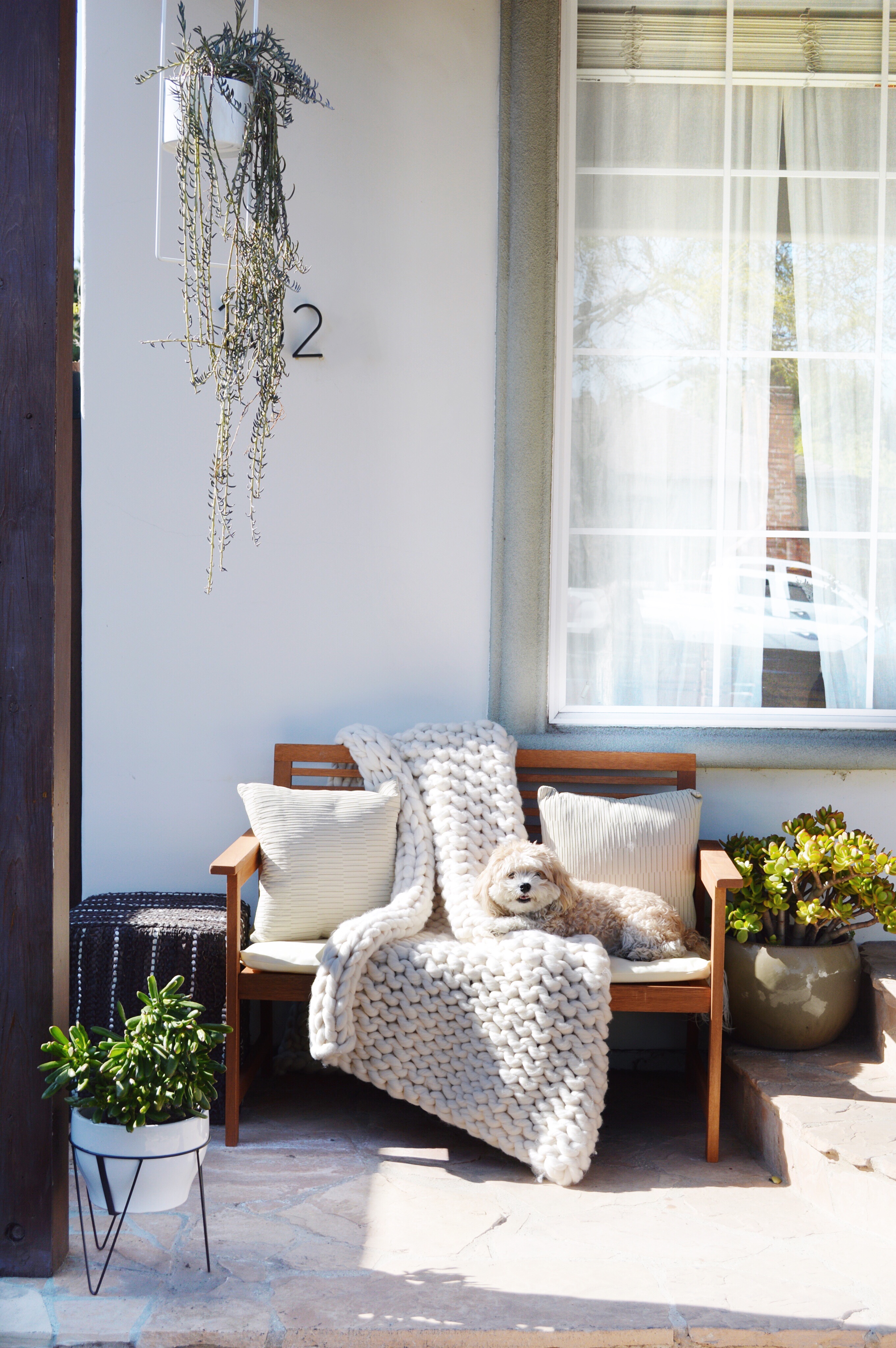
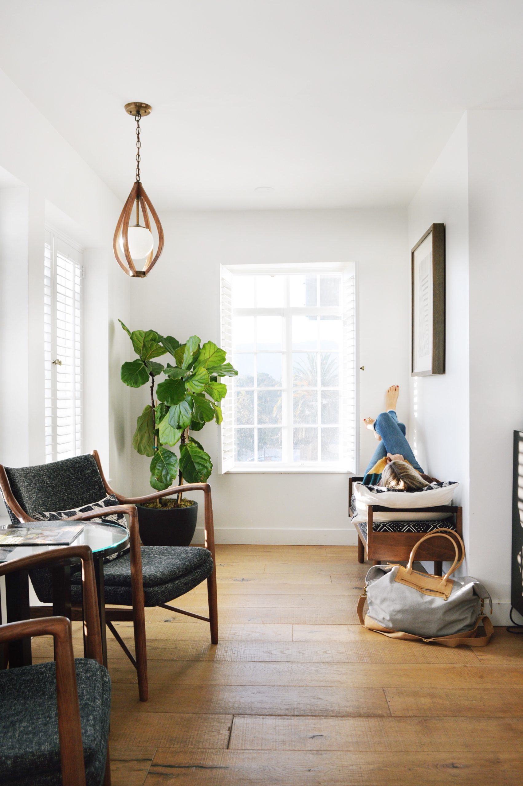
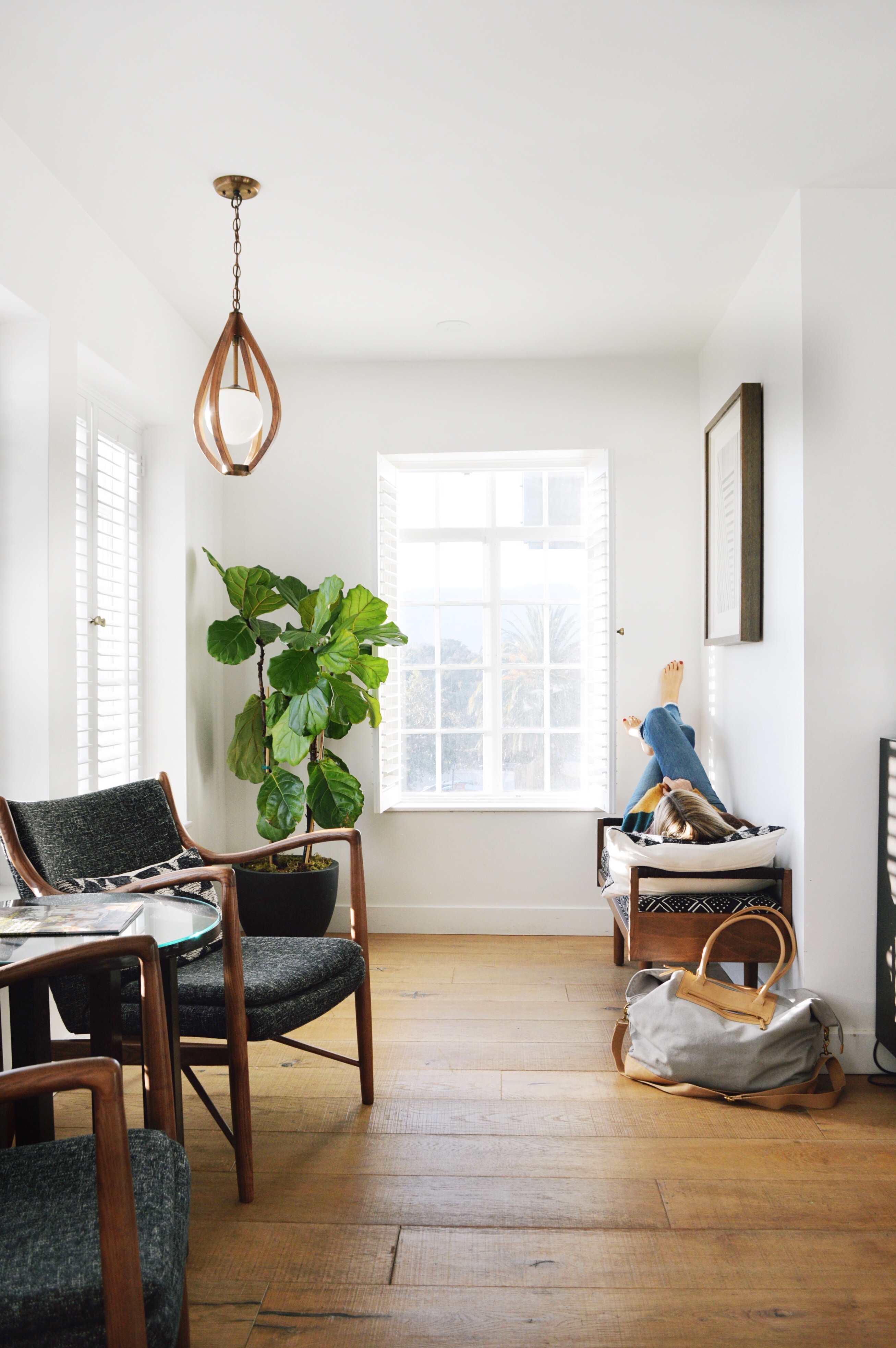
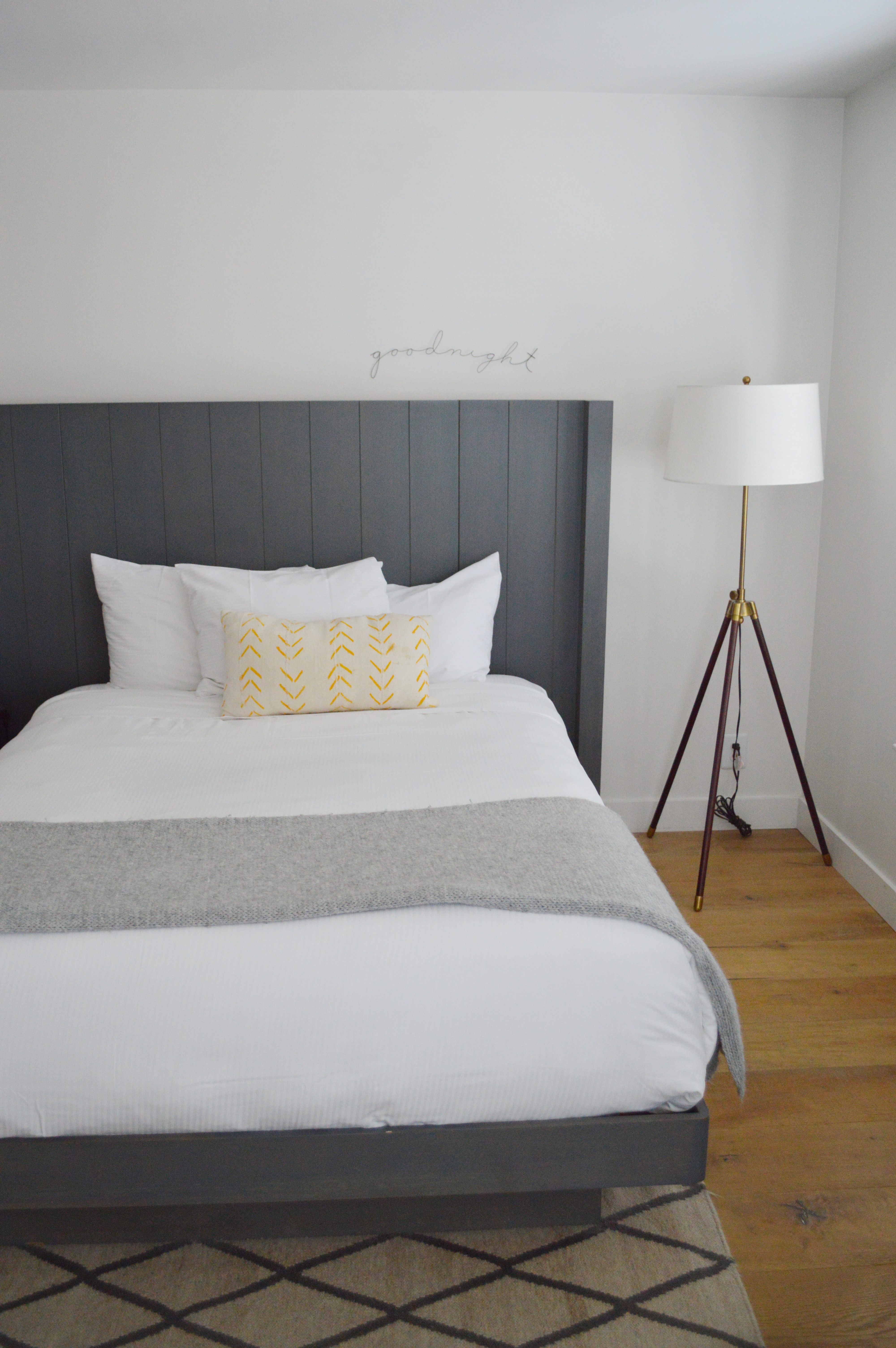
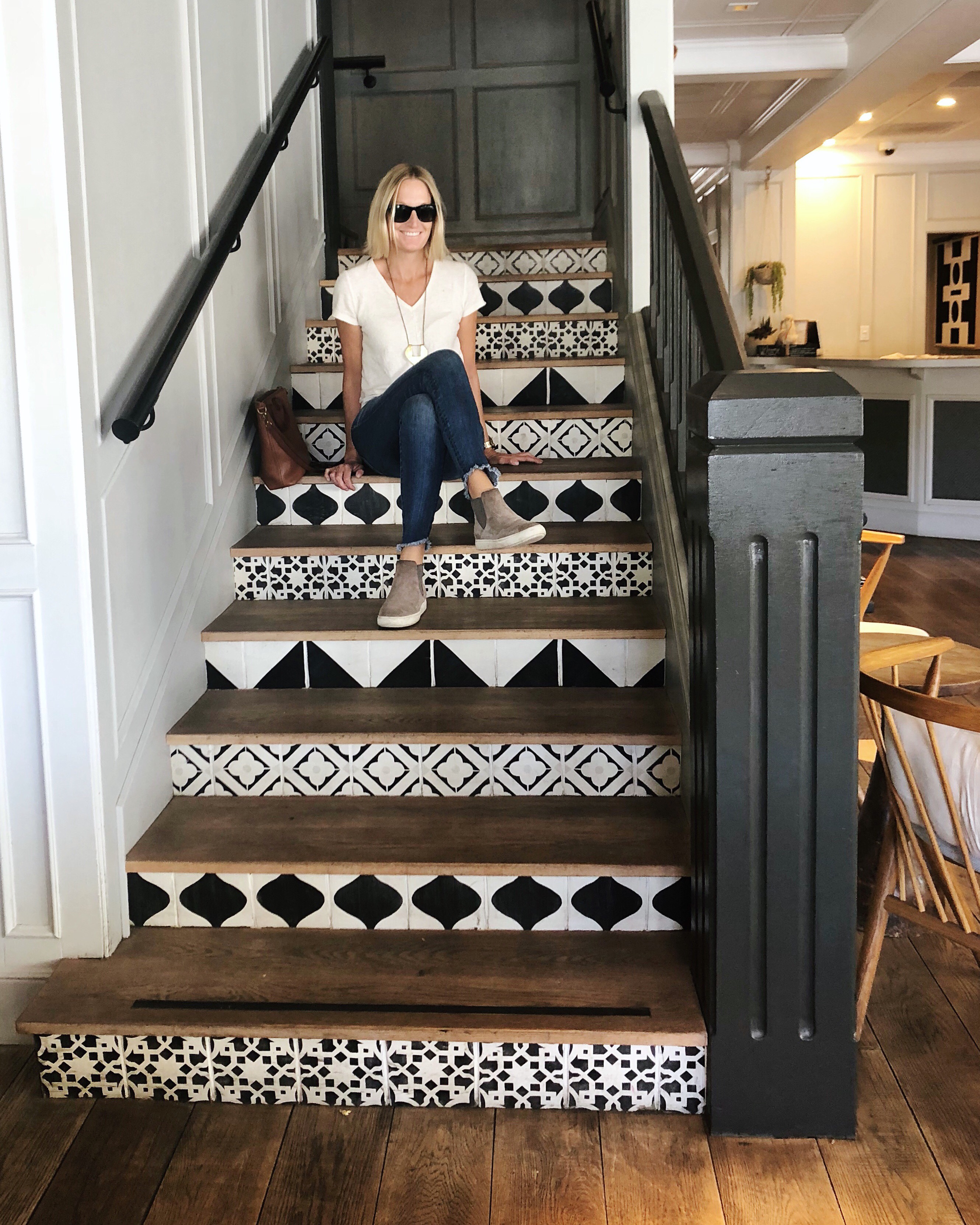
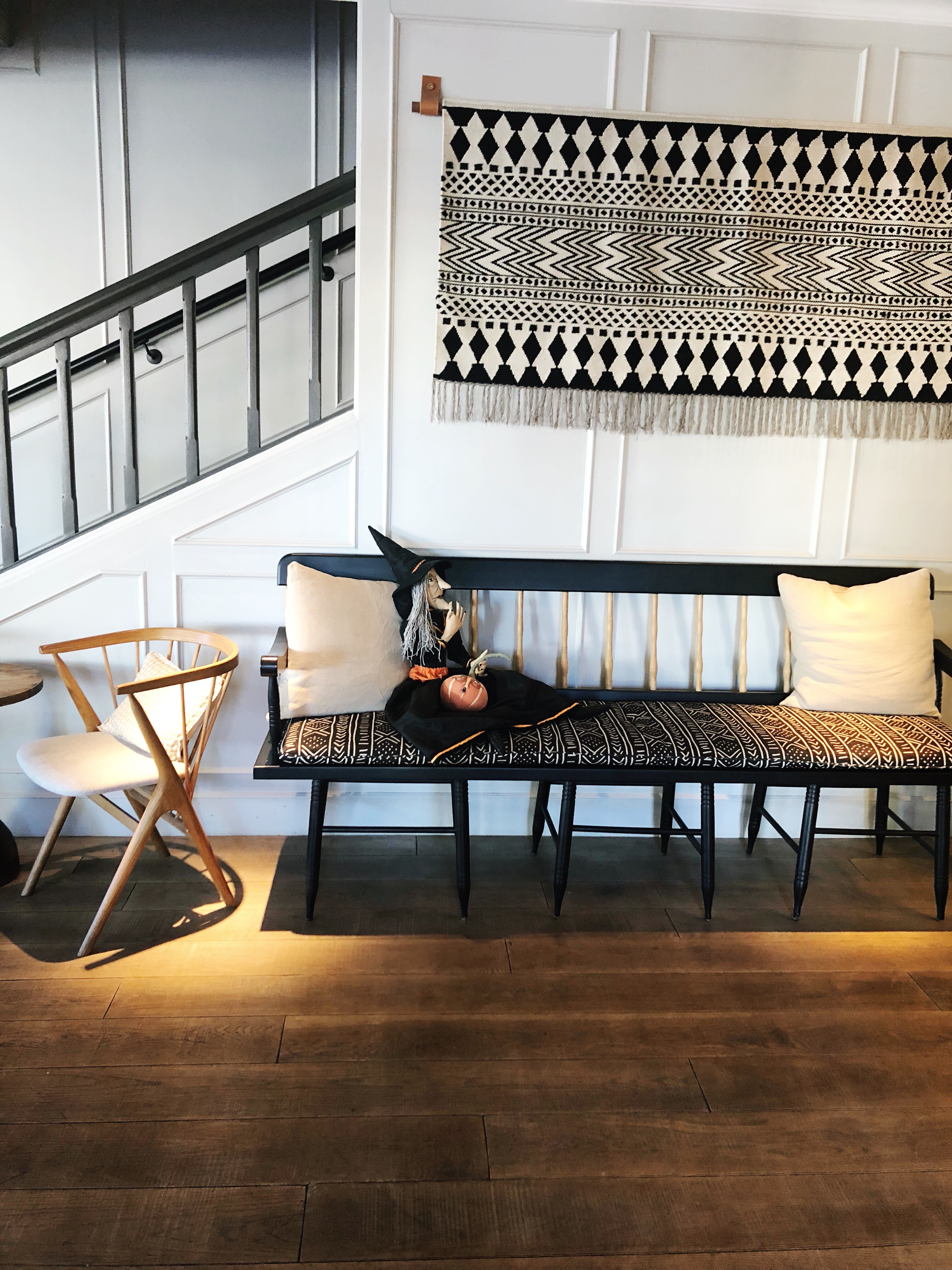
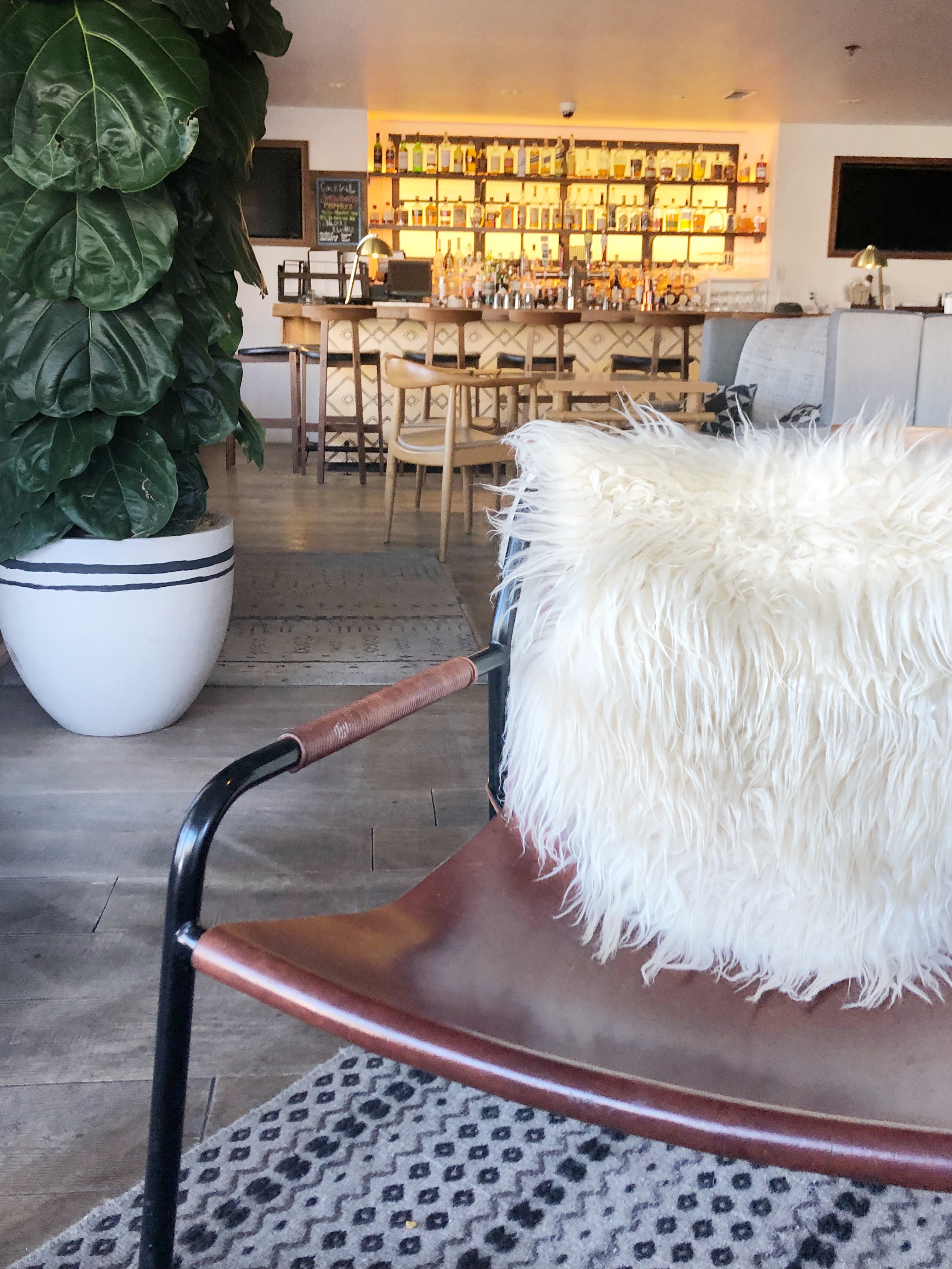
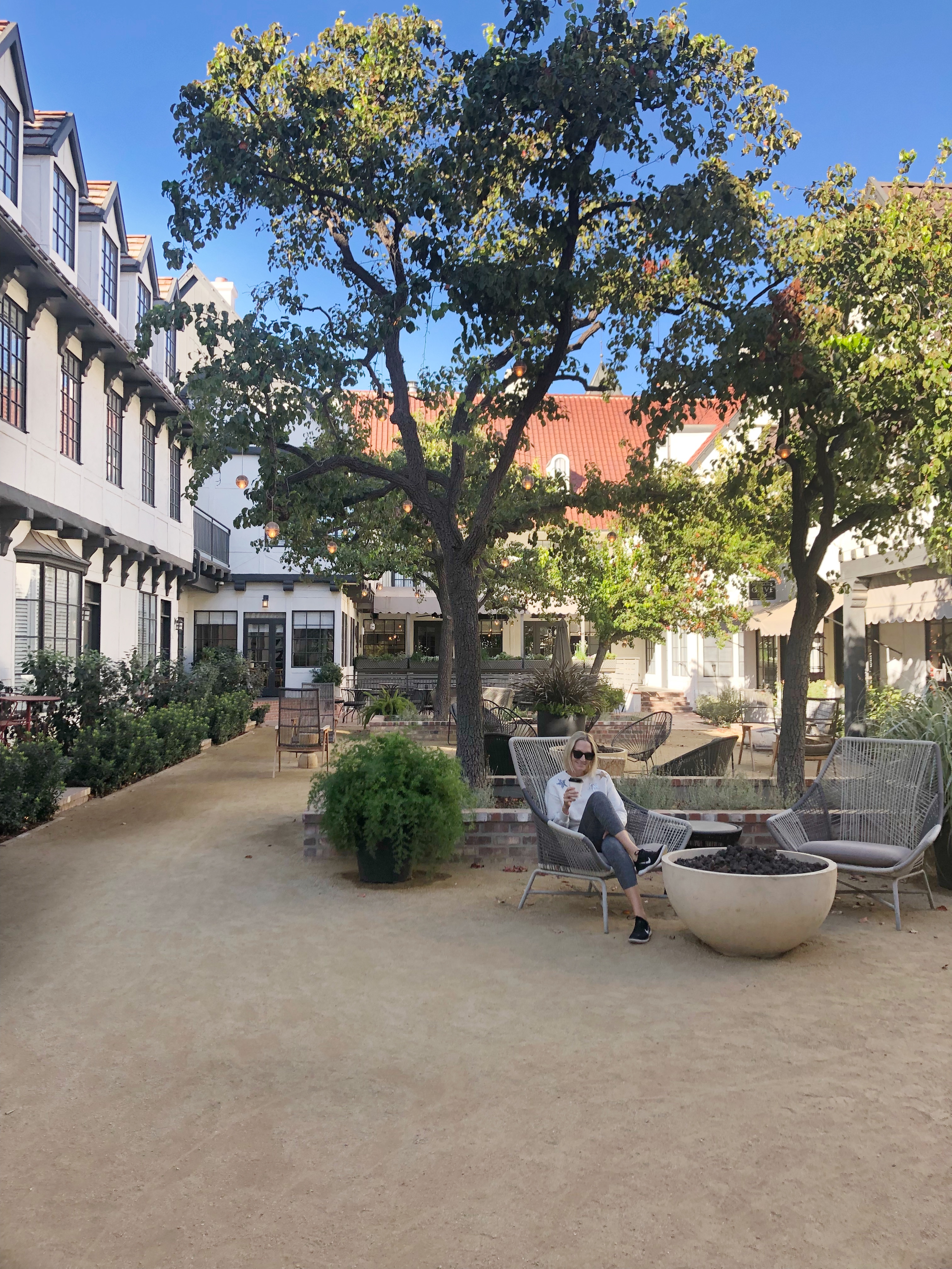
If you are looking for a romantic weekend away, a girls trip destination or even a cute festive town to explore with your family – I’ve got the perfect spot for you — The Landsby in Solvang, CA. It is a freshly remodeled boutique hotel with cool design, friendly staff, spacious rooms and nice amenities – like a courtyard of fire pits just steps from town. Thanks to The Landsby, I recently enjoyed a one-night stay and left totally refreshed.
The rooms are spacious, bright and modern.
The lobby is comfortable, stylish and has an amazing bar and restaurant with such friendly staff. My friend and I ate dinner at the bar and were treated so so well.
The outside court yard has many fire pits and comfortable chairs for hanging out at night with a bottle of wine from one of many local shops. The town of Solvang is adorable. I look forward to returning with my husband and we will plan on visiting some local wineries (GORGEOUS) and walk around town. BUT we may also return with our kids because the town has some adorable toy stores, parks and local hikes. Also, given the abundance of halloween decorations, I am SURE the town will be decked out for Christmas. It would probably be a beautiful time to visit.
Let me know if you have any questions about this adorable spot! My trip was sponsored but all of these opinions and photos are my own. I TRULY loved this hotel and plan on visiting again soon.
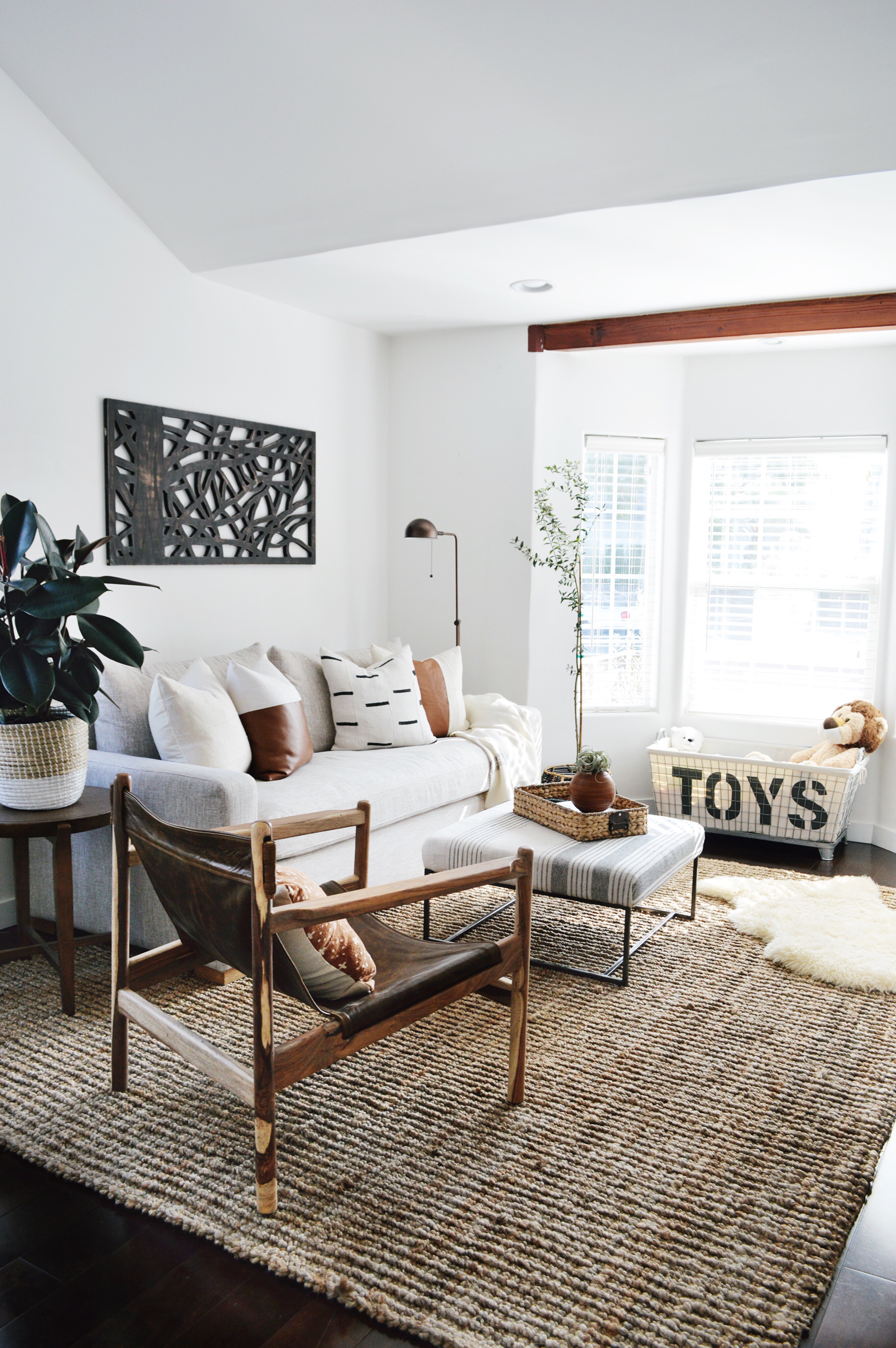
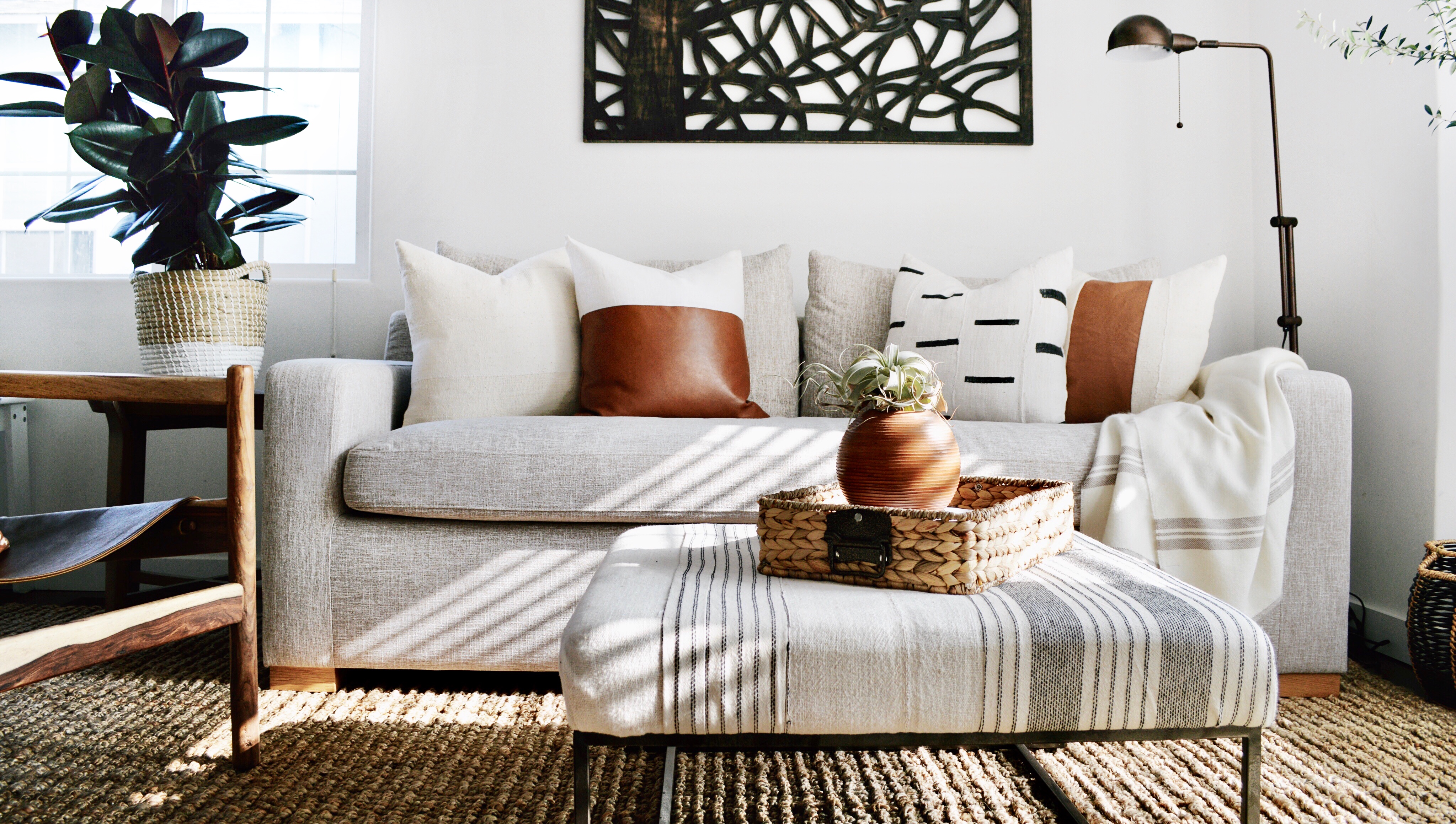
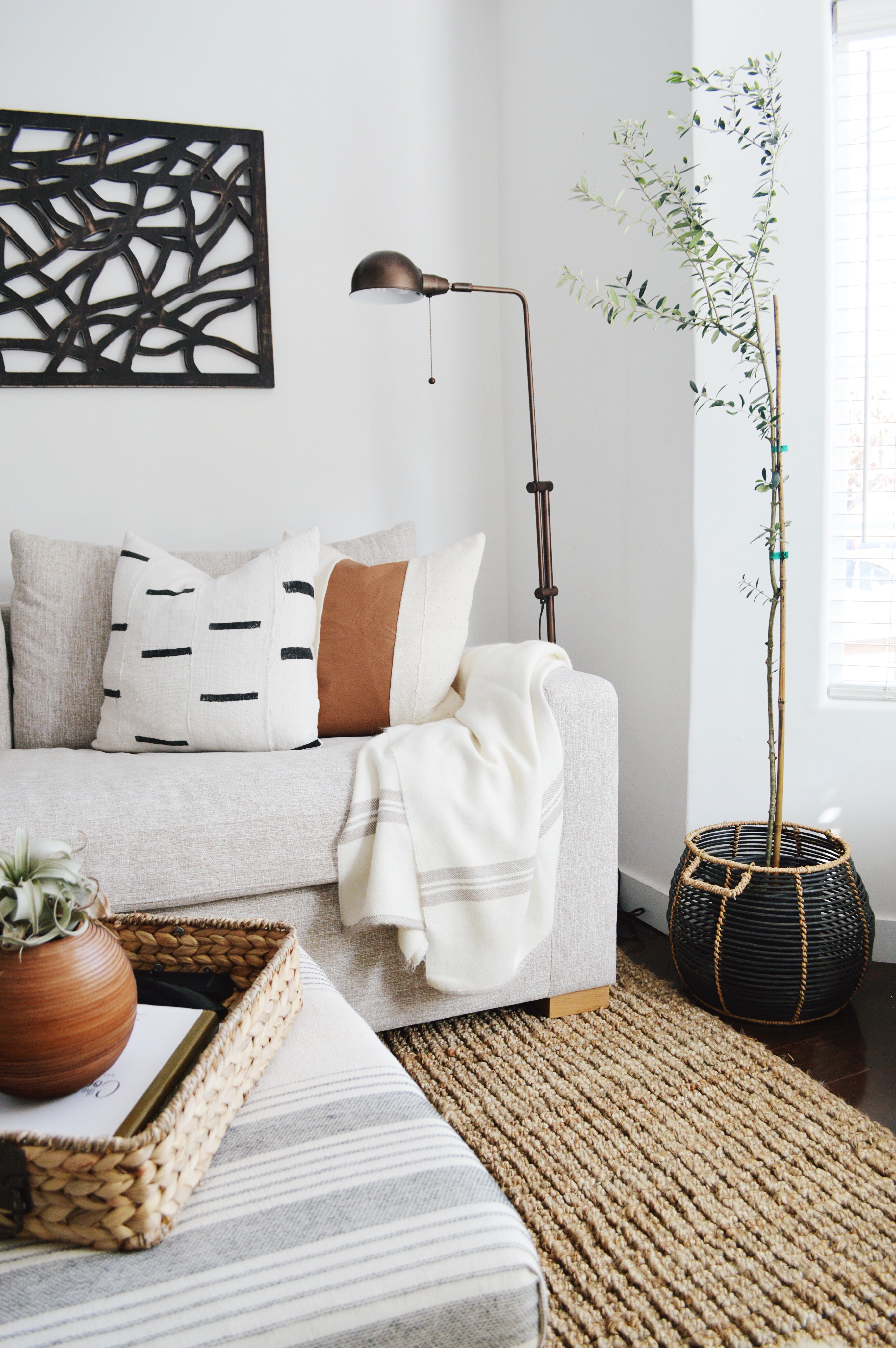
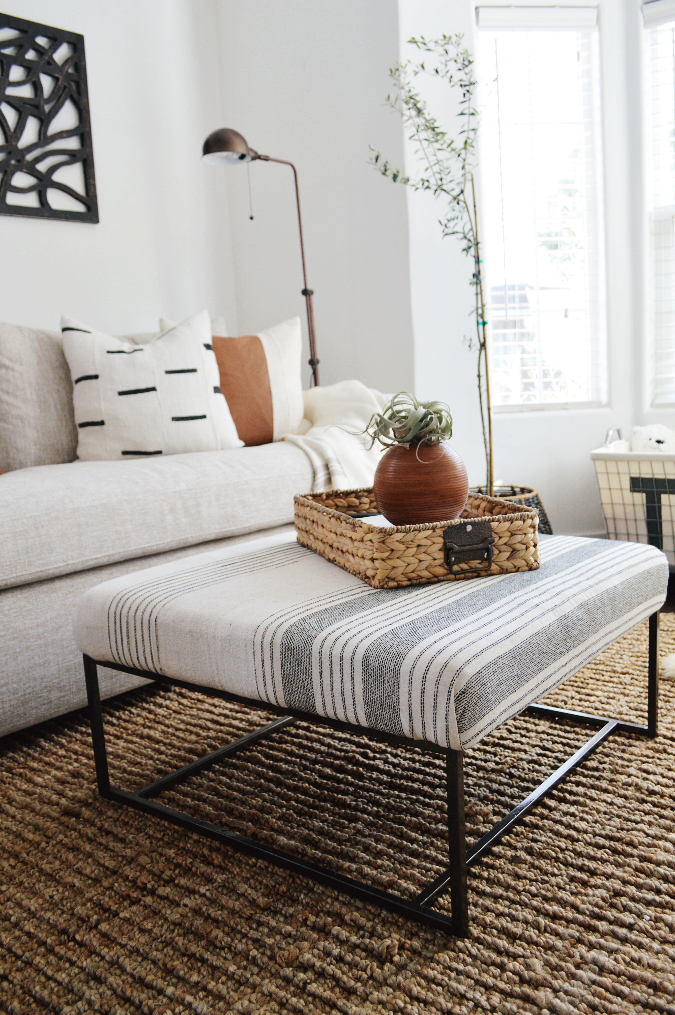
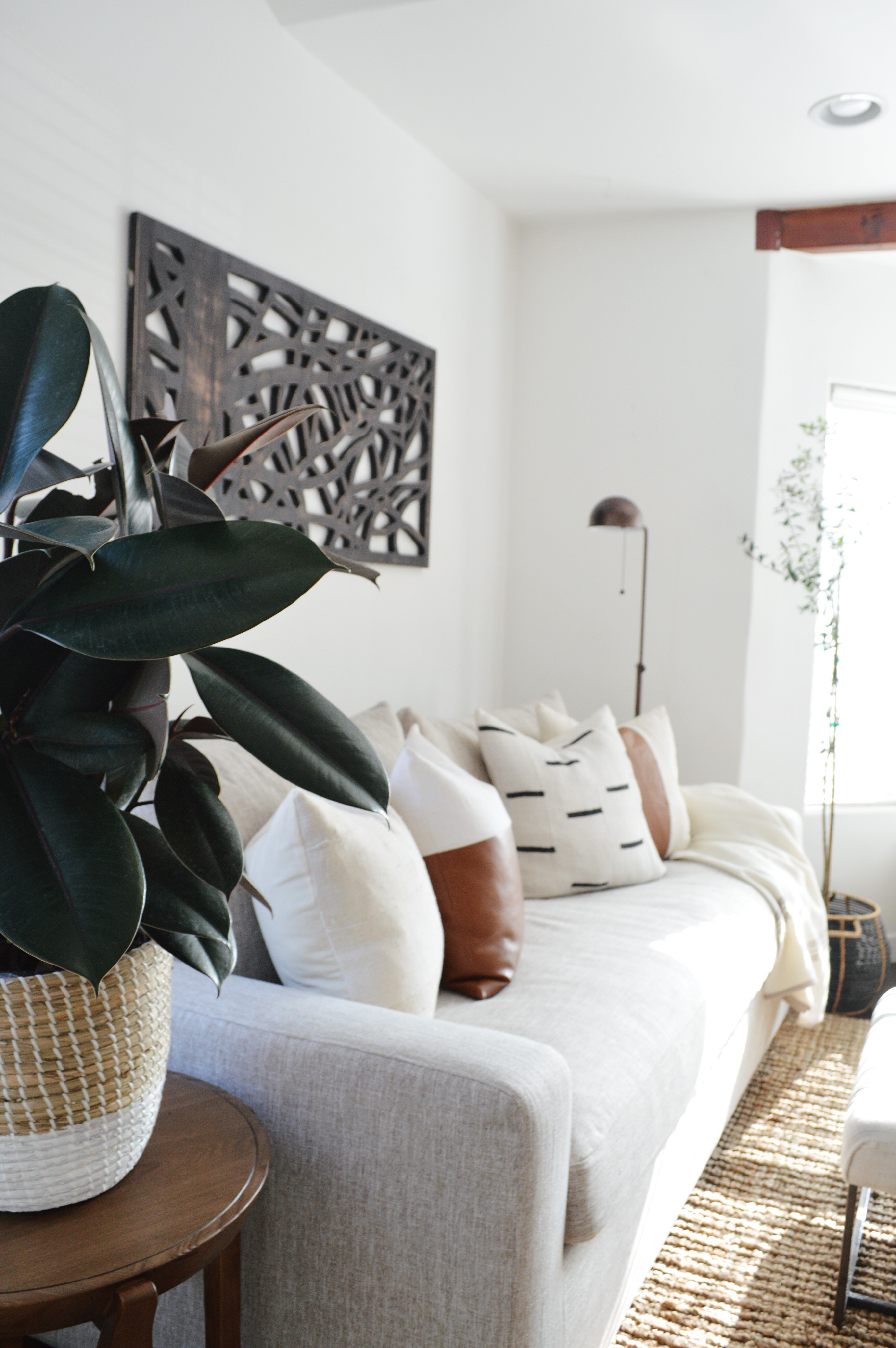
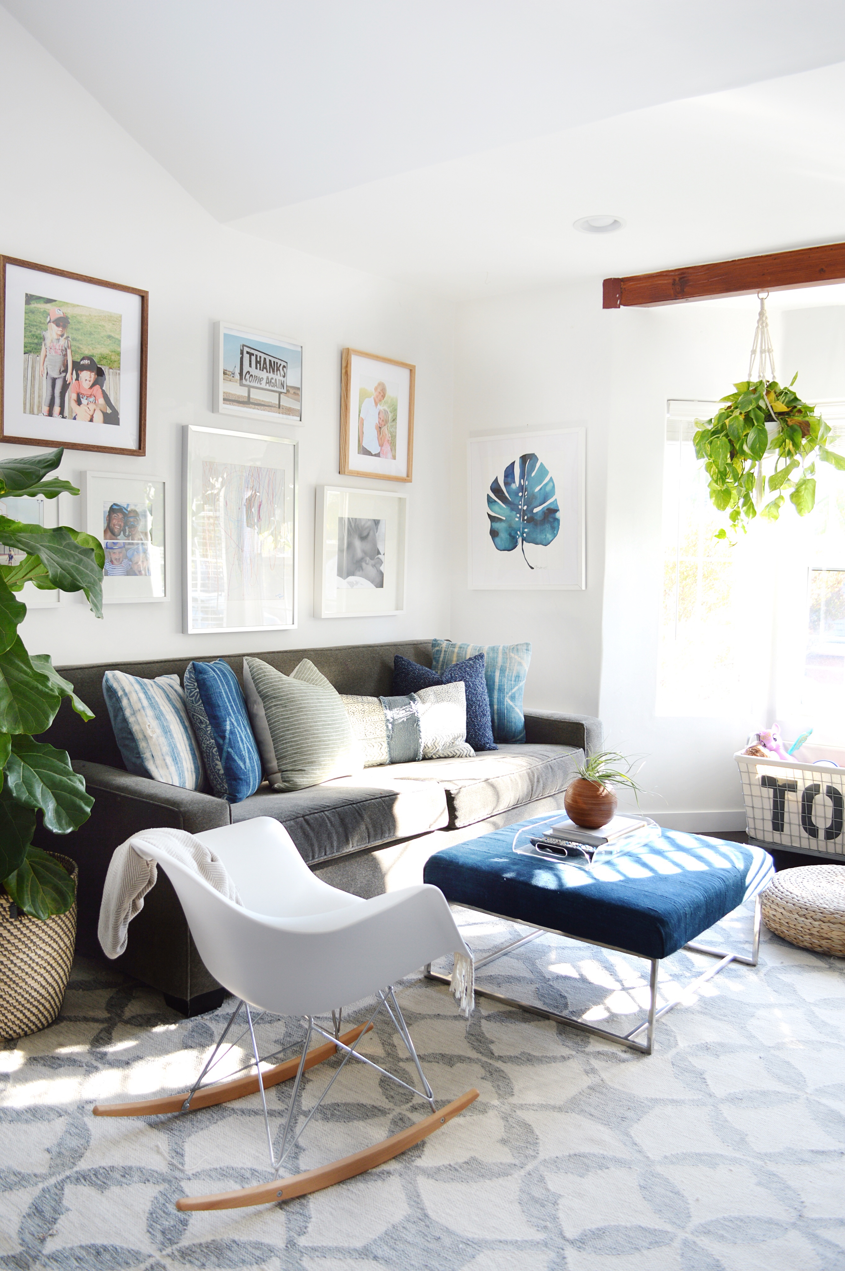
Our family room is heavily used. We hang out in here to play games, watch tv, play video games, do arts and crafts, etc. A lot of the kids toys are in here so they refer to it as the playroom. For so long, this room was a mixture of our leftover furniture. FINALLY, it matches the rest of our house. It now has the same neutral, organic/earthy feel. AND WE LOVE IT!
We sold our gray couch and chose this neutral sleeper sofa from Interior Define. It is theSloan Sleeper in wheat. We LOVE it. It is comfortable and beautiful. We looked for a long time and when we finally decided on this sleeper, we were very happy they wanted to work with us. Please feel free to ask me any questions if you are considering this purchase!
The rug, the lamp, the accent chair and the side table are all from AllModern. I am obsessed with it all! Click here for the chair, here for the lamp, here for the rug and unfortunately the side table is no longer available. I am so impressed with the quality of everything I’ve received from All Modern.
The ottoman was a DIY. I saved the tutorial to my story highlights. The fabric is vintage mudcloth and vintage hmong hemp that I pieced and sewed together. The pillows are from my shop. Click here to shop.
The plants are fromFast Growing Trees. Click here for the olive tree and here for the rubber plant (the awesome one on the side table).
The toy box is from Restoration Hardware kids. Click here.
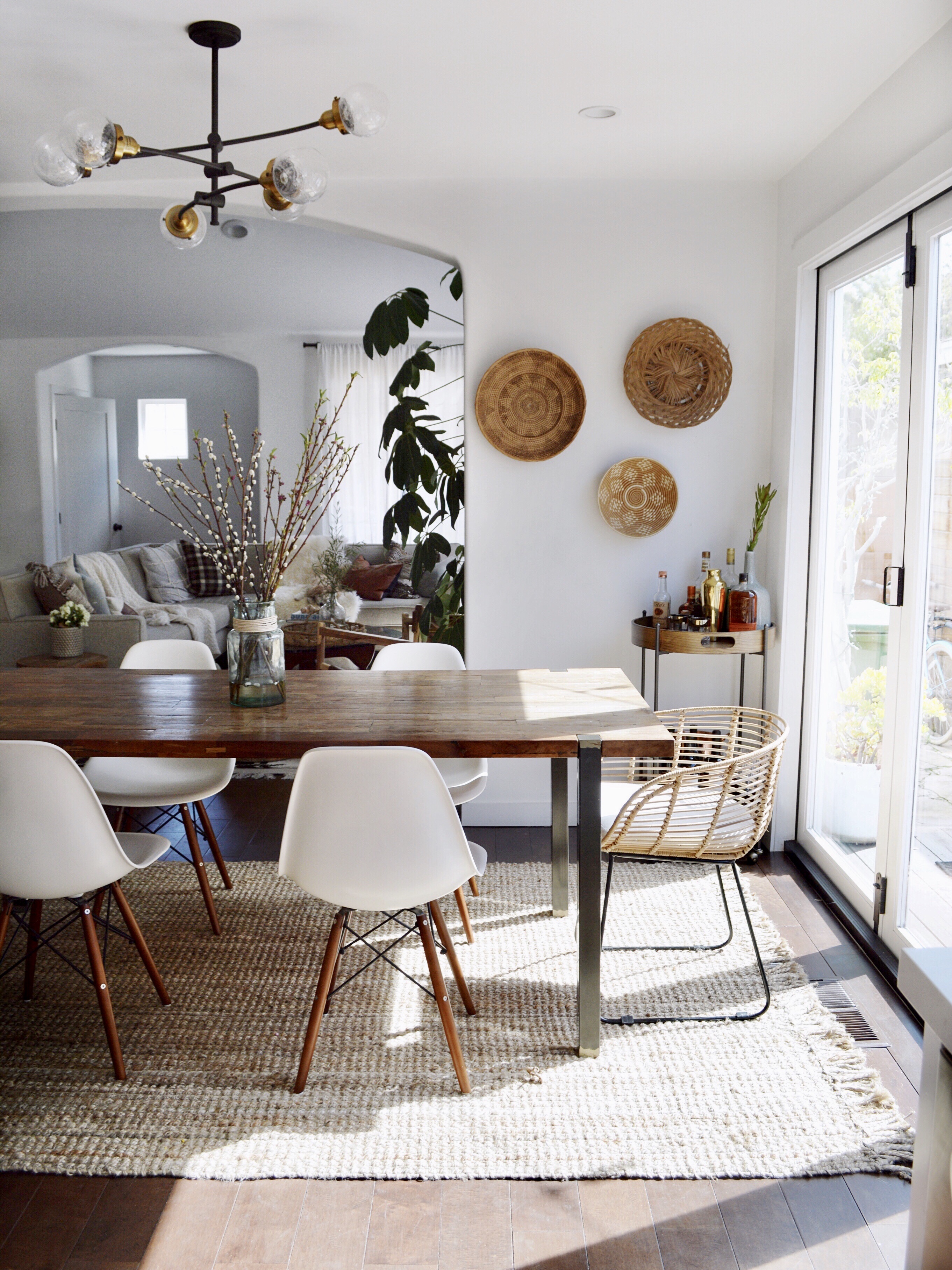
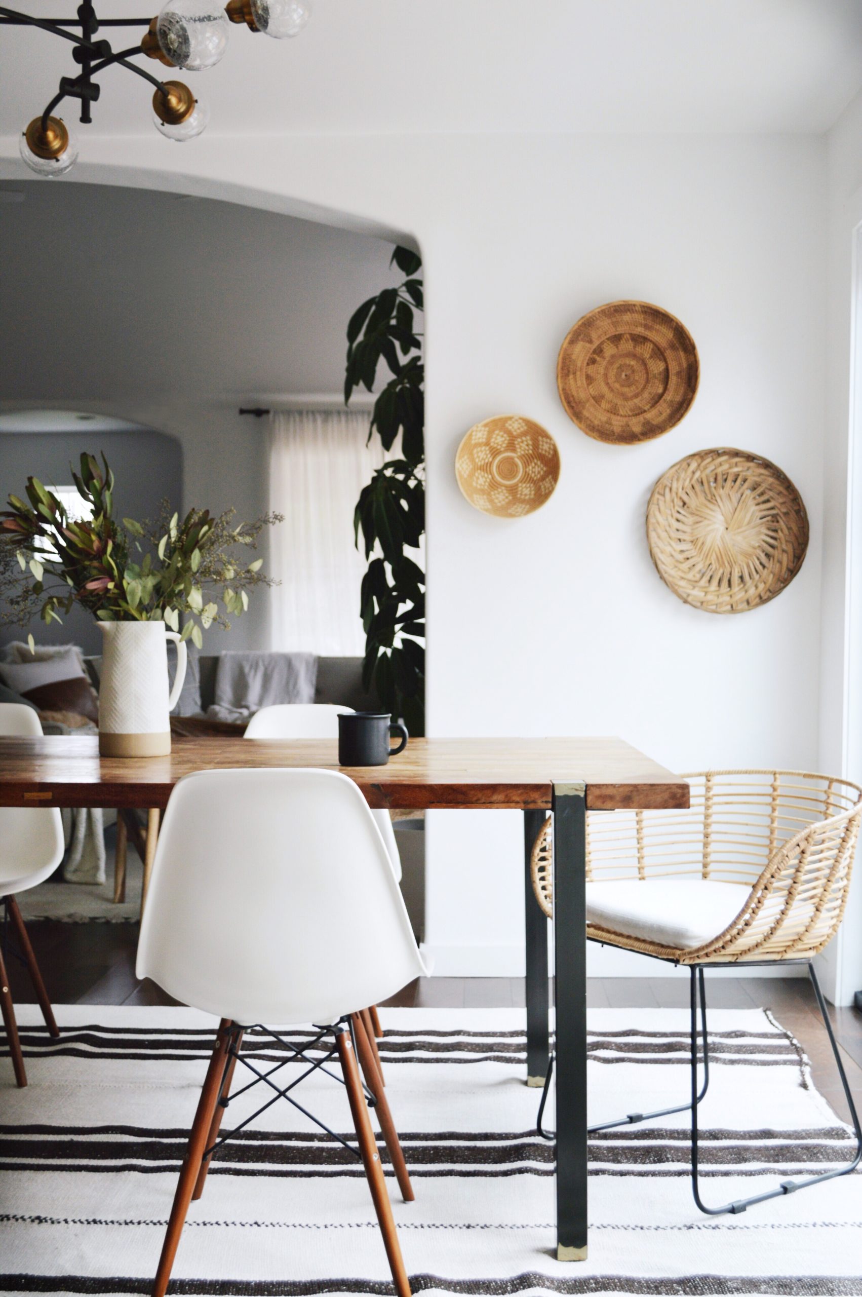
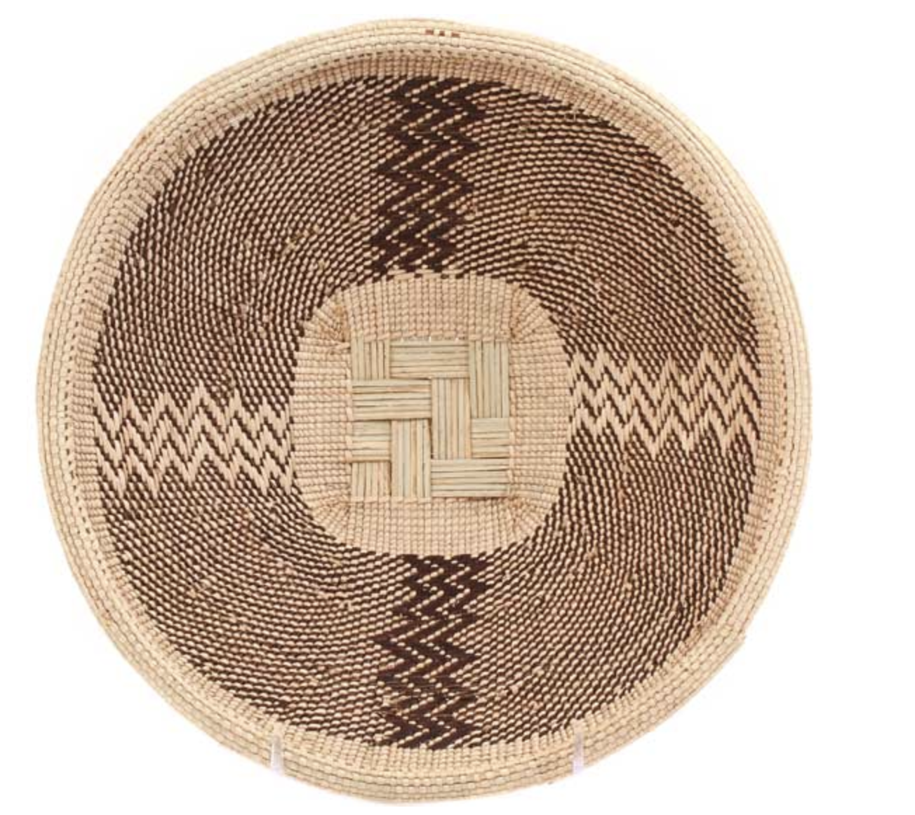
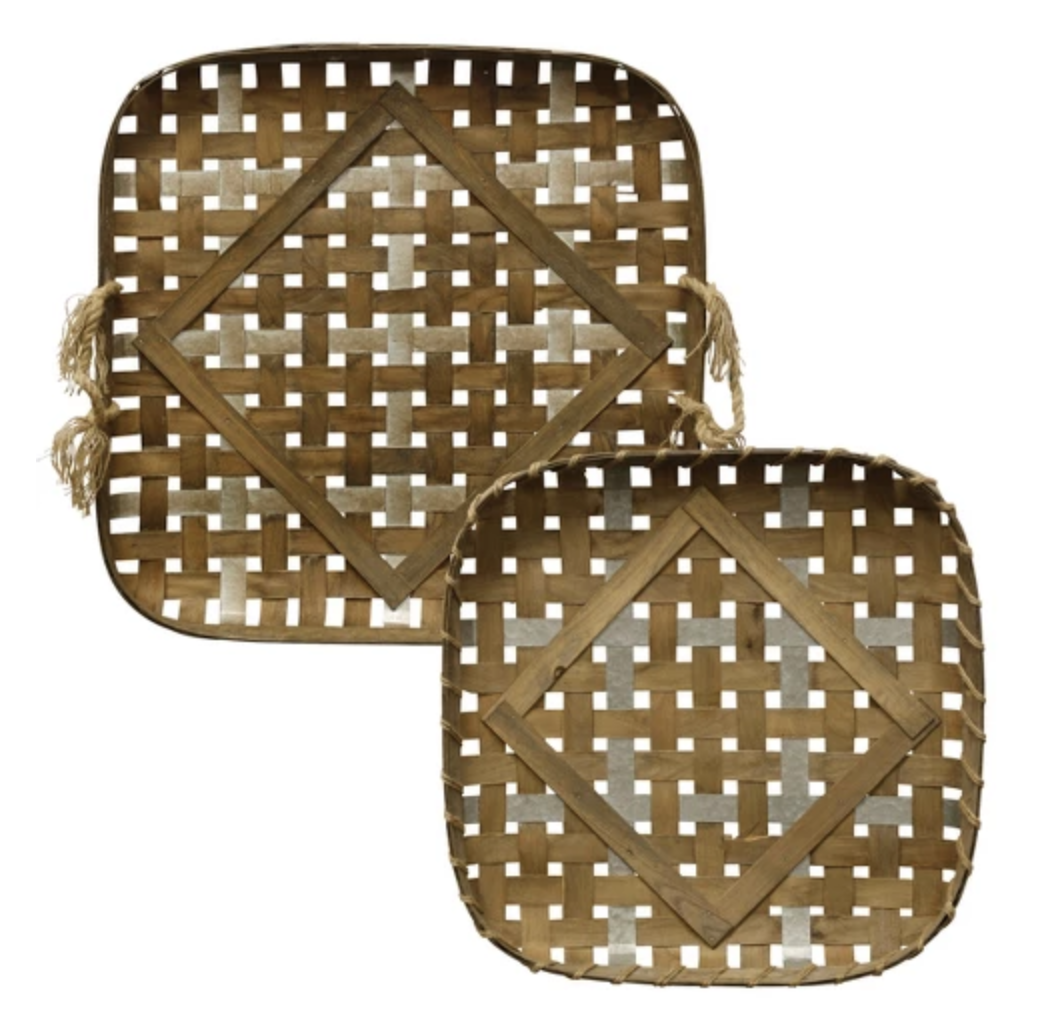
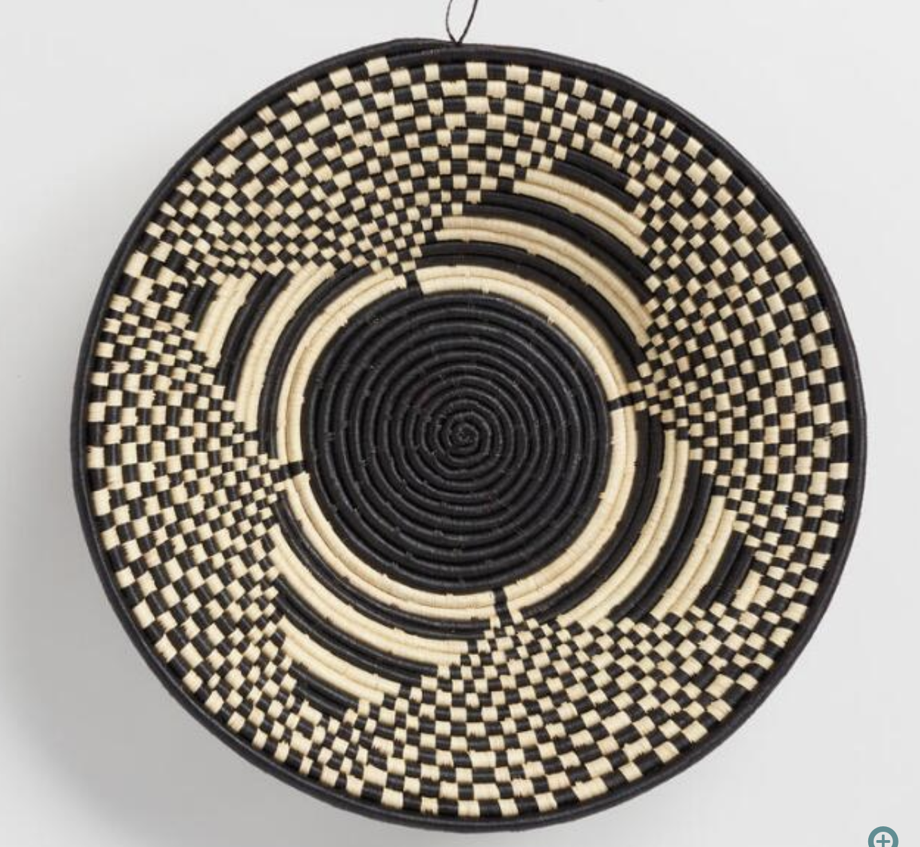
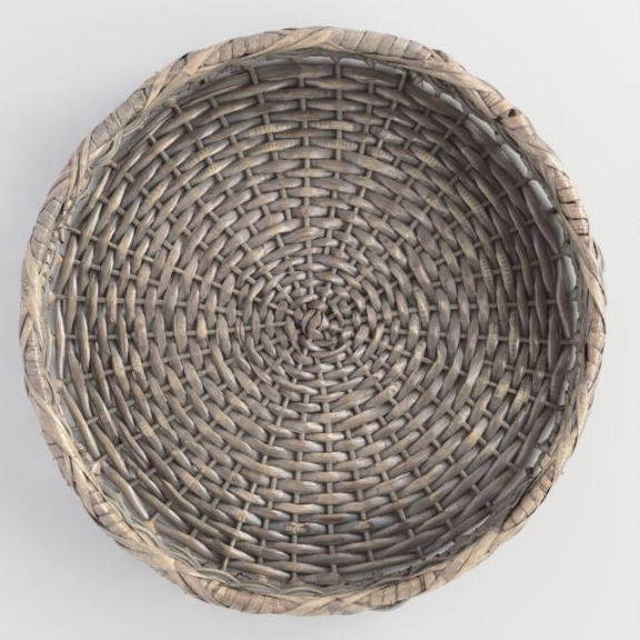
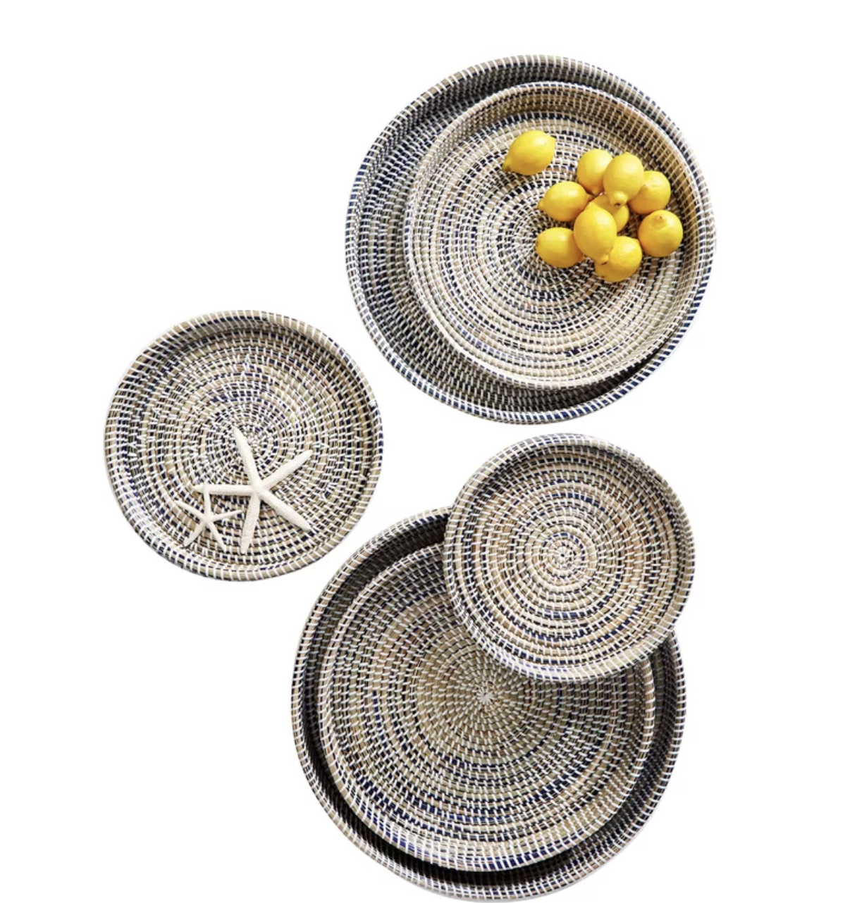
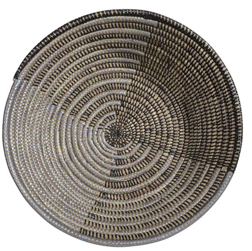
SO many of you ask where I purchased the baskets hung on my dining room wall. They were all thrifted but I’ve rounded up some great places to shop! I hope this is helpful – just click “shop here” under each picture for the link.
(1) shop here for fair trade beautiful handwoven baskets from Africa at great prices!
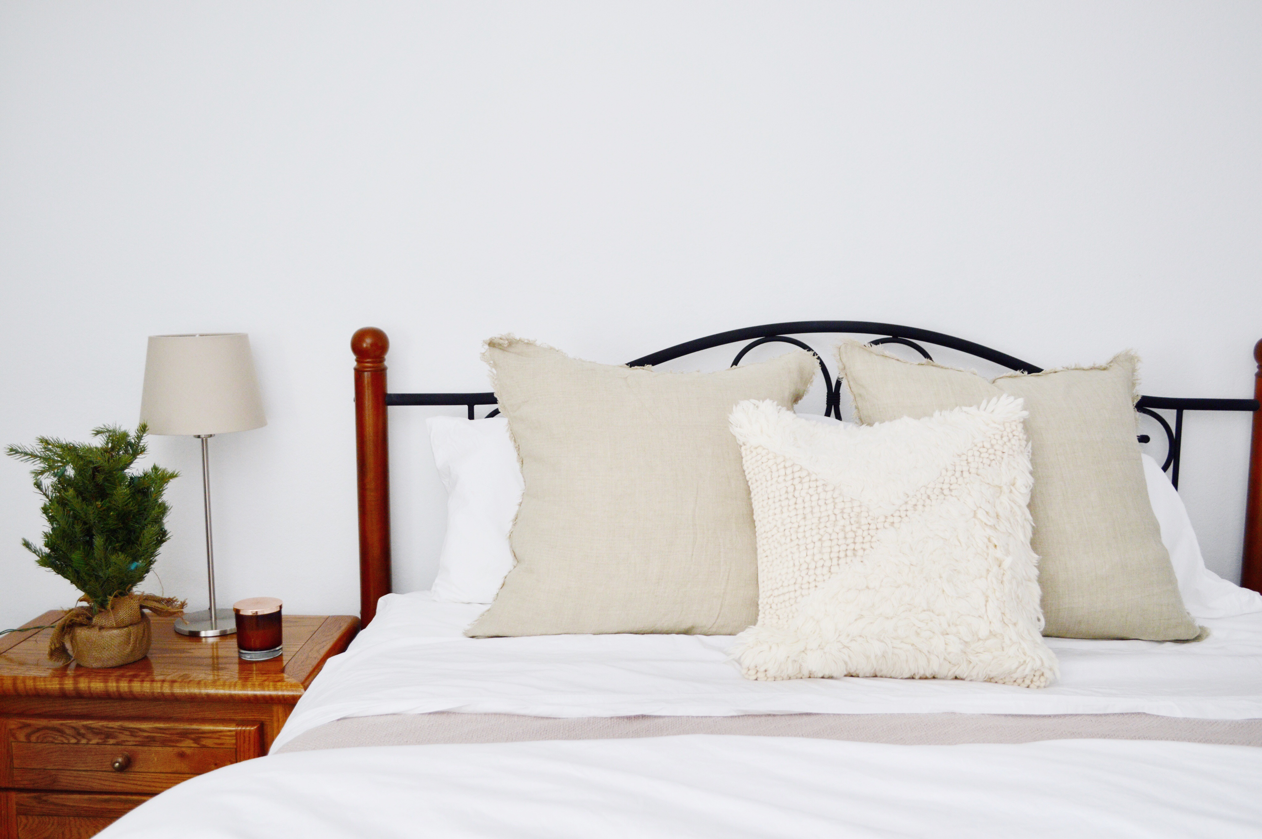
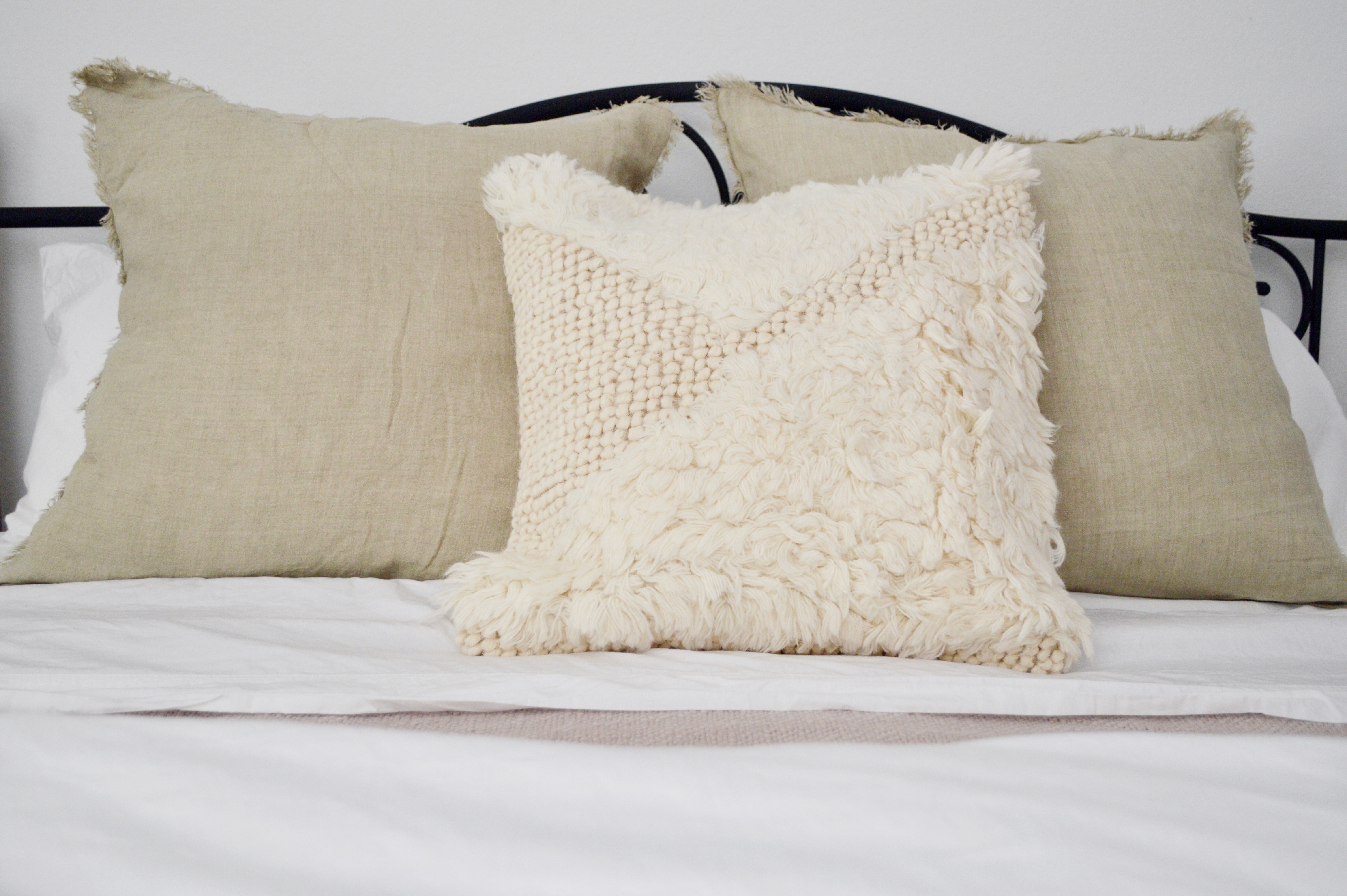
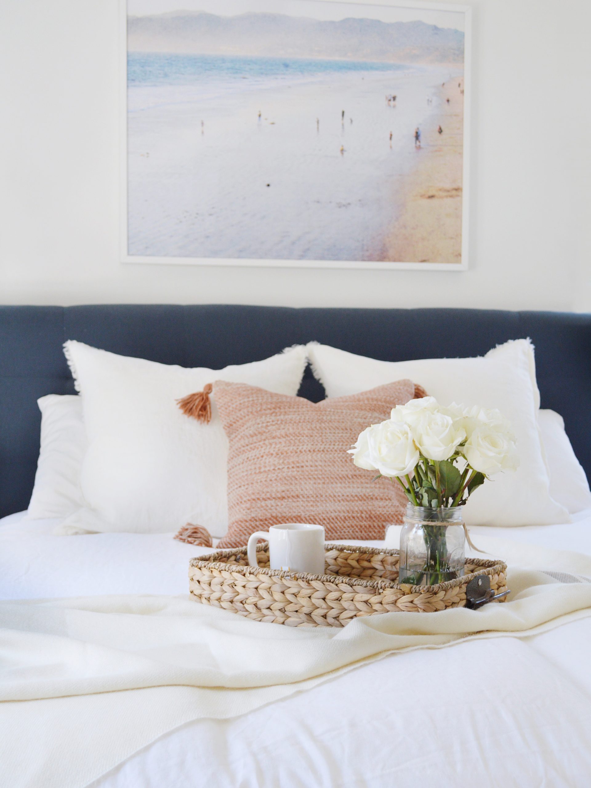
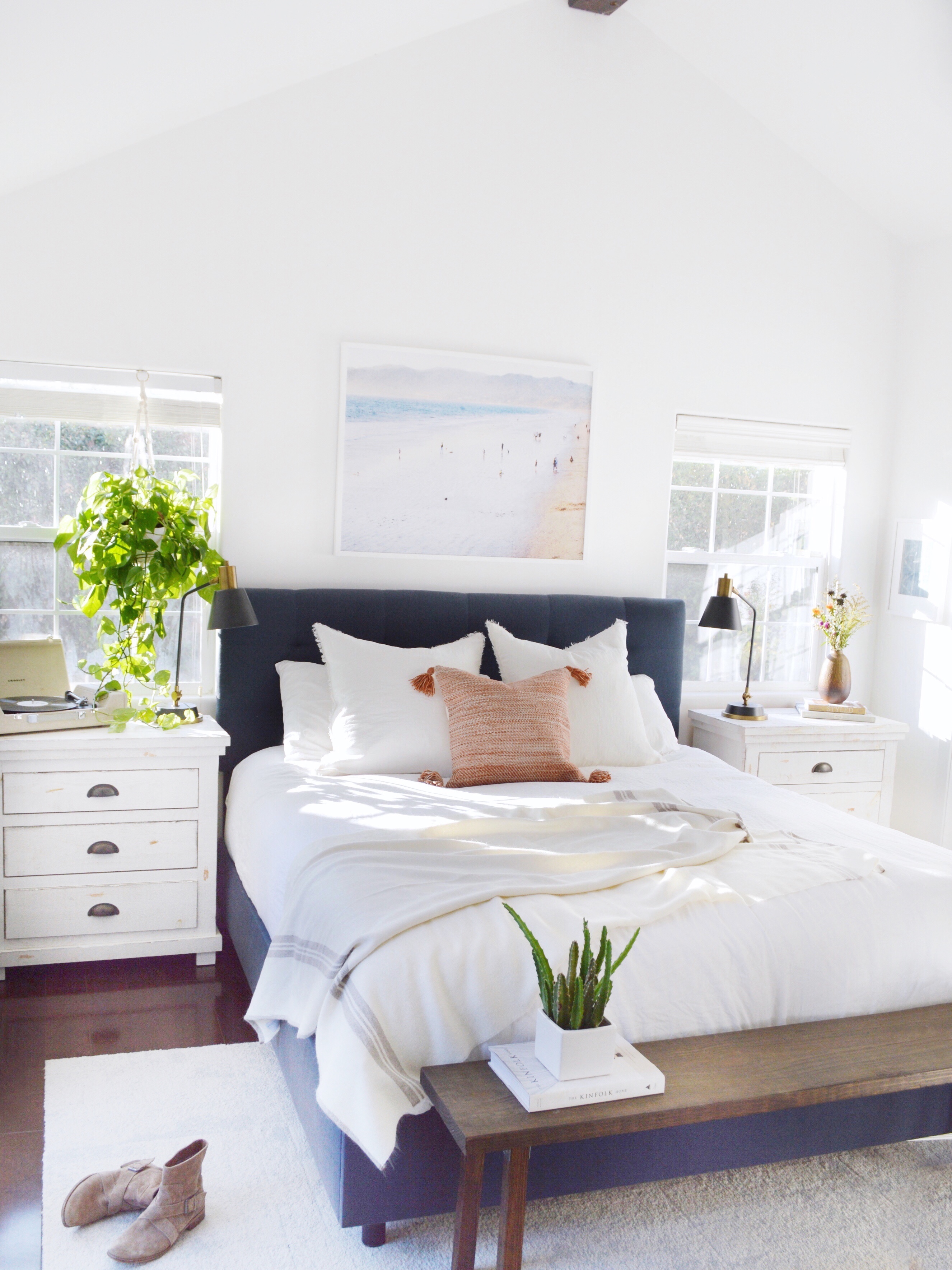
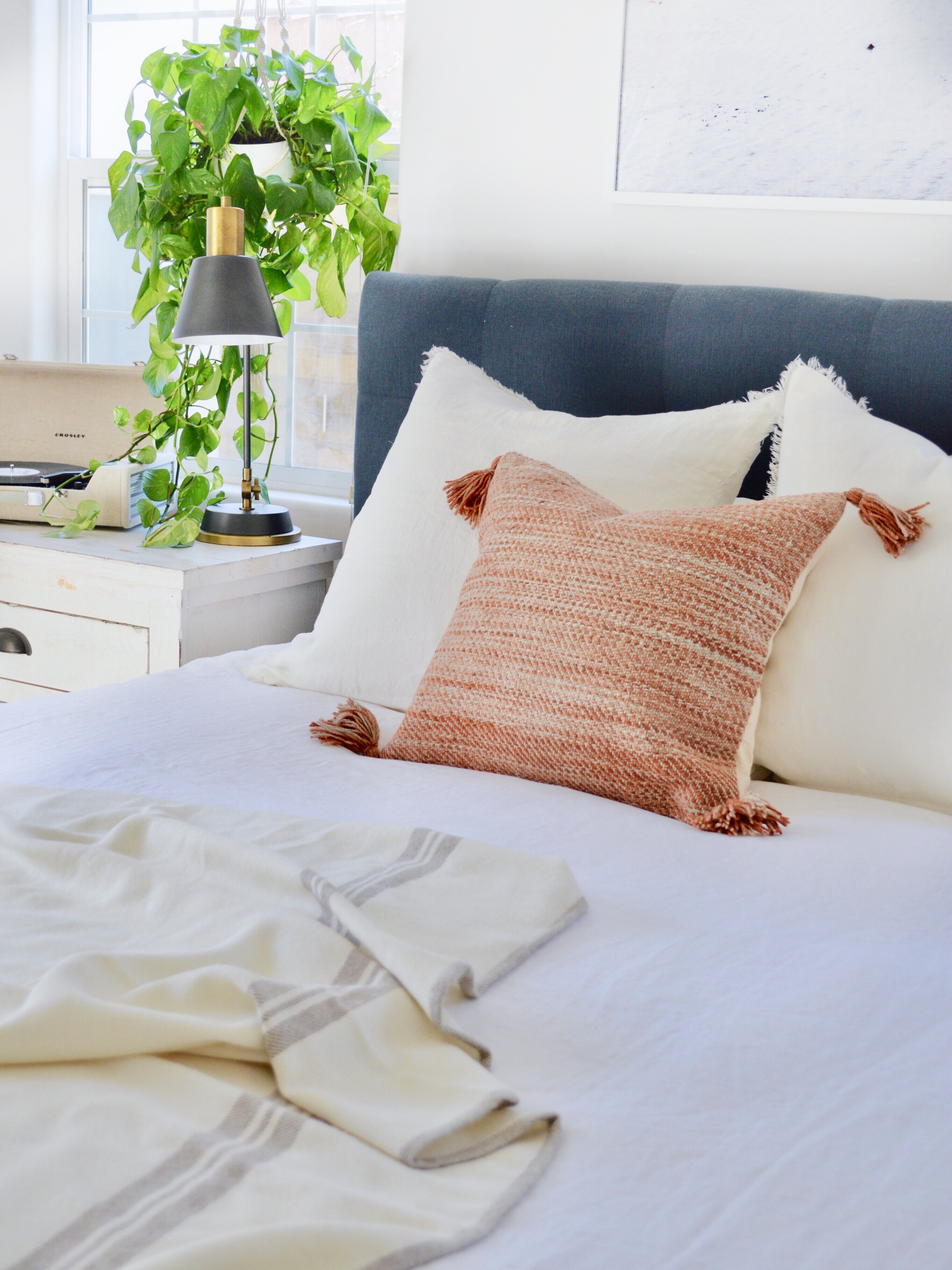
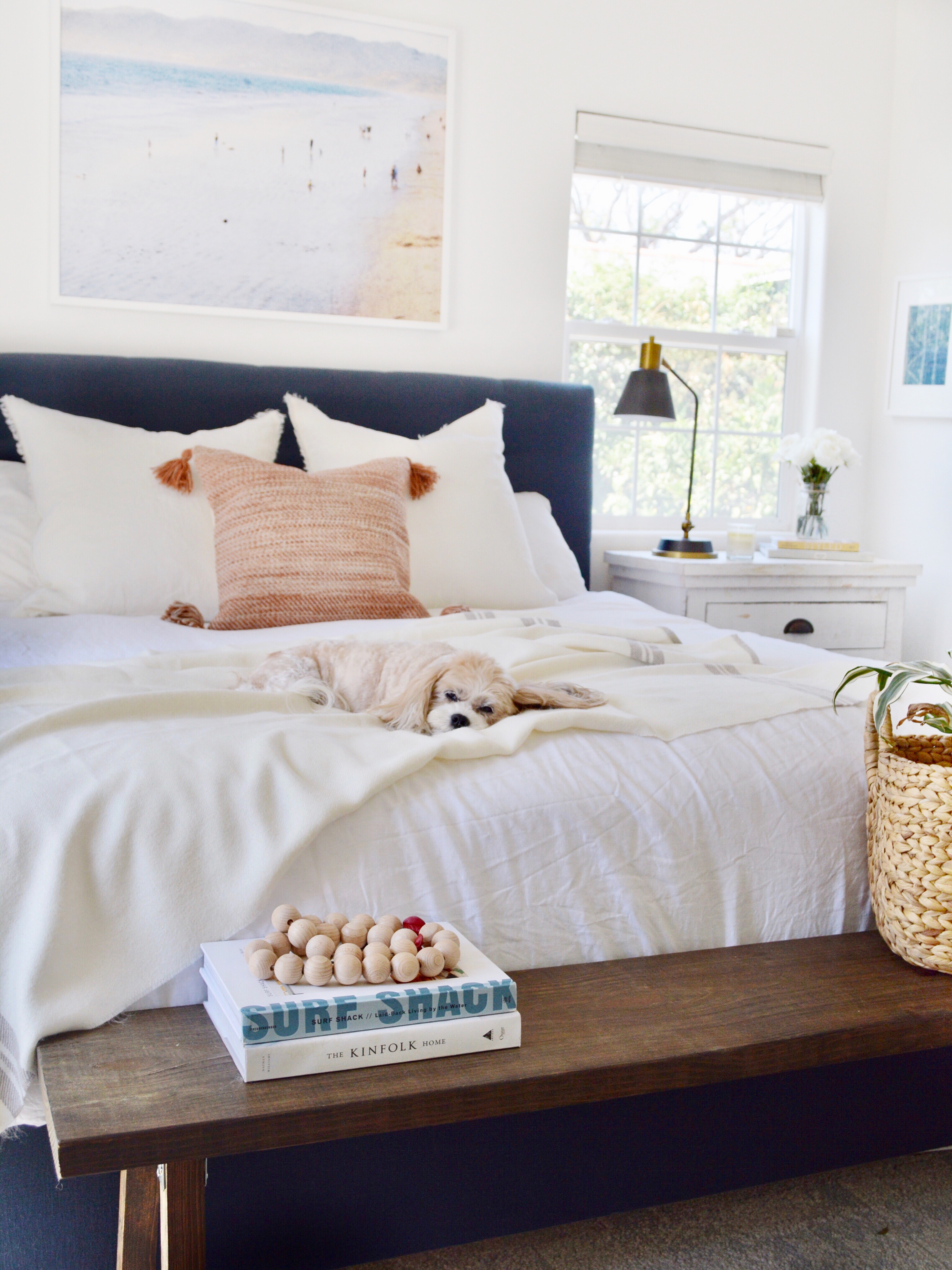
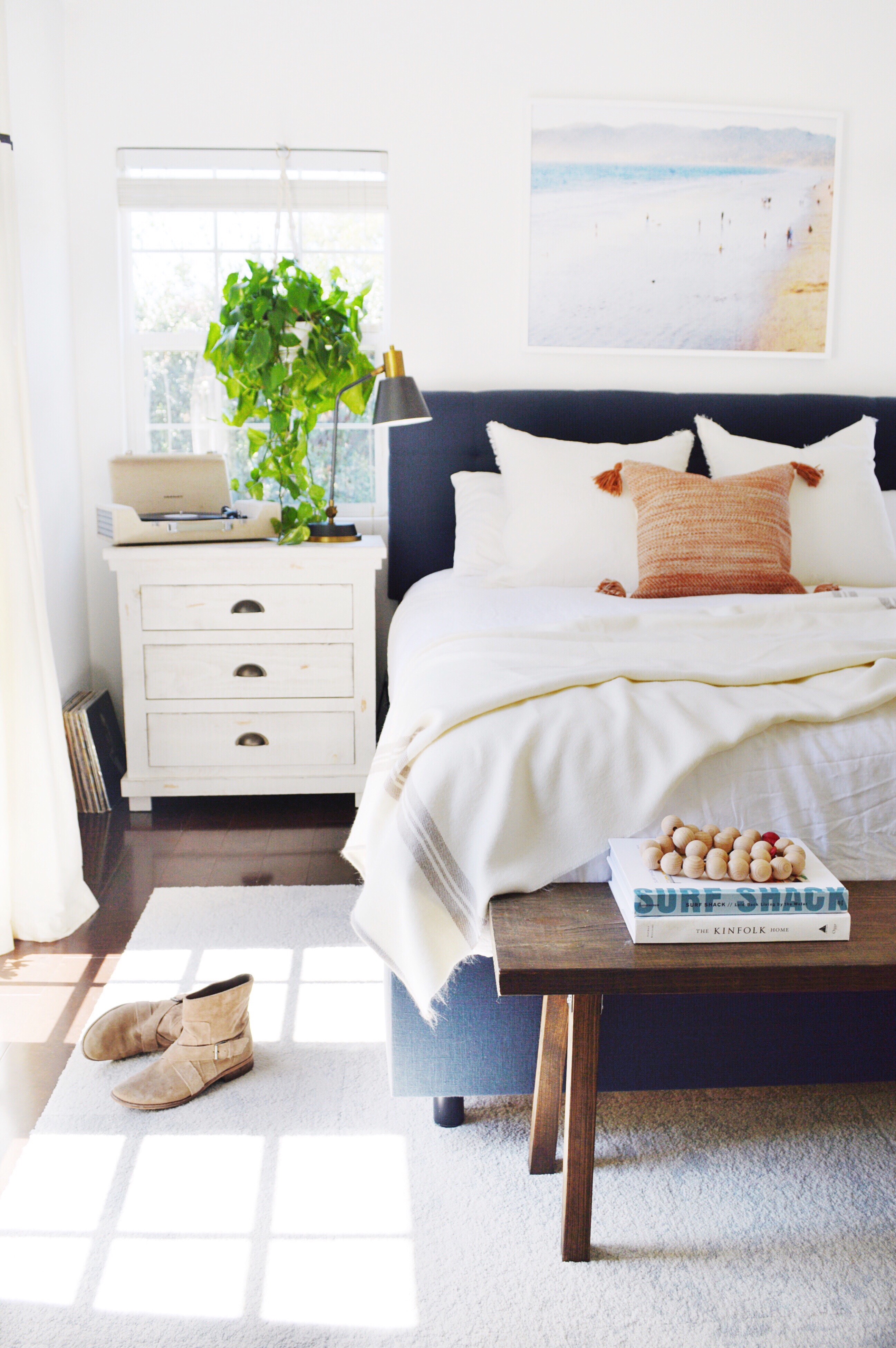
I love my bedding to feel like fancy hotel bedding – crisp, clean and luxurious. My personal preference is white bedding because it seems the freshest to me and I can always change the look of it with a throw or decorative pillows. When the Company Store asked me to collaborate, I took a look at their website and said YES in a heartbeat! And I am SO THANKFUL I said yes! You guysssssss . . . their bedding is so gorgeous and luxurious. I wanted white bedding but with some neutral pops that will transition well into Fall. And they are having a sale!!! 25% off + free shipping with code PL25FS18 until 11/13!
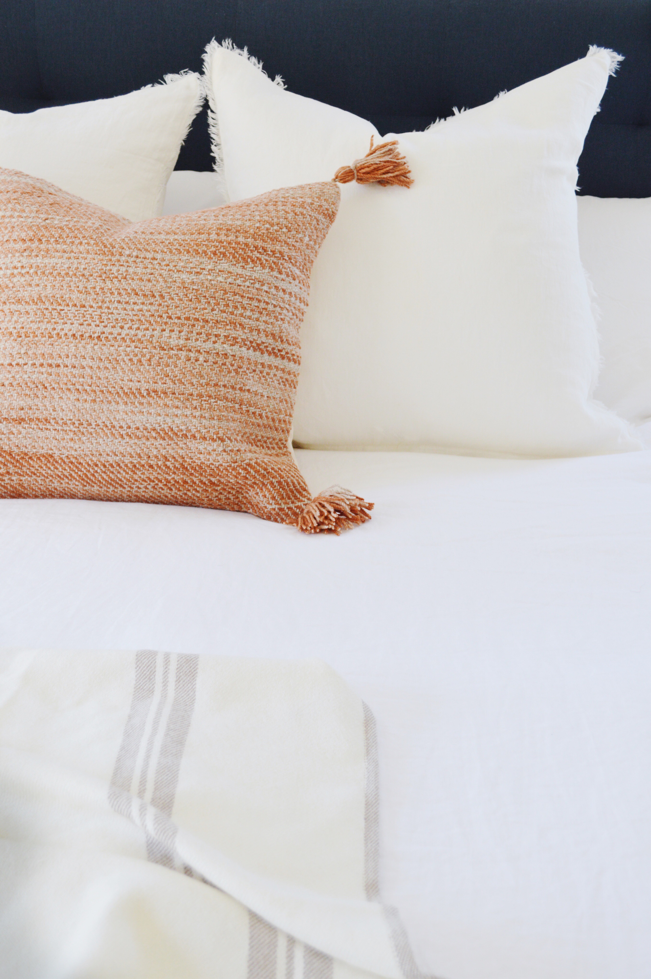
For the duvet, I chose a white linen — I personally love the wrinkled, soft and casual look of linen. You can shop this linen collection here. It is so pretty – I definitely made the right choice!
For sheets, I chose 400 thread count Supima cotton sheets in white. These sheets are the BEST. They are cool, crisp, soft and fresh all in one. I highly recommend them. You can shop them here.
I wanted to add some neutral texture via a throw, so I chose the Alpaca stripe throw. You can shop it here. It is soft and warm and my dog agrees (and photo bombed my photoshoot). 🙂
I wanted the throw pillows to stay neutral and soft but add a touch of fall. I chose belgium linen pillow covers with a subtle fringe – in ivory – for the large shams (shop here) and to add a touch of fall I chose a beautiful woven rust pillow with tassels (shop here).
This post is sponsored by The Company Store. I personally chose and LOVE all of the products discussed in this post.
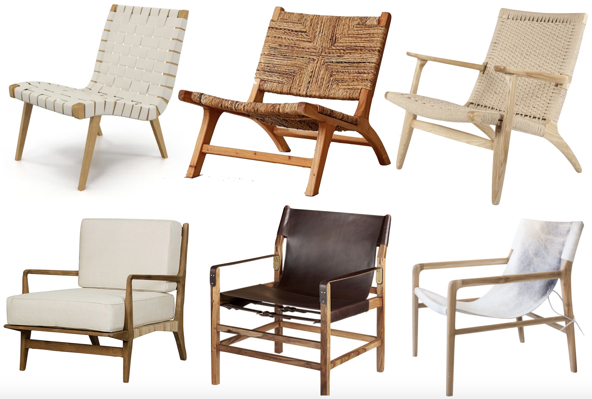
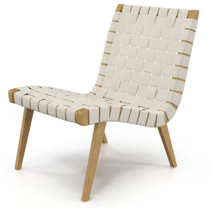
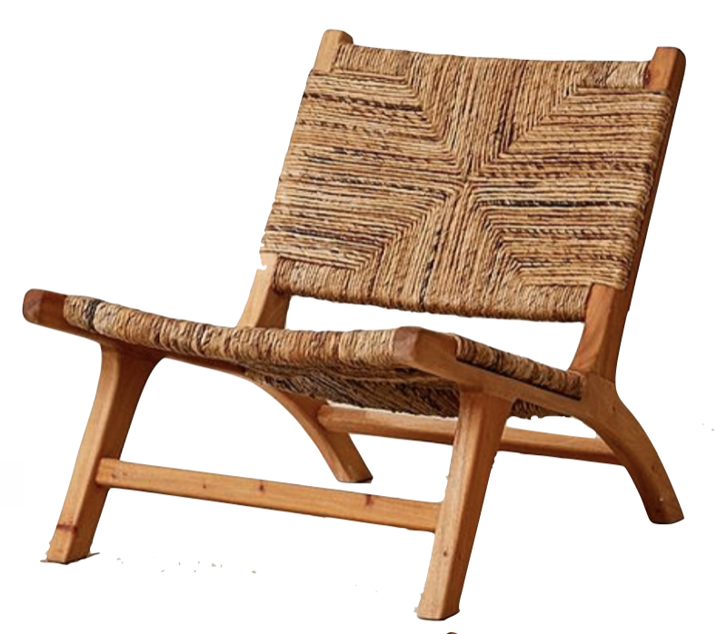
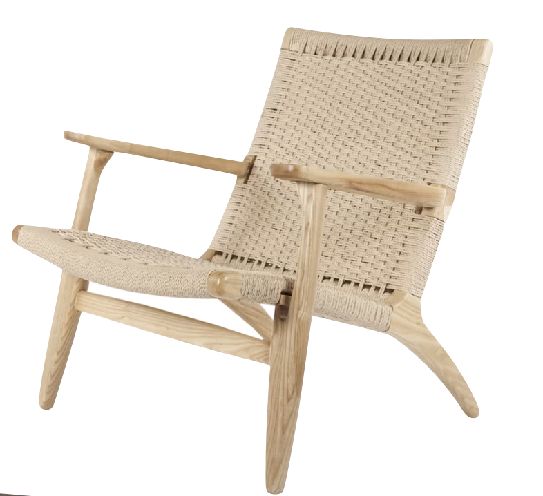
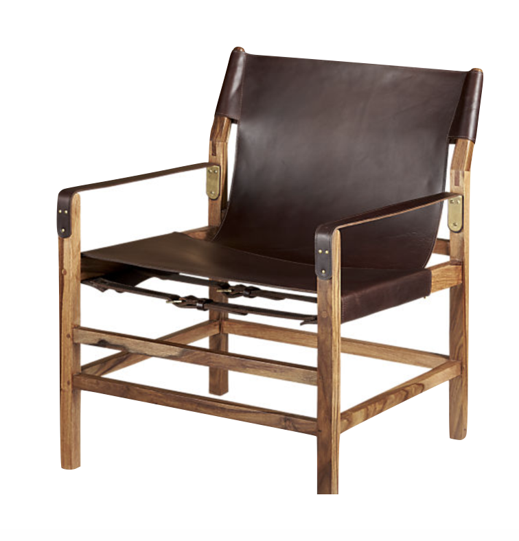
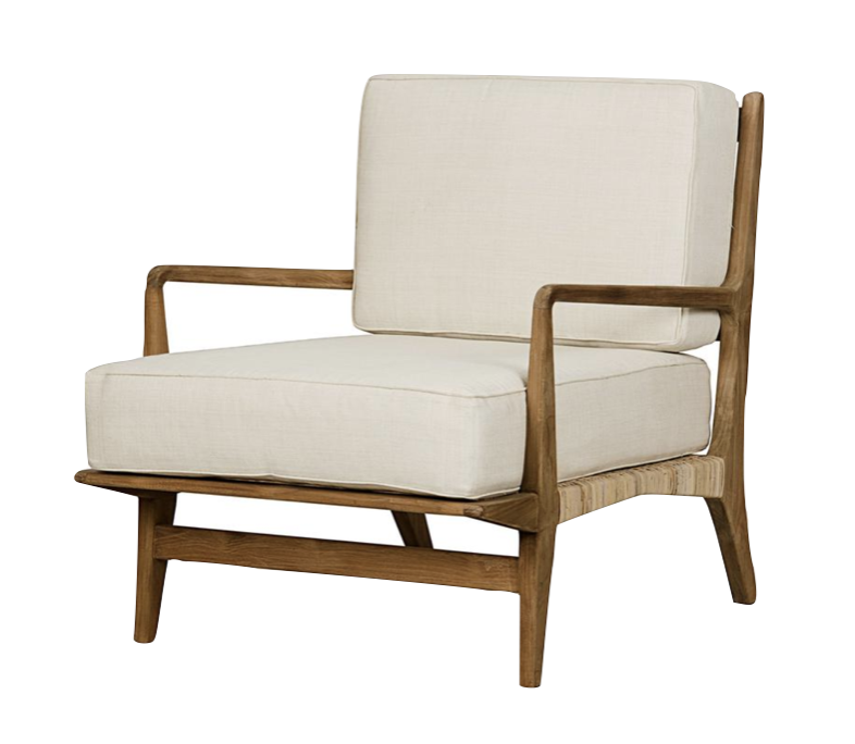
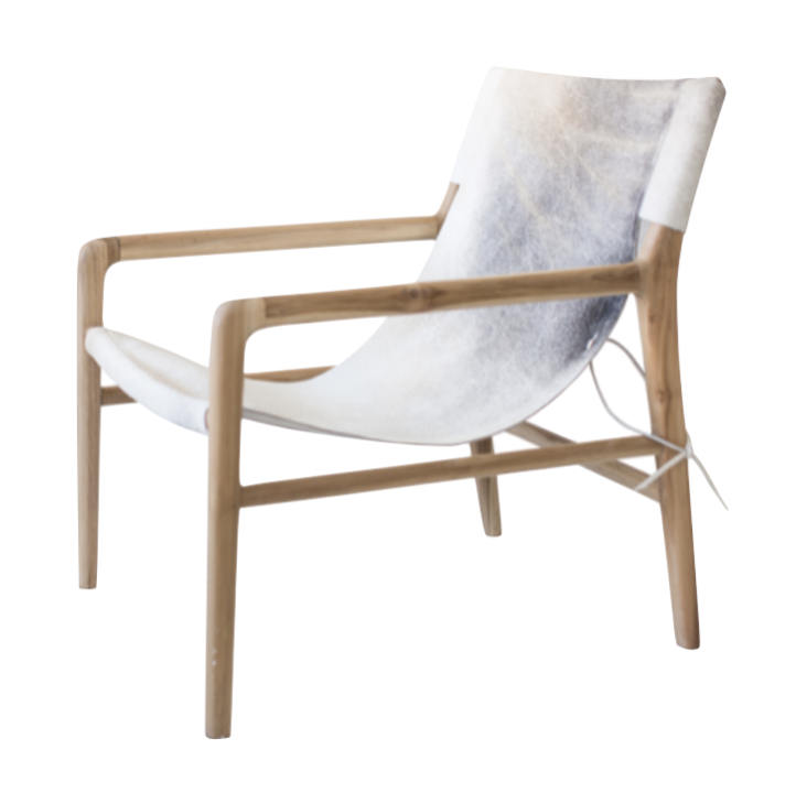
I have accent chairs on my mind! Besides the chairs I included in my family room design boards (previous post), here are some of my current favorites. It probably isn’t surprising that they are all wood framed and compliment my favorite aesthetic — organic modern. Here they are listed from low to high:
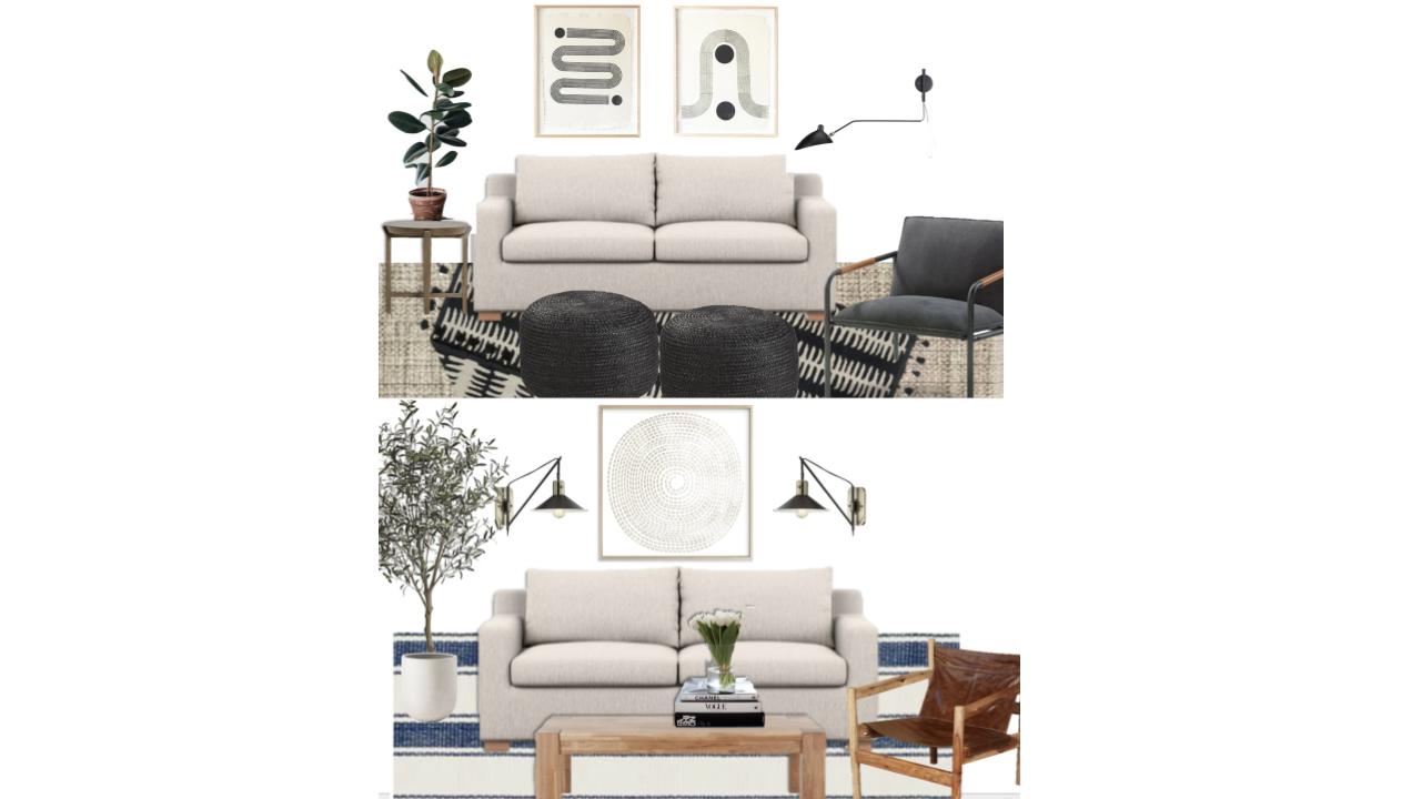
The kids are back in school so it’s project time for this mama! I truly enjoy mixing things up around our house. I’m craving more and more simplicity around here. Less toys, less stuff, less clutter, etc. We have been purging like crazy around here! Our family room is currently a mix of furniture I did not want to let go of. But now it’s time for a refresh! My team member Elle and I came up with 2 different looks for this room and we want YOU to help choose the winner! I will have a vote on my insta stories but also feel free to comment below! The only piece of furniture I have already committed to is the gorgeous sloan sleeper sofa from Interior Define.
I’m including all links for each option below.
AND GUESS WHAT? After you guys help me decide which option to implement, I’m going to put together a more budget friendly version of the room for those who want the look at an even friendlier price point. That being said, many of the products linked below are currently on sale and hopefully don’t sell out before I get a chance to purchase them! 🙂
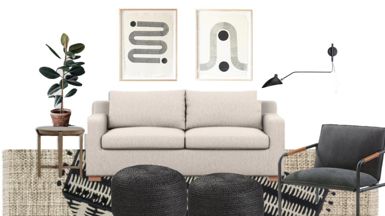
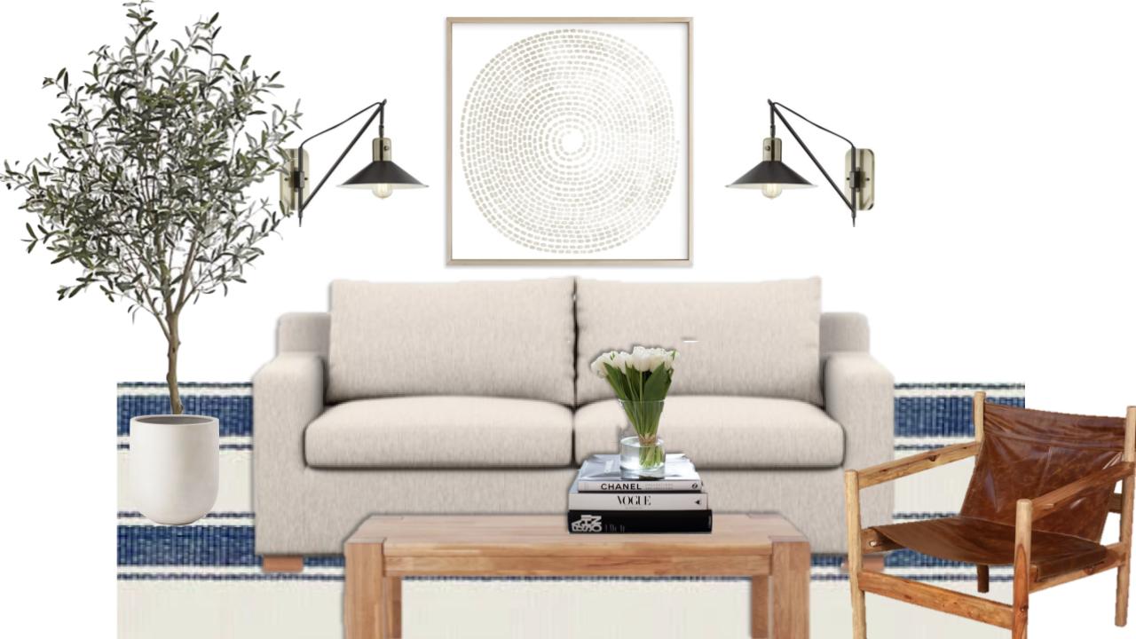
Option 1: Neutral with pops of black
I don’t have much black in our house, so this look would be such a fun change yet remains consistent with the style of our home. The poufs are great for a family room – no sharp edges is nice with kids constantly playing in here. Clearly missing: pillows. I will add some from my collection once I choose an option.
Option 2: Neutral with pops of wood
This neutral style with pops of wood — as you have probably seen in our living, dining room and kitchen — is my jam. I love the neutral fresh feel of this one. The coffee table has edges, but would be nice for the kids to sit and do projects on it.
I’m so conflicted! Please help — vote on my stories, DM me, comment below, etc! THANK YOU!!!!
Here are some before pictures (I love it . . . I’m just ready for a refresh):
family room before pic
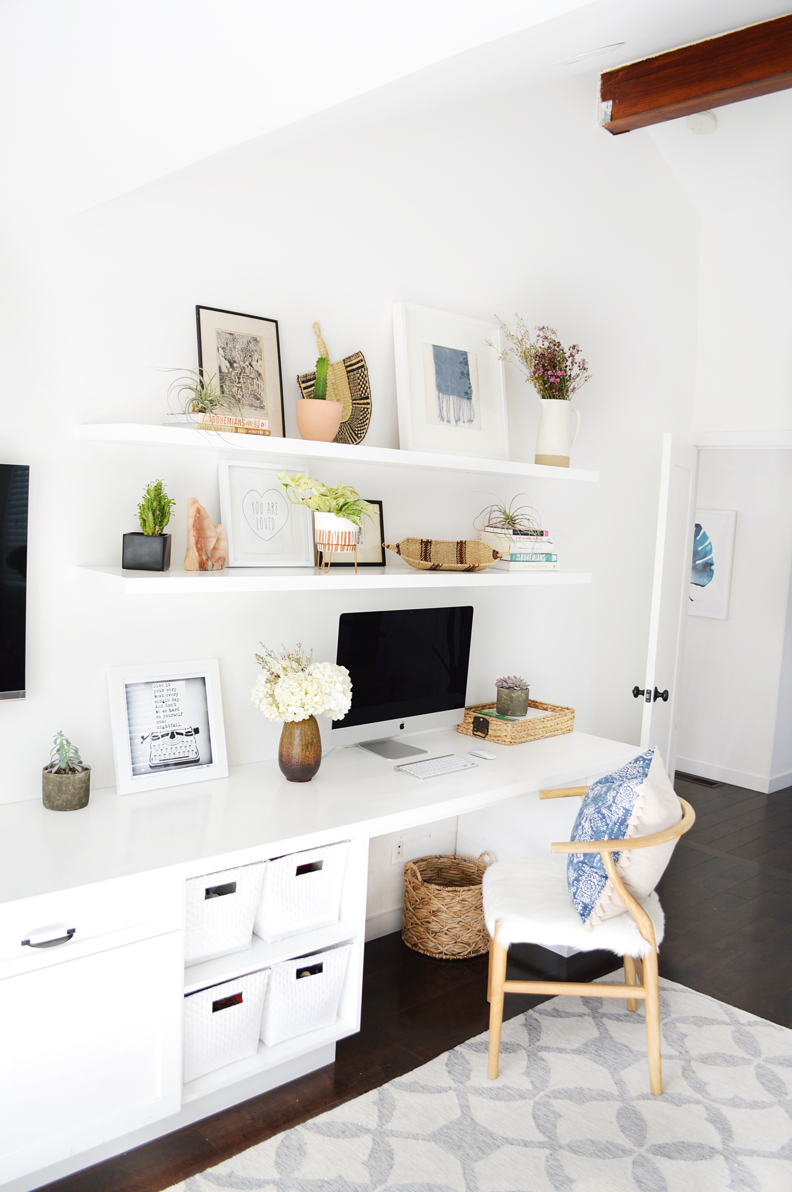
And this is the other side of the room – our office space with cabinets for toy storage and a tv. This won’t change much except for the styling to match whichever option you guys choose!