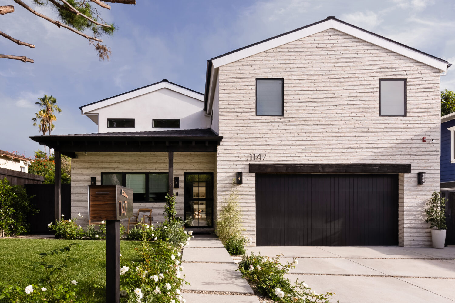
This custom ADU design was created from the ground up with family entertaining and everyday living in mind. When designing a new build ADU, functionality is just as important as aesthetics, especially when the space needs to support gatherings, indoor-outdoor flow, and frequent use. I had to carefully balance durability, thoughtful layouts, and beautiful finishes to create a space that works hard while still feeling elevated.
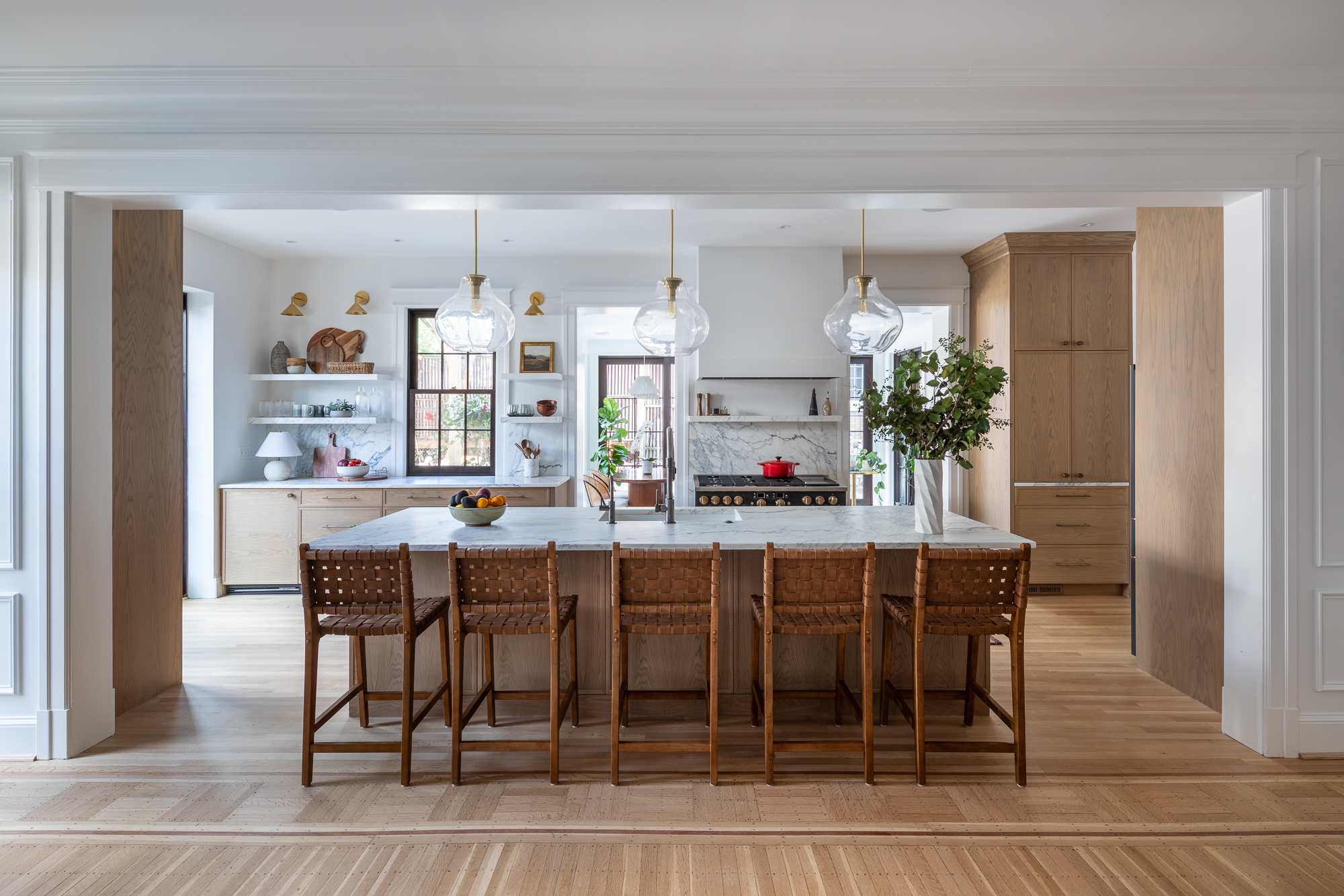
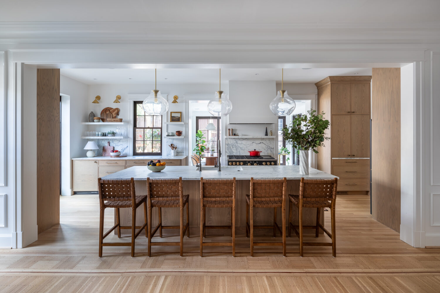
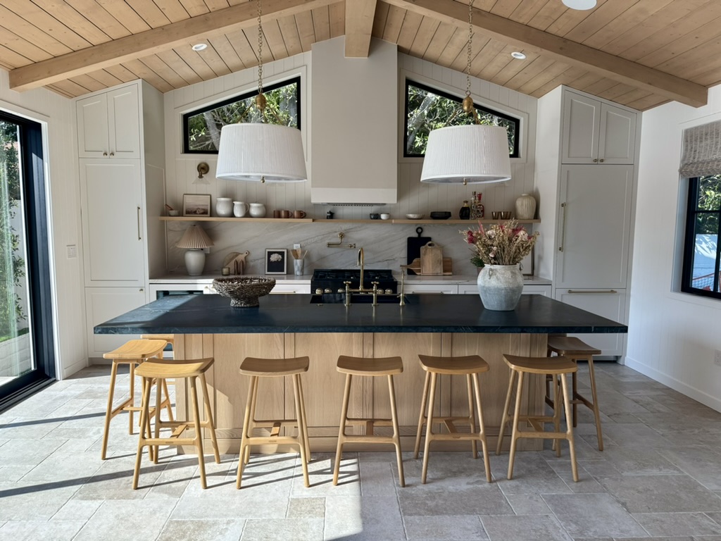
A Kitchen Designed for Entertaining
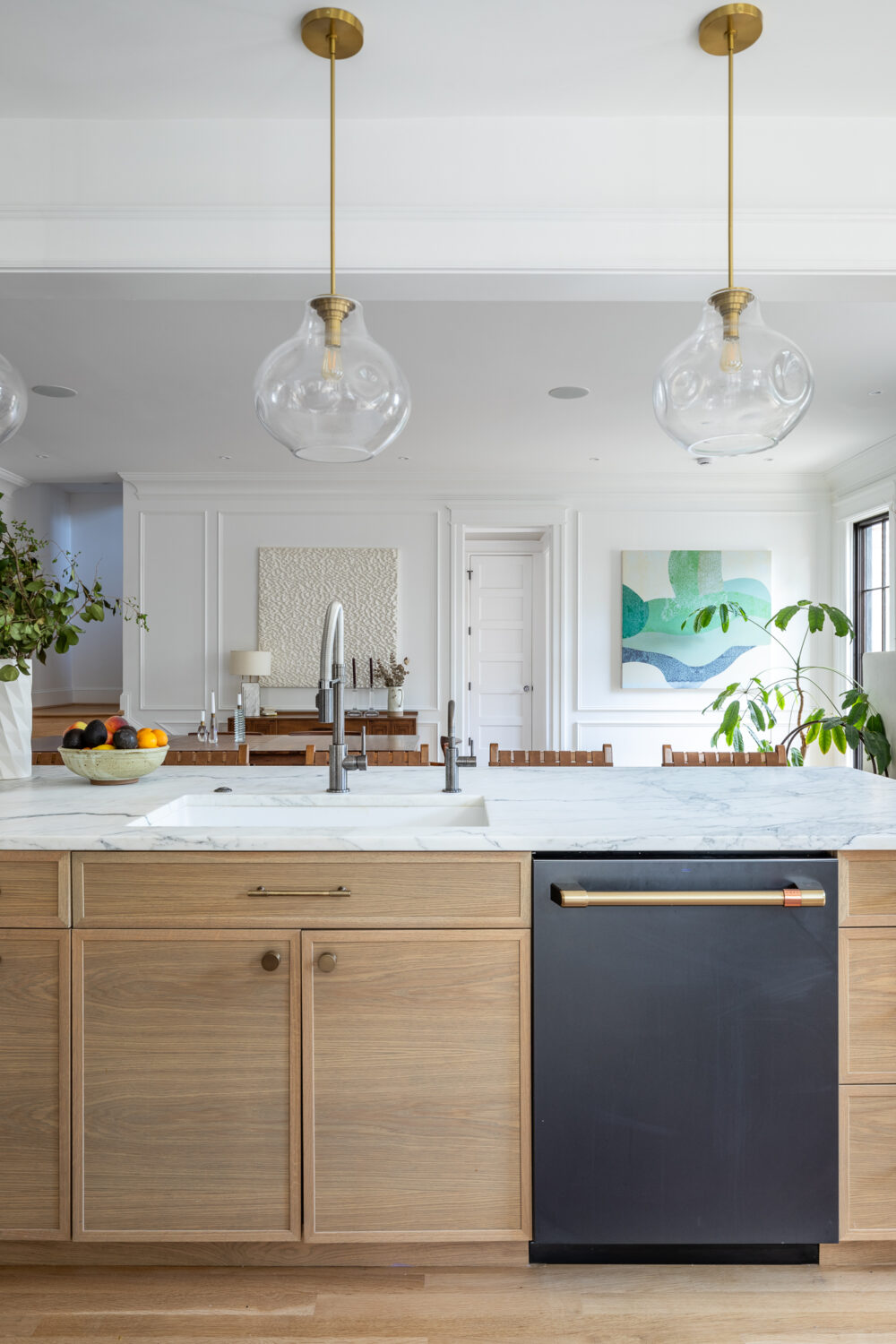
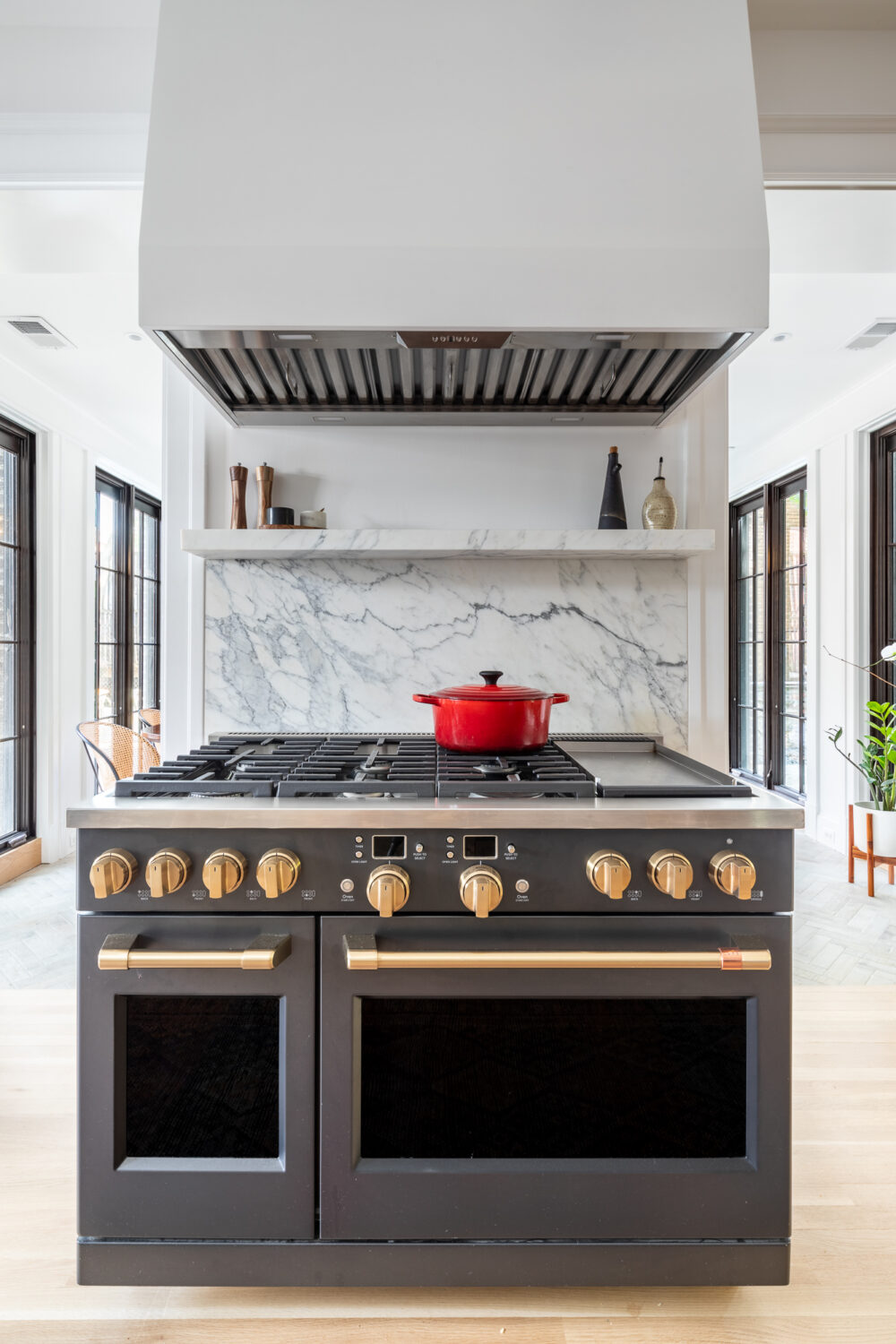
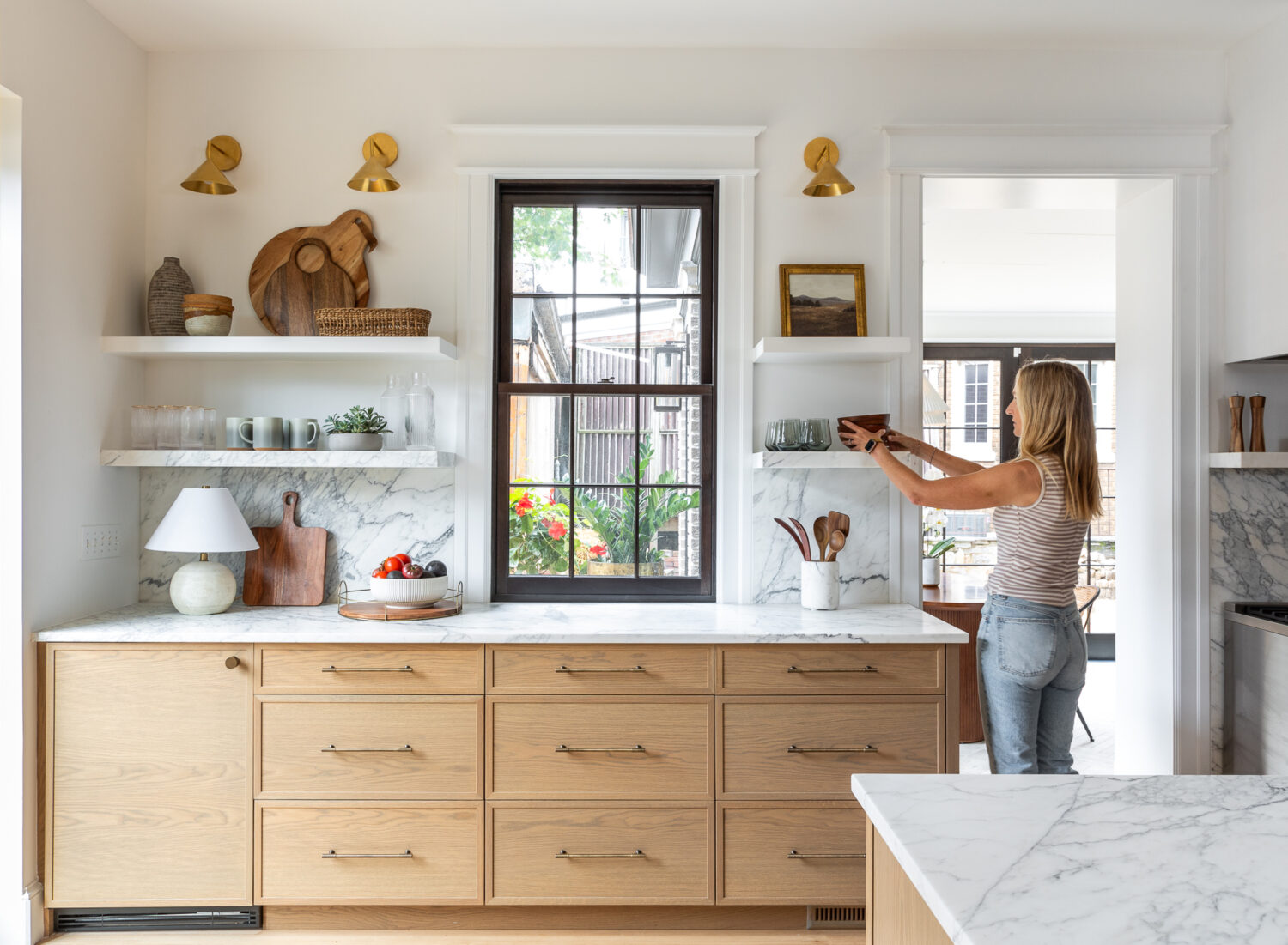
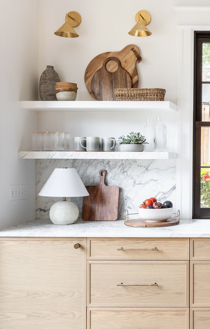
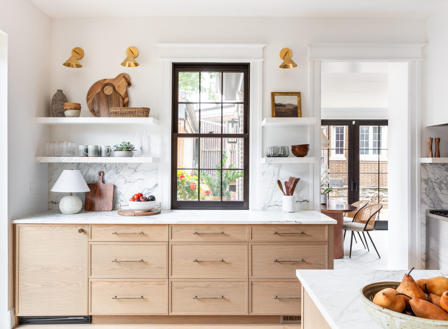
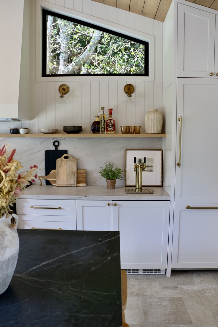
The kitchen serves as the anchor, with generous counter space, smart storage, and durable materials that stand up to frequent use AND beauty of course. Because this space is often used for hosting, we incorporated a few fun “party house” must-haves, including an ice machine and a kegerator. Also, thinking about large guest gatherings, I designed the island with overhangs on both sides to accommodate additional counter seating. I try to do this in most kitchens I design when the space allows it!
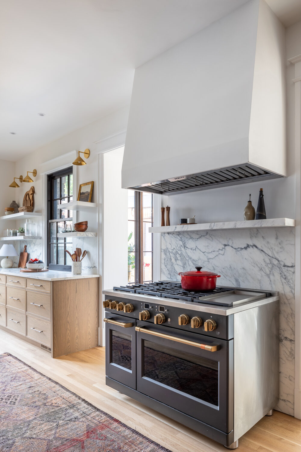
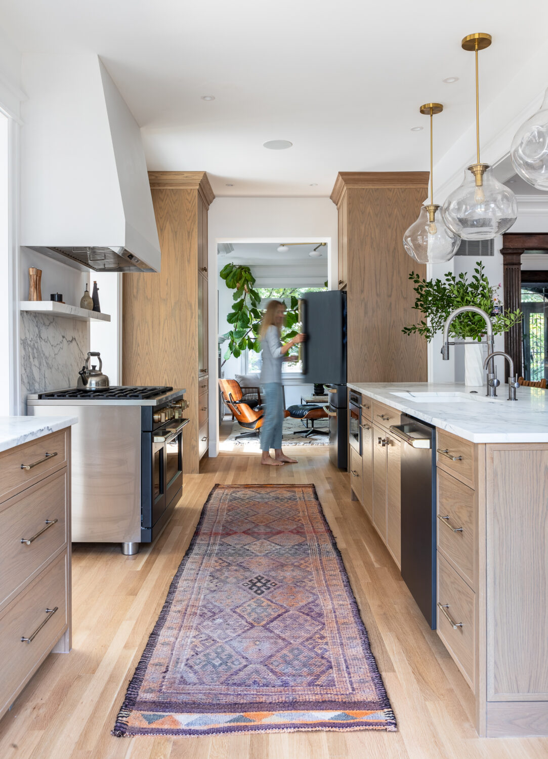
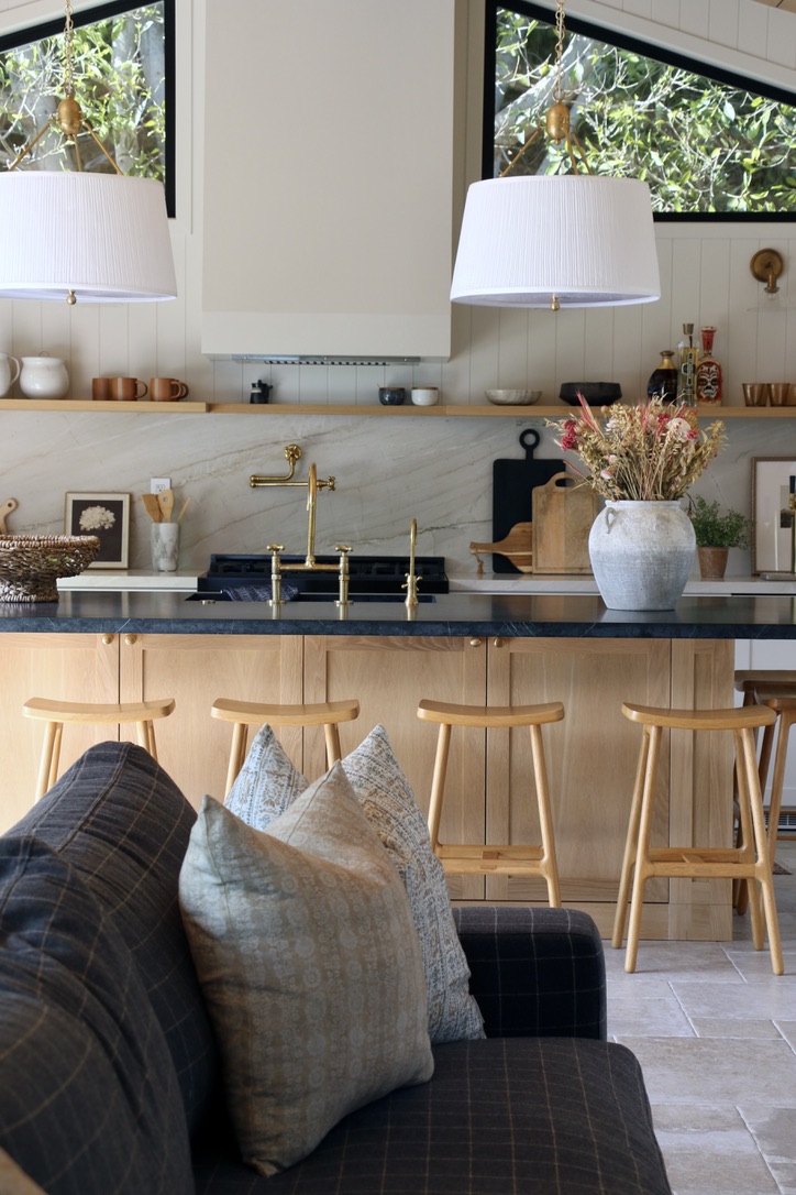
The entire build is an open layout since it was built as an entertaining space, so it was really important to me that the kitchen blended nicely with the look and feel of the entire space. I added a shelf on top of the quartzite backsplash to display everyday items and art, which IMO makes it prettier (and more interesting) to look at. The shelf is white oak instead of fabricating a quartzite shelf – it adds warmth to the space and was friendlier to the budget. The back counter and backsplash are quartzite, while the island countertop is soapstone—a last-minute pivot that happened when the client and I spotted the perfect slab and fell in love. Sometimes, the best design decisions are the spontaneous ones.
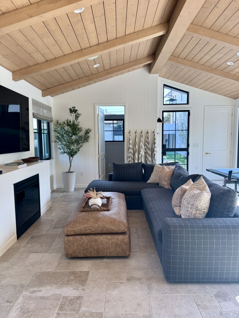
Durable Flooring for High-Traffic ADU Living
Because this ADU is heavily used and has constant indoor-outdoor flow, flooring selection was driven by durability. The material needed to handle high foot traffic, spills, and frequent entertaining while still grounding the space visually.
To avoid a space that felt overly new or sterile, we selected a porcelain tile that mimics the look and character of limestone while offering long-term durability. Choosing practical, low-maintenance flooring allows the family to fully enjoy the ADU without worrying about wear and tear, which I think is an essential consideration in any realistic design project. When spending money on thoughtful design, we should all aim for longevity.
The contrast between the flooring and the ceiling was planned and I love it! We planked the ceiling and added beams to give the space warmth and more character. The stain is a custom mix of stains that took many tries to perfect!
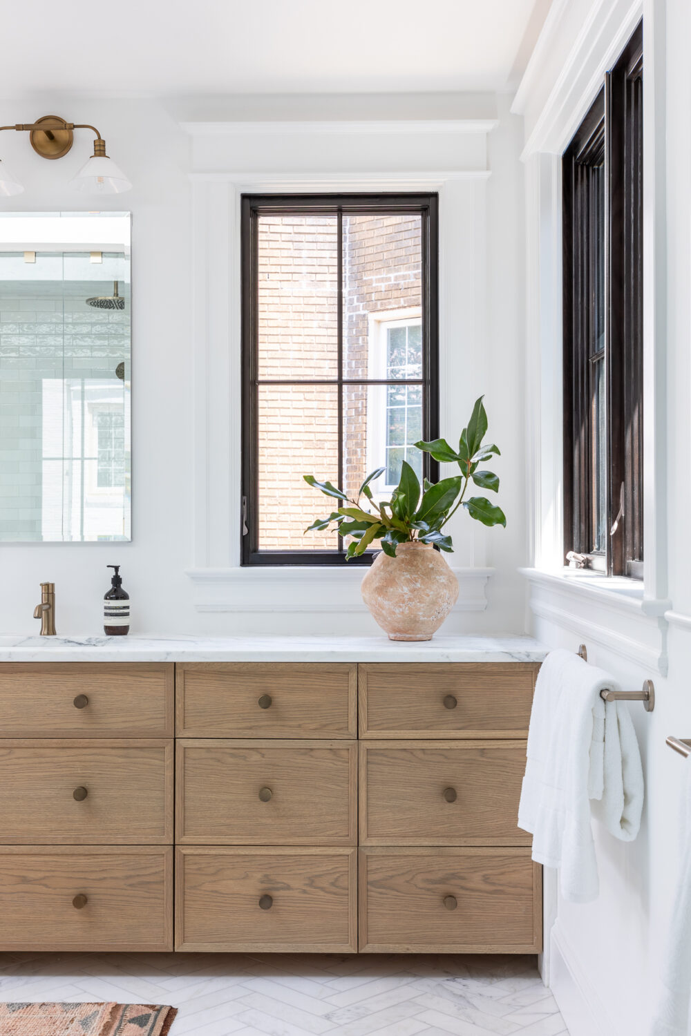
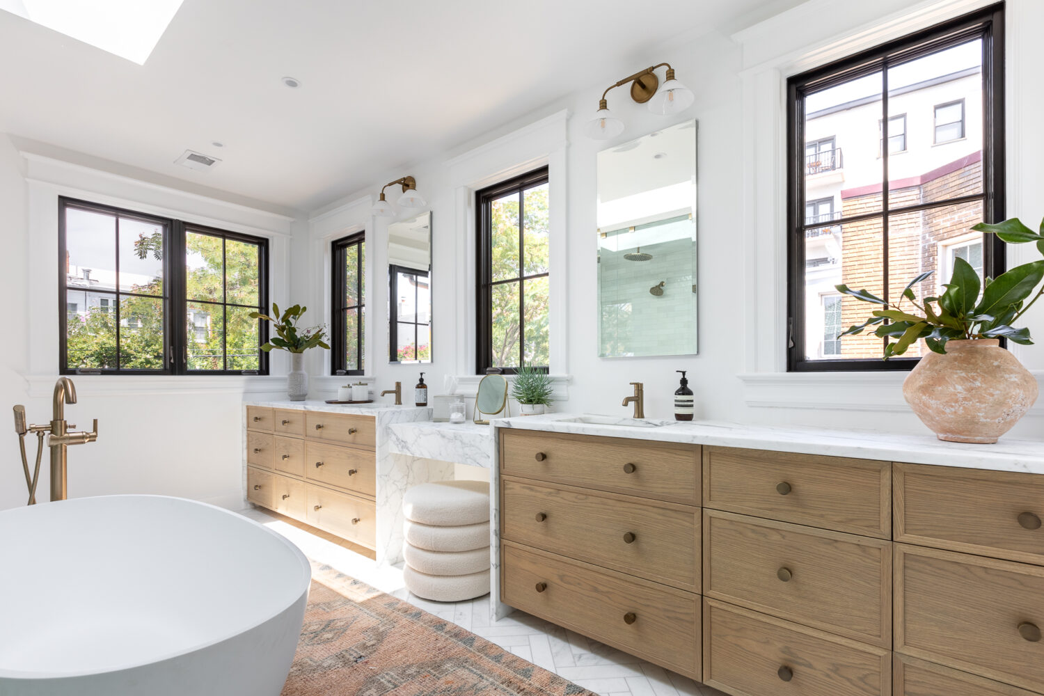
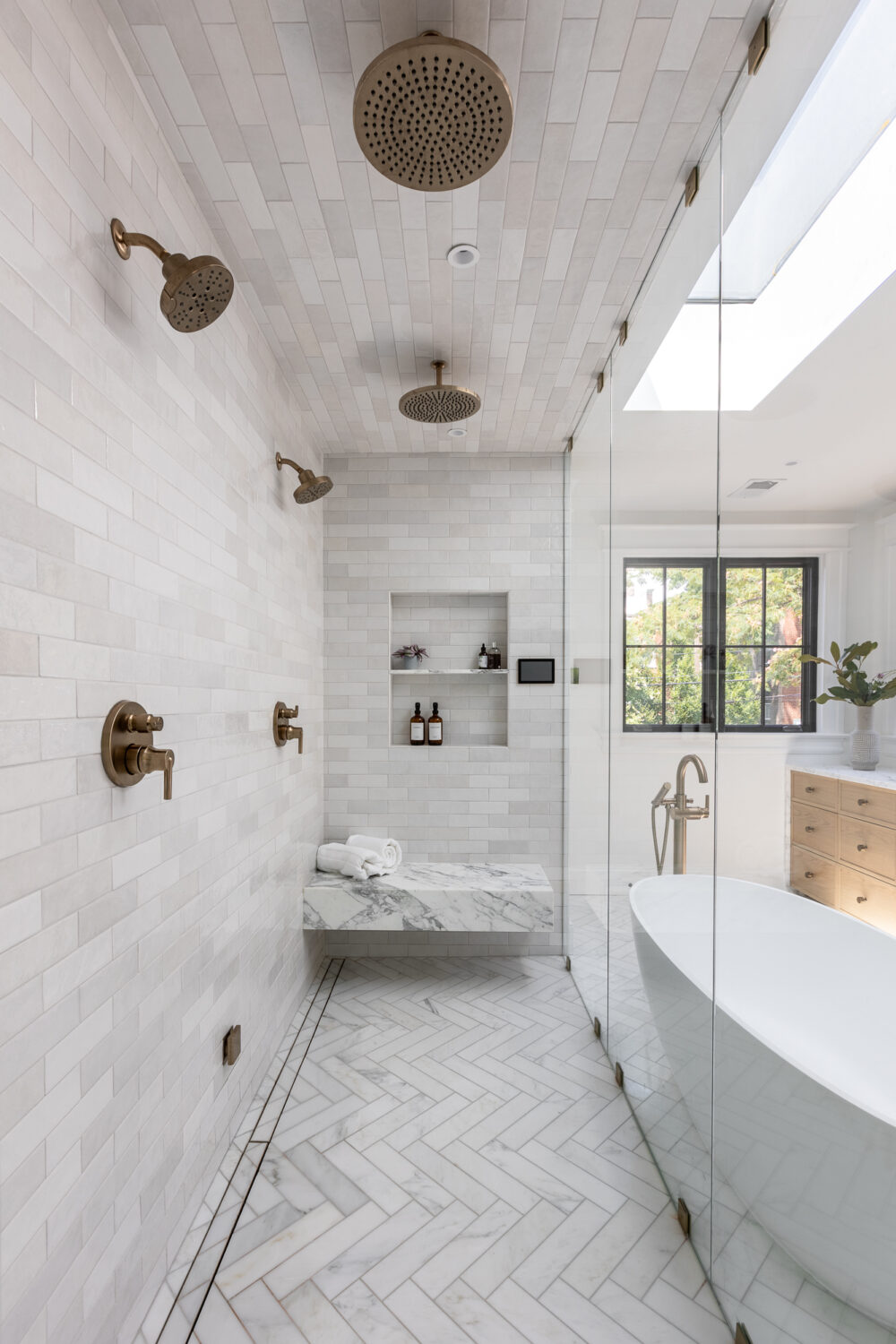
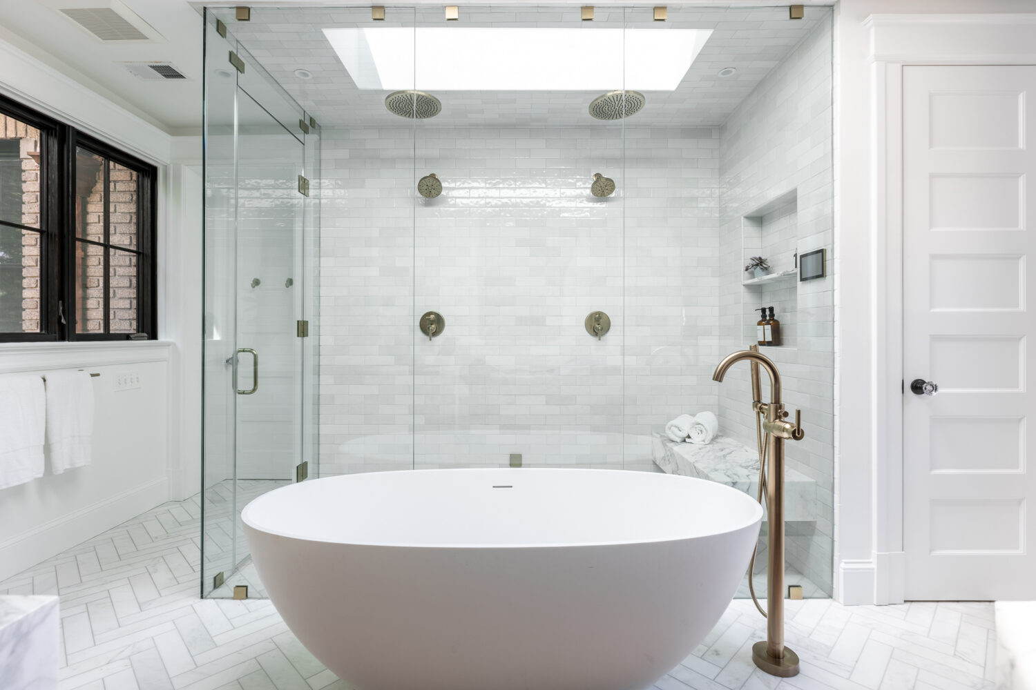
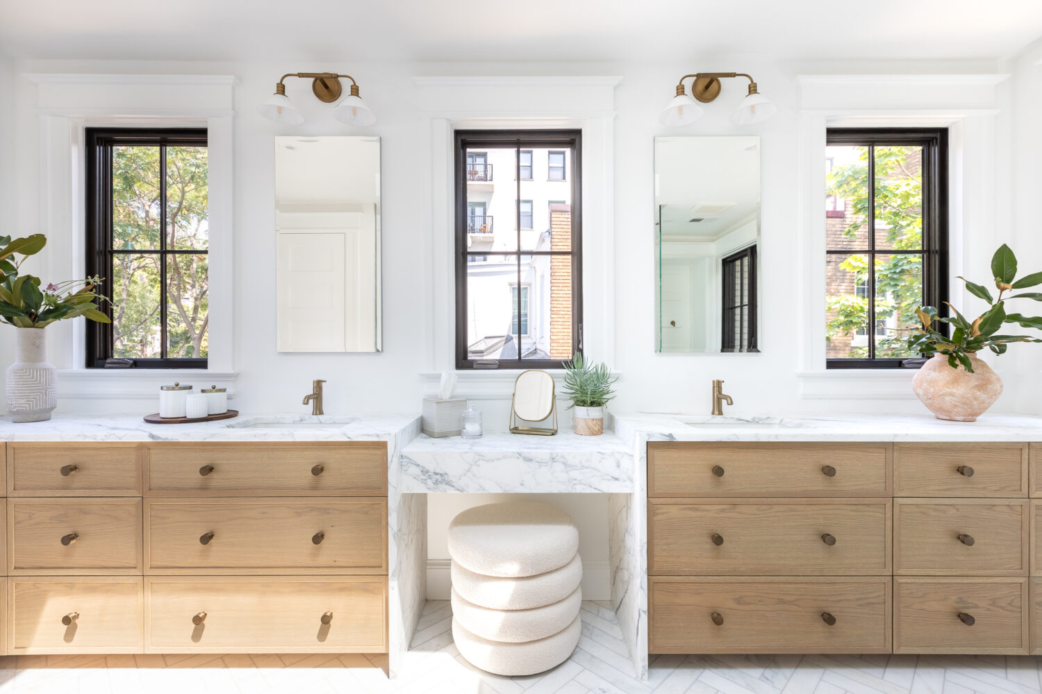
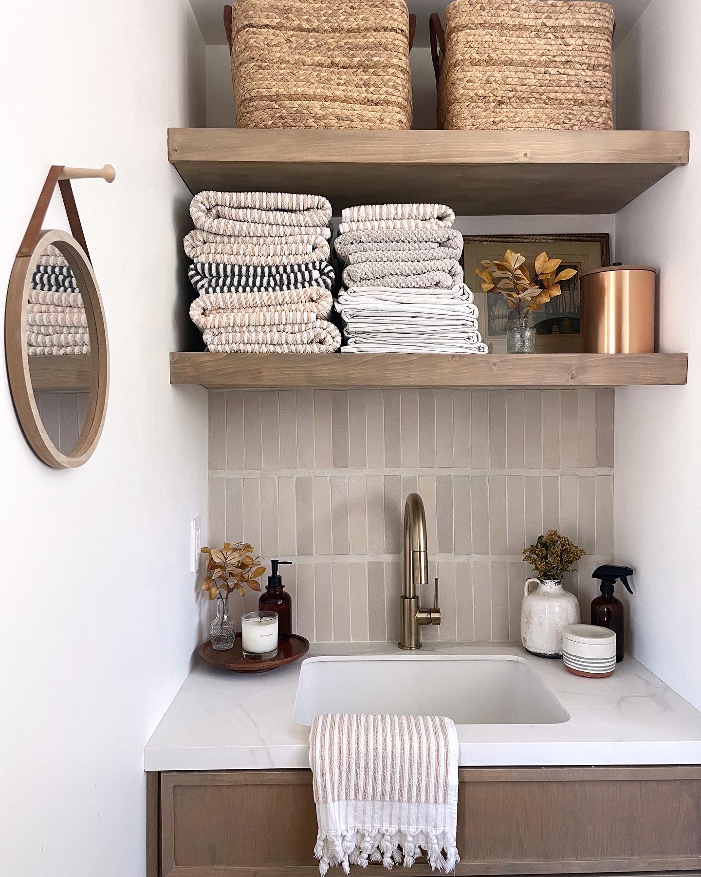
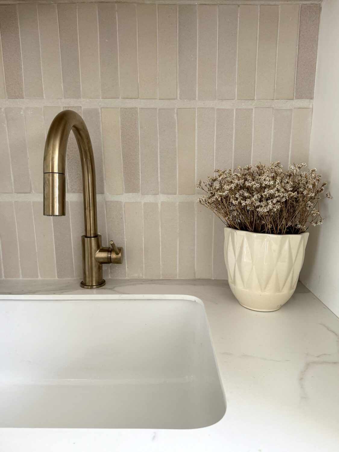
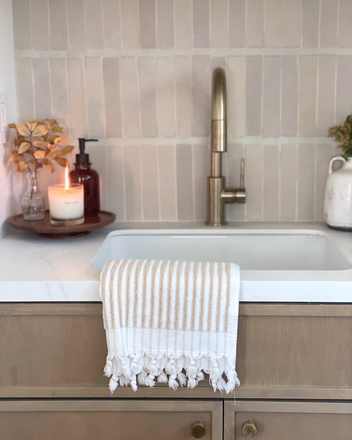
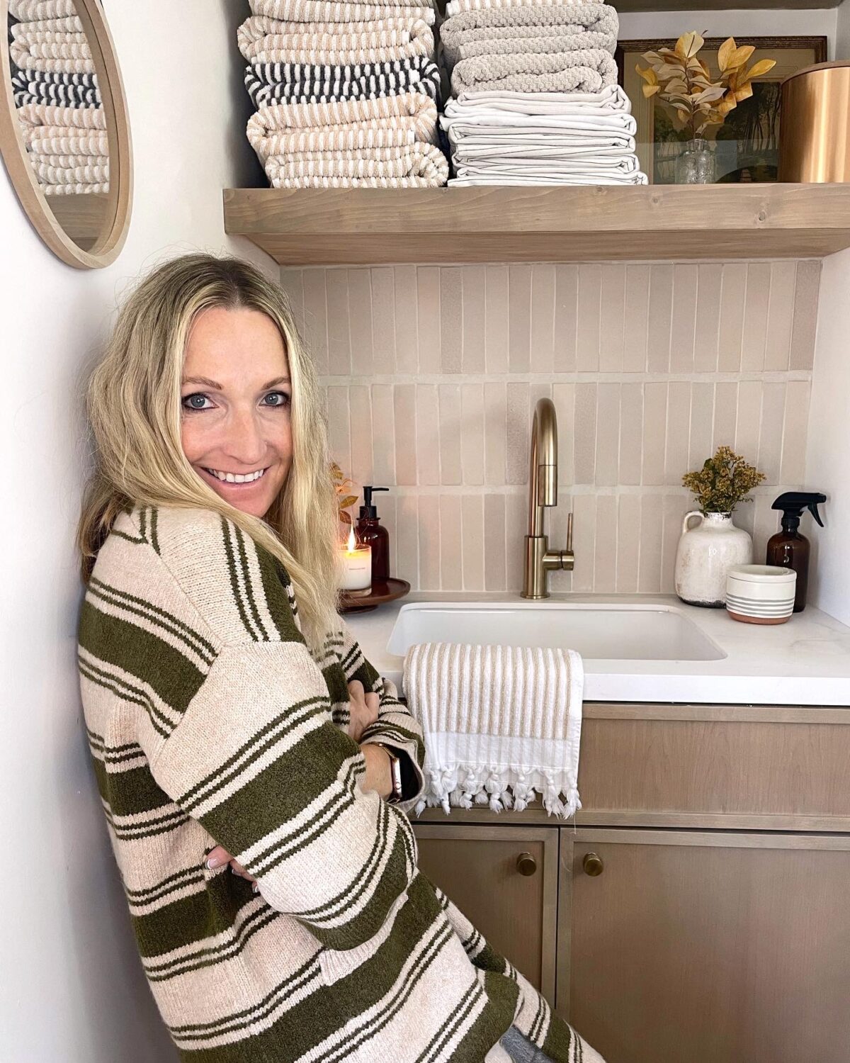
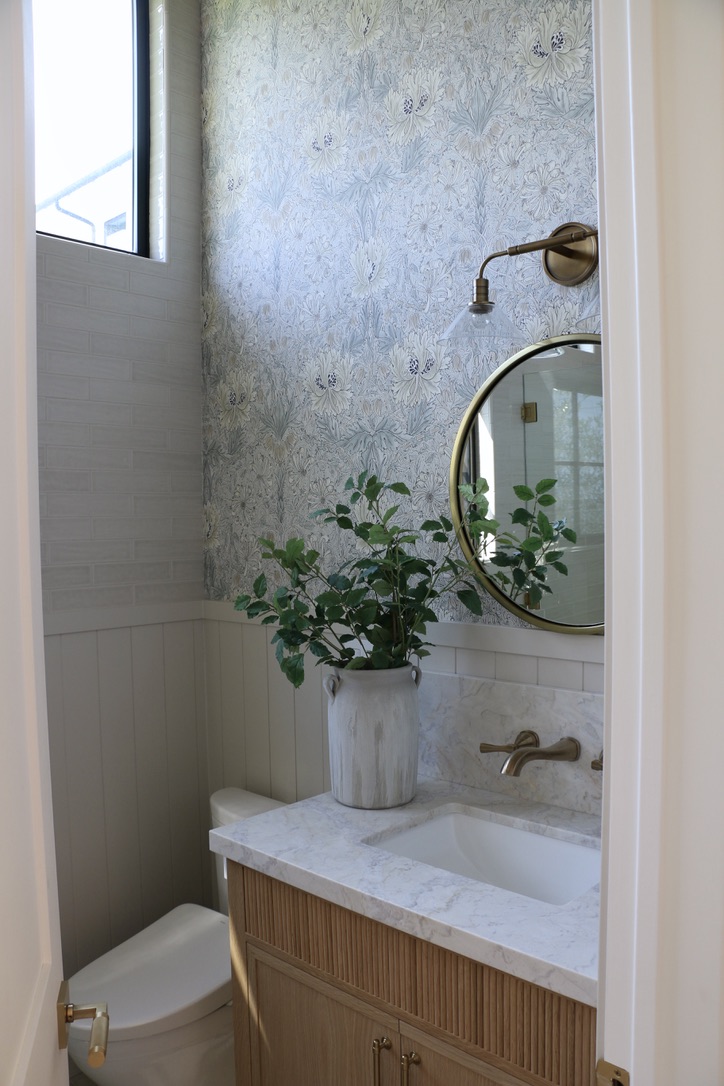
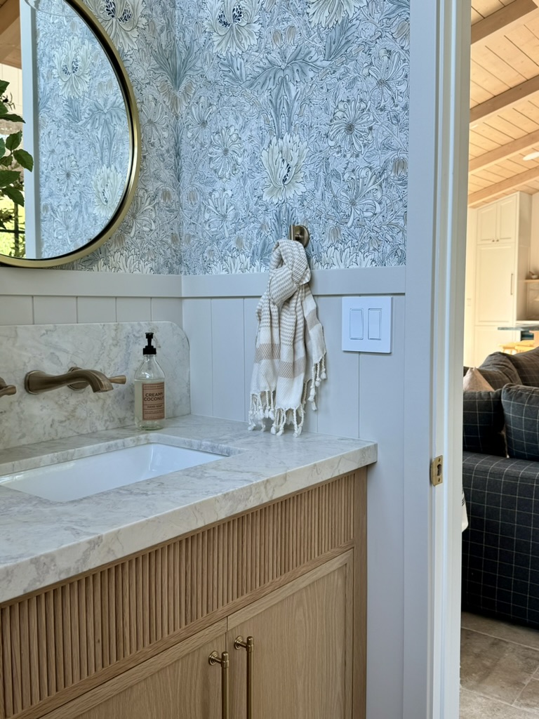
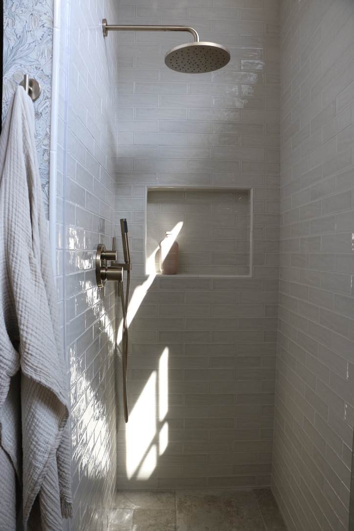
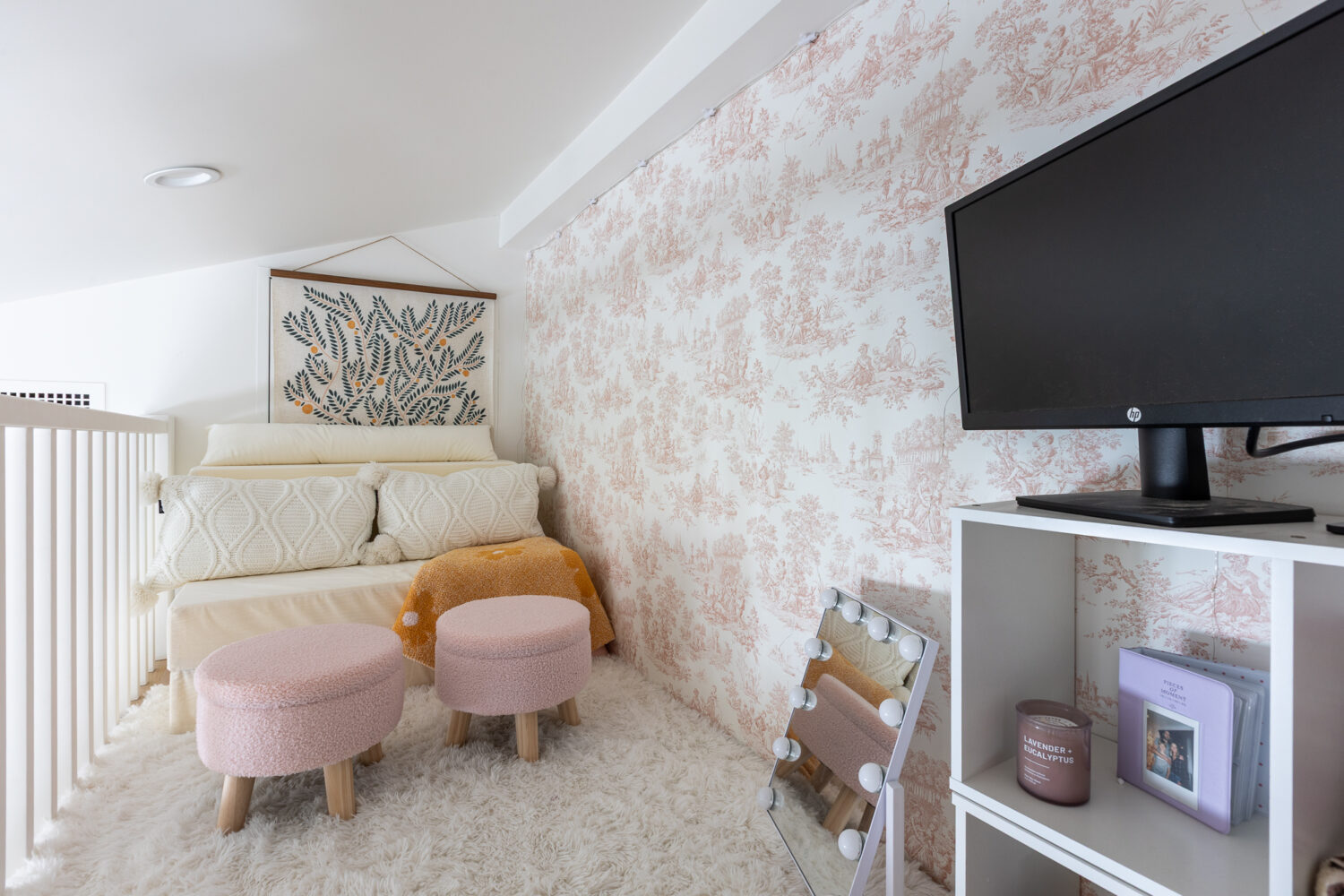
An ADU Bathroom That Works Hard (and Still Looks Beautiful)
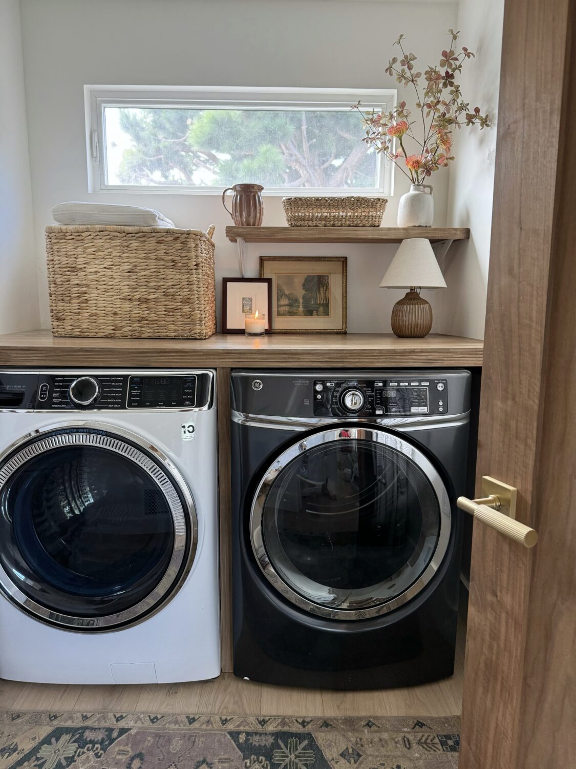
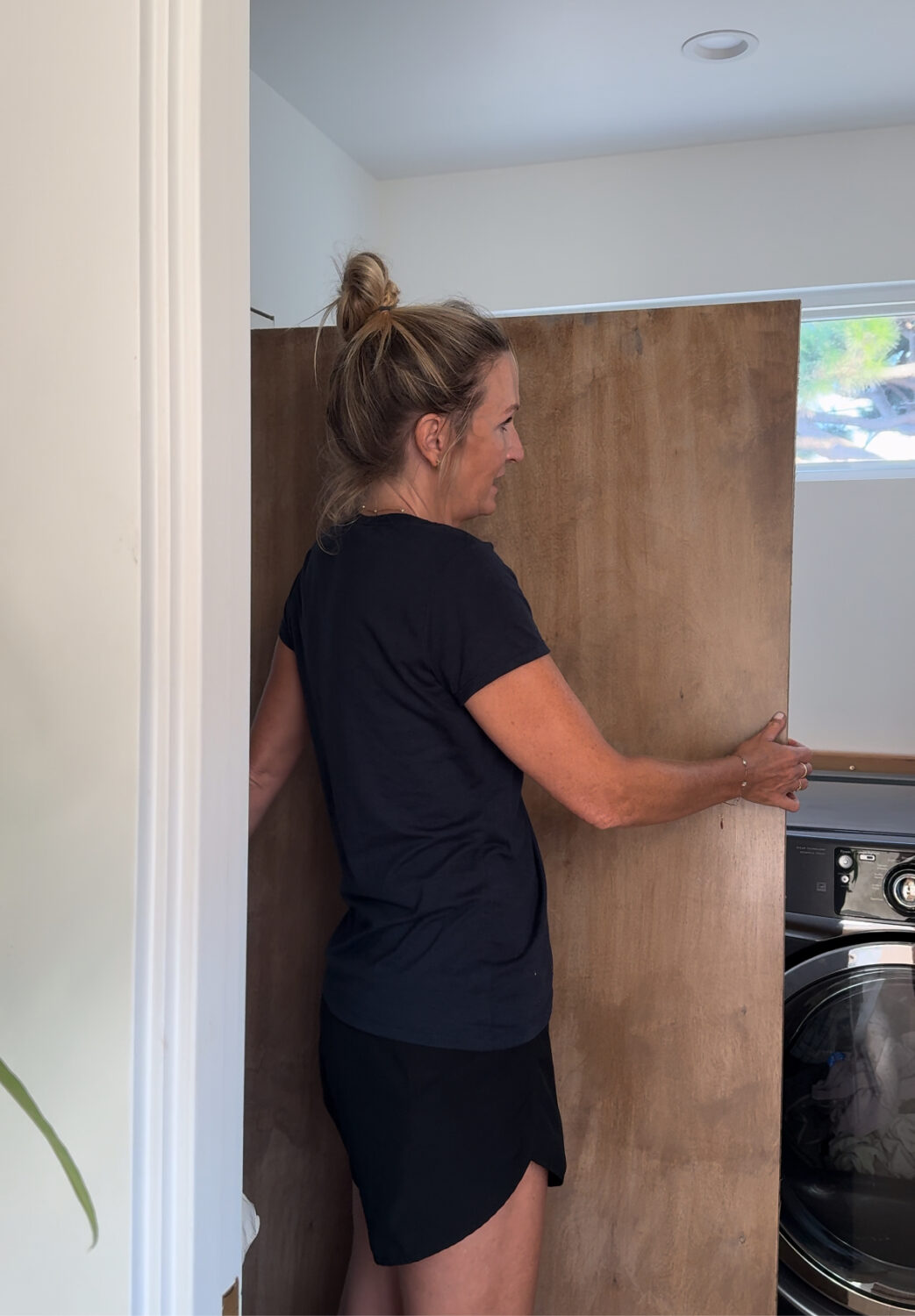
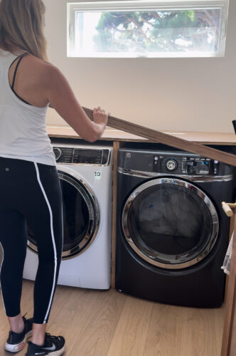
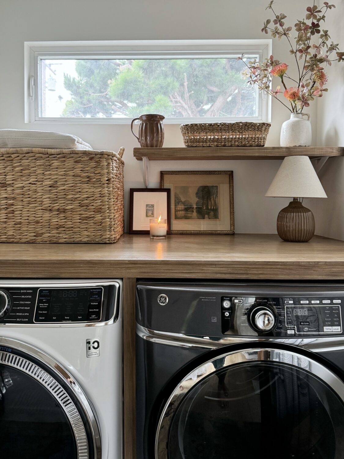
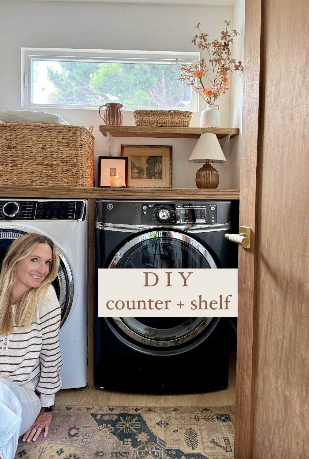
The bathroom is a perfect example of how thoughtful planning can maximize a small footprint in an ADU. We were able to fit a custom vanity with ample storage, a full shower, and a stacked washer and dryer—without the space feeling cramped or overly utilitarian.
Wallpaper and wall molding add warmth and personality, elevating the room so it feels intentional and designed rather than purely functional. This bathroom proves that even in a compact ADU, it’s possible to incorporate laundry, storage, and style seamlessly.
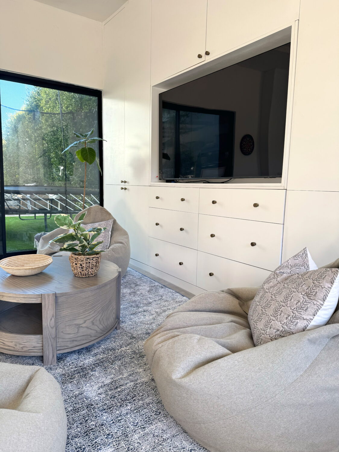
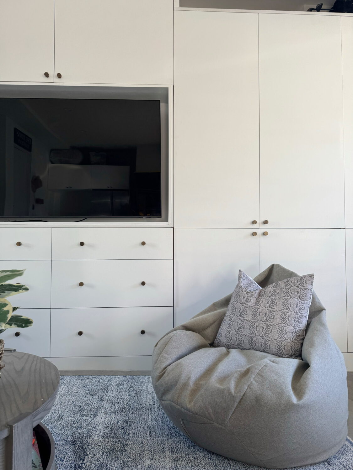
A Custom Fireplace Cabinet Designed to Blend Into the Architecture
To add warmth and character to the main living space, I designed a custom fireplace cabinet that blends seamlessly into the architecture of the ADU. Vertical wood plank paneling was added to the walls to introduce charm and subtle coastal flair, and the fireplace surround and cabinetry were designed using the same paneling pattern so everything visually disappears into the wall.
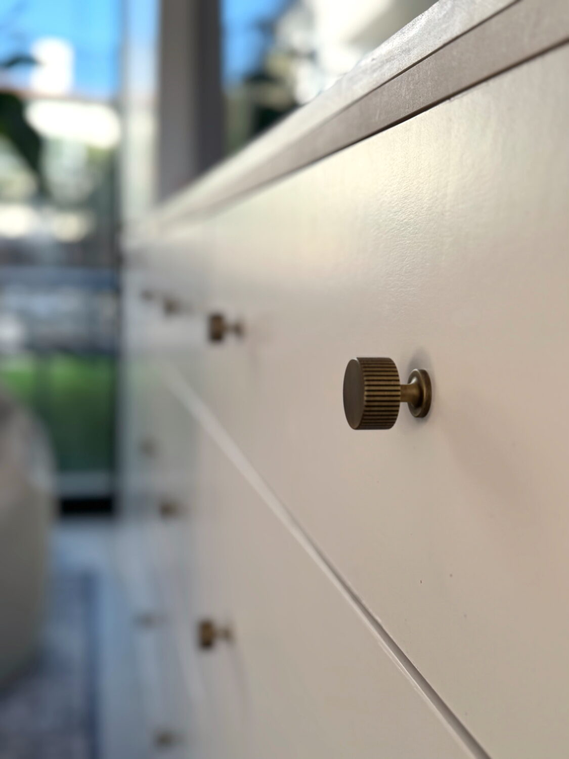
The result is a calm, cohesive focal point that enhances the space without overpowering it. To maintain a clean, unfussy look, I skipped hardware entirely and used push-to-open cabinetry, allowing the texture and craftsmanship to take center stage.
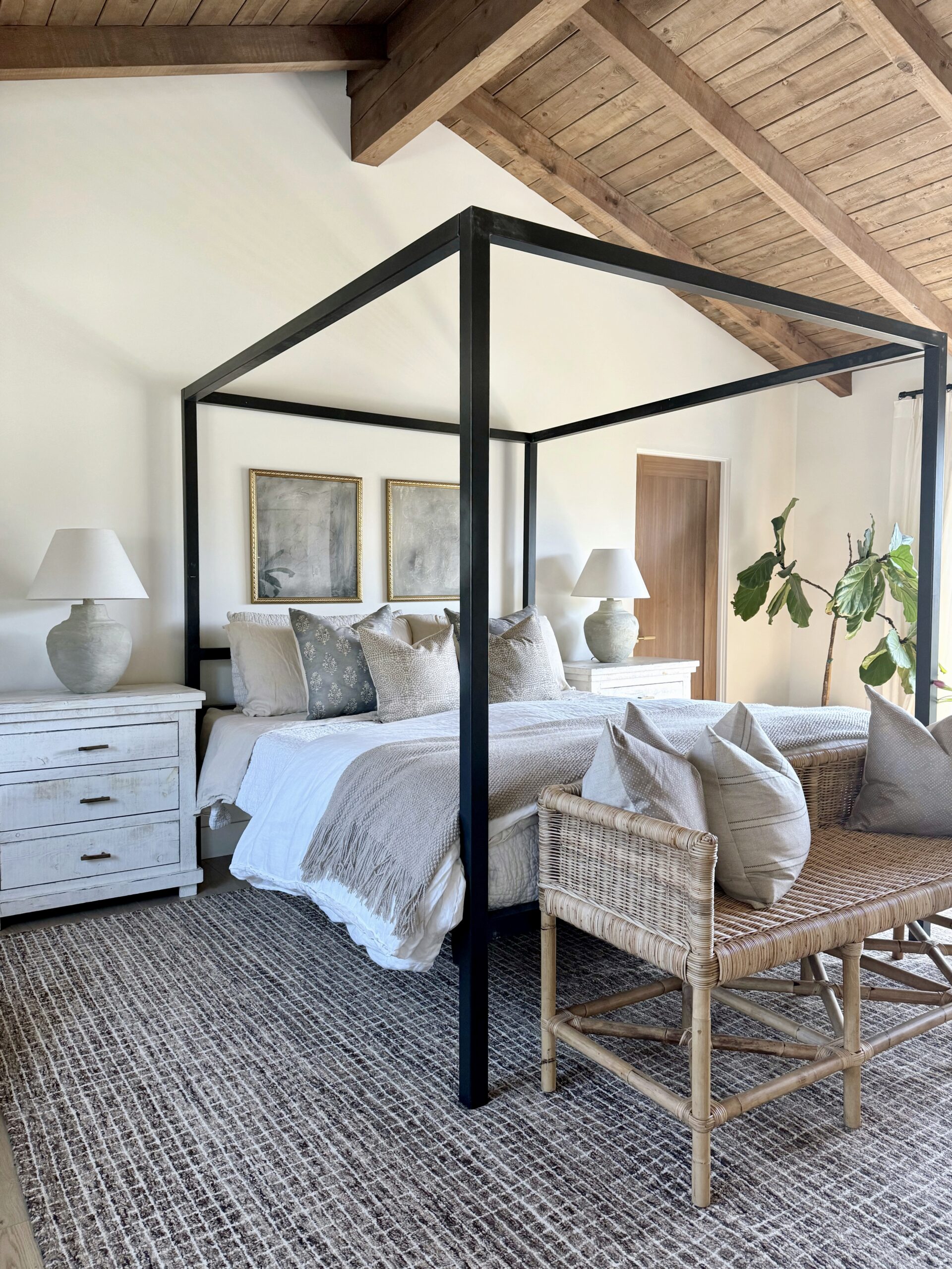
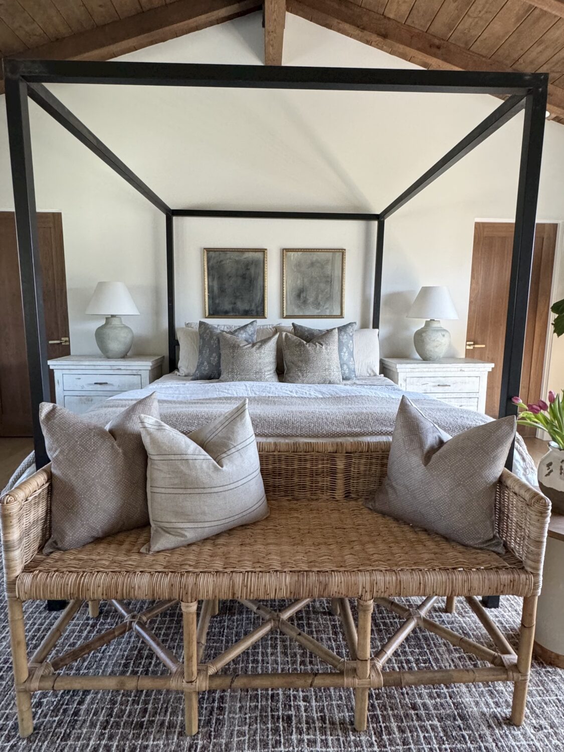
Custom Seating Designed for ADU Entertaining
A custom-designed sofa was created specifically for the room, providing comfortable seating for lounging, TV watching, and entertaining without sacrificing aesthetics. The subtle plaid fabric adds visual interest while remaining timeless.
Because of the length of the sofa, a custom leather ottoman coffee table was designed to stay properly scaled to the space. It functions as both a surface for drinks and a place to put your feet up, reinforcing the relaxed, inviting feel that’s essential in a family-focused ADU.
We will eventually add a rug but with so many little (and big) feet in and out of this space, we opted for the natural floors that are easy to clean for now.
Thoughtful ADU Design That Supports Real Life
Every design decision here, from layout and materials to custom cabinetry and furniture, was made to support how the family actually uses this space. The result is a custom new build ADU that feels intentional, comfortable, and perfectly suited for everyday living and entertaining.
You can shop many of the products I used below. And for those asking, the kitchen cabinets are painted “Natural Cream” by Benjamin Moore and the walls are “Chantilly Lace.” I linked the colors on Samplize (ALWAYS order samples before choosing a color) – also linked below.
xo,
Kristin


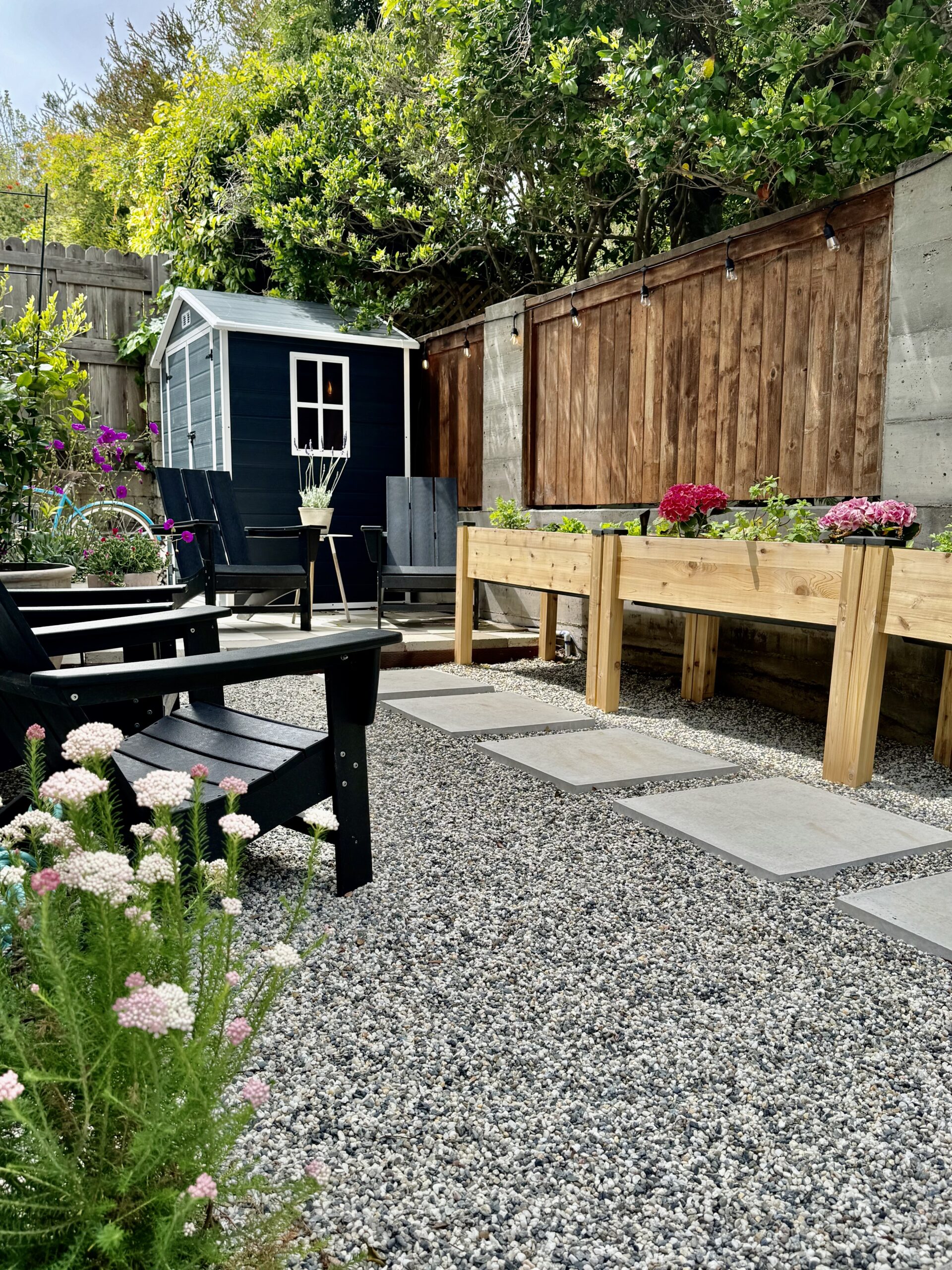
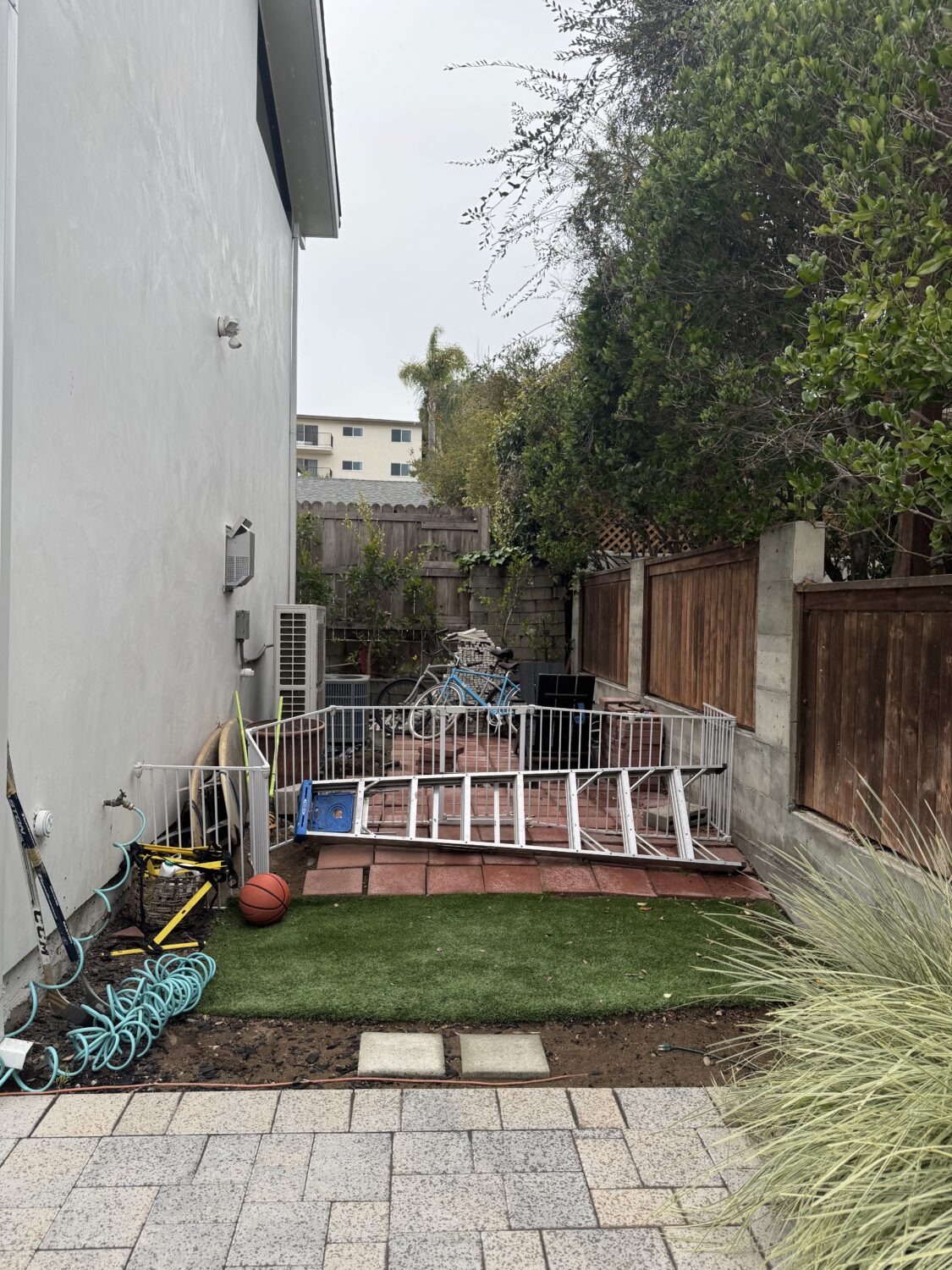
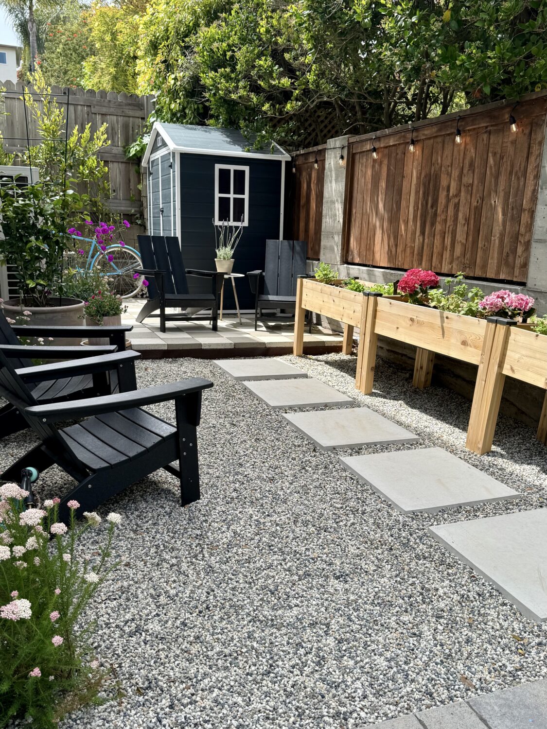
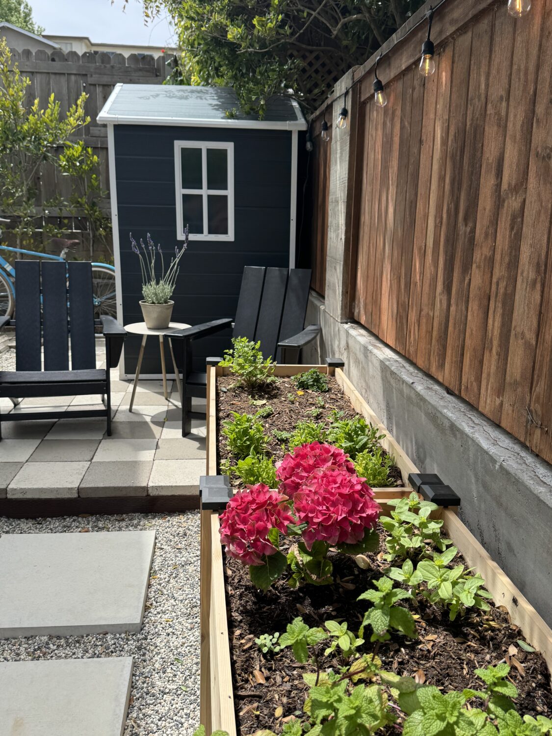
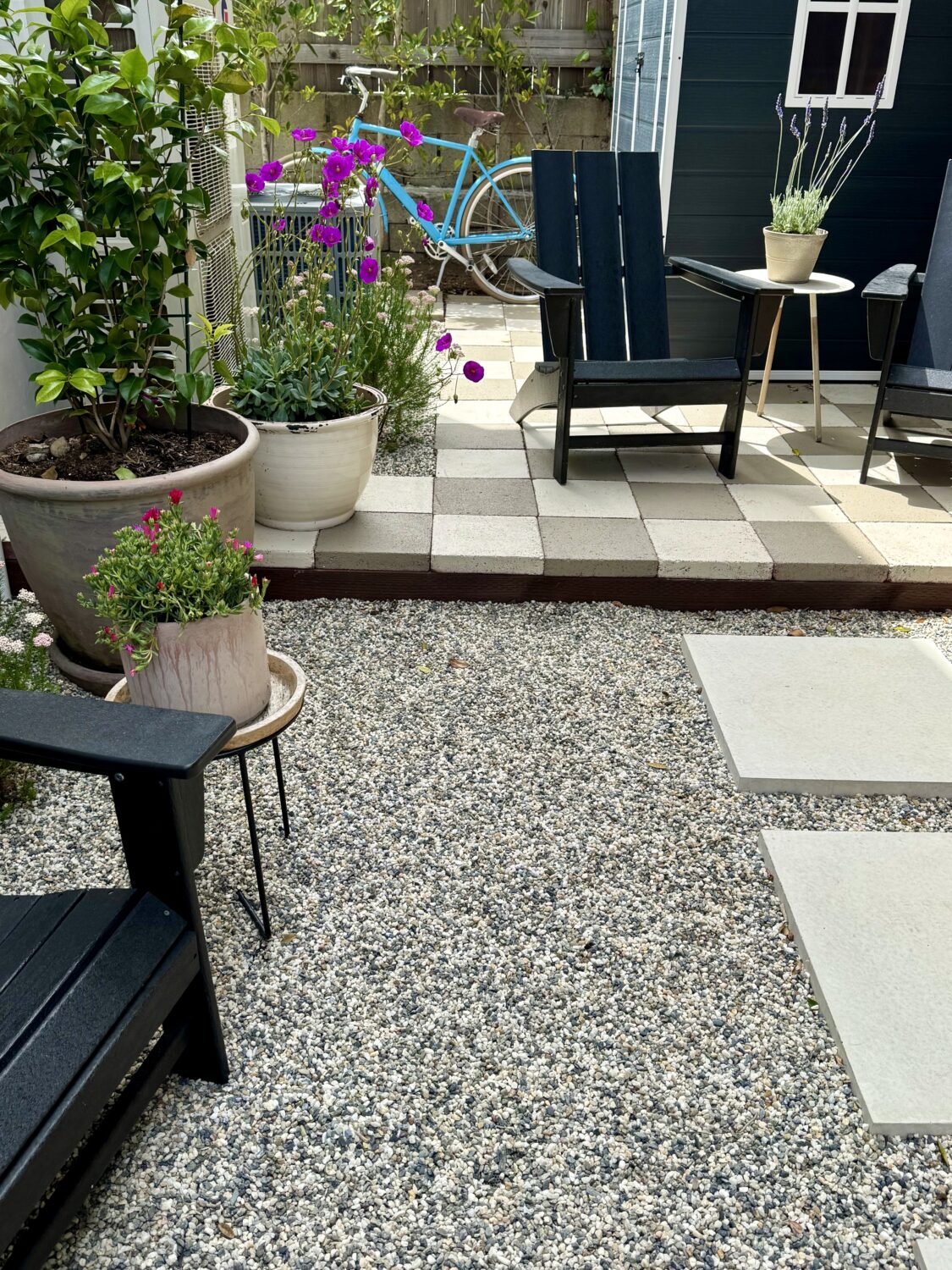
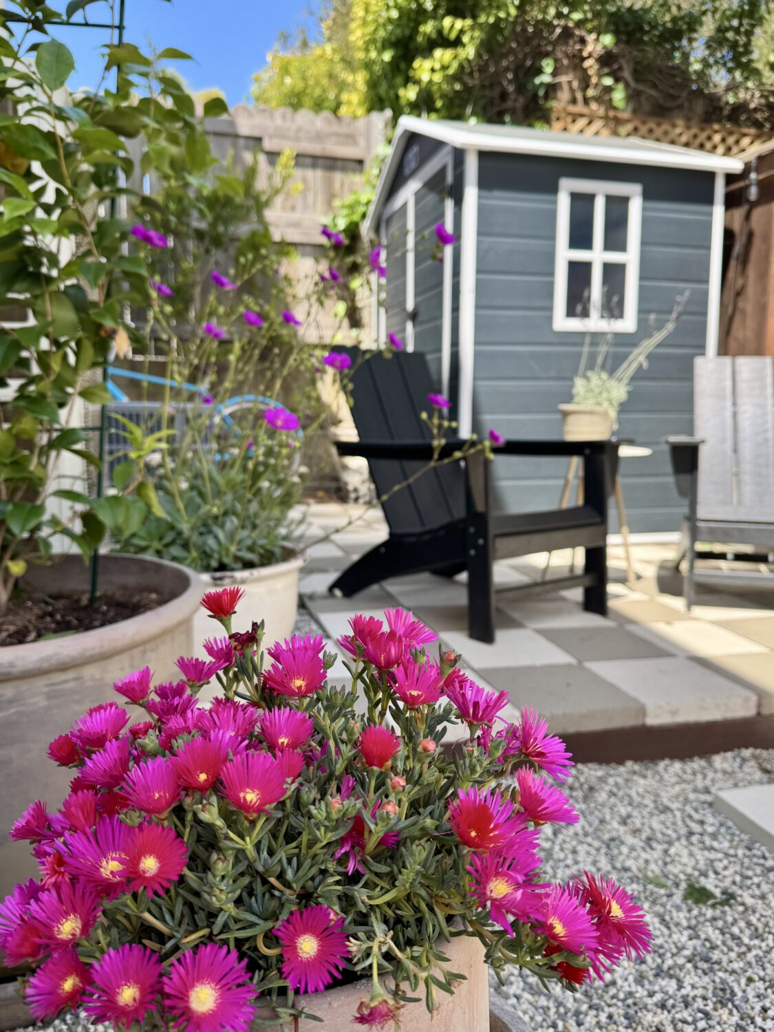
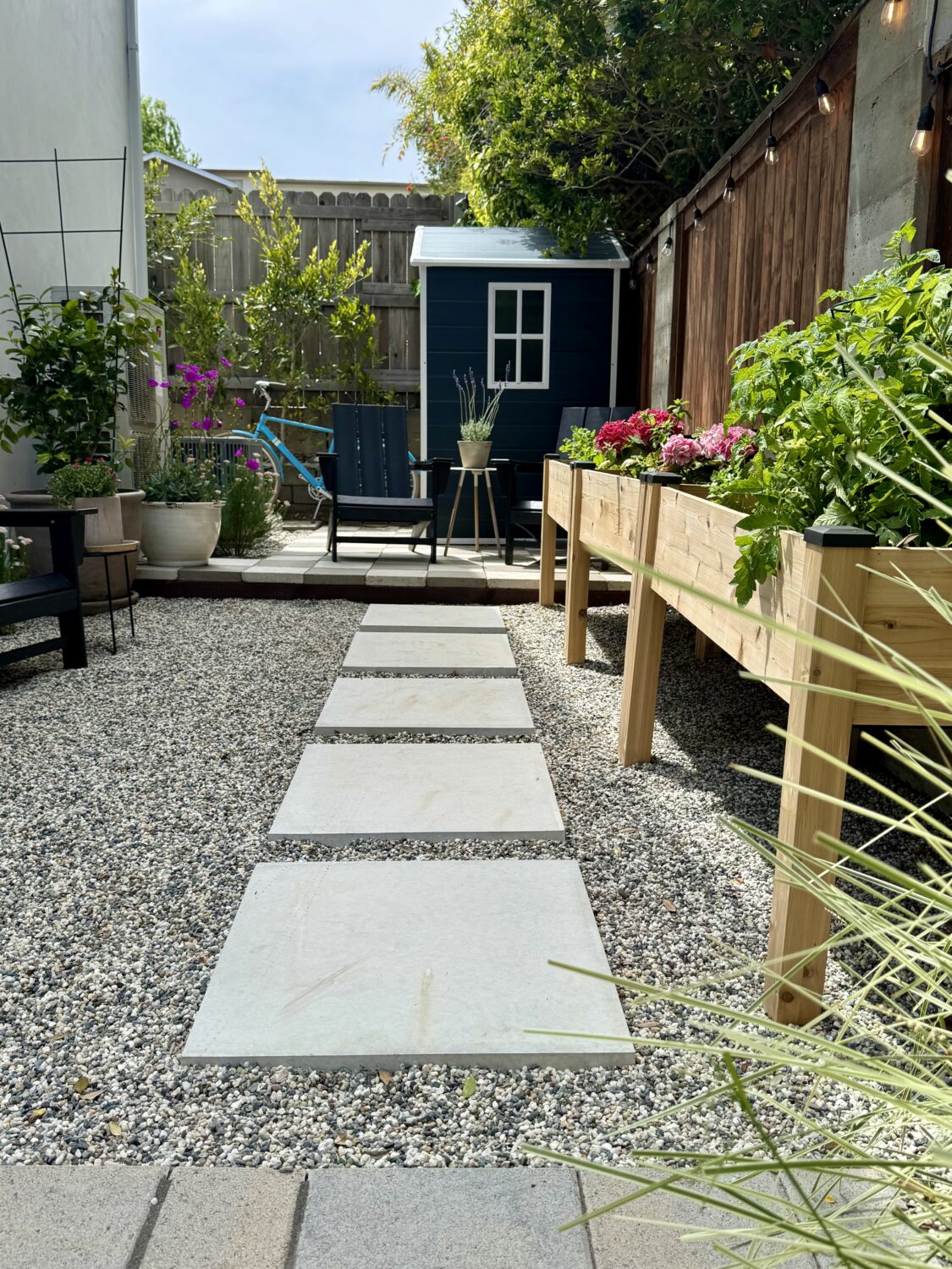
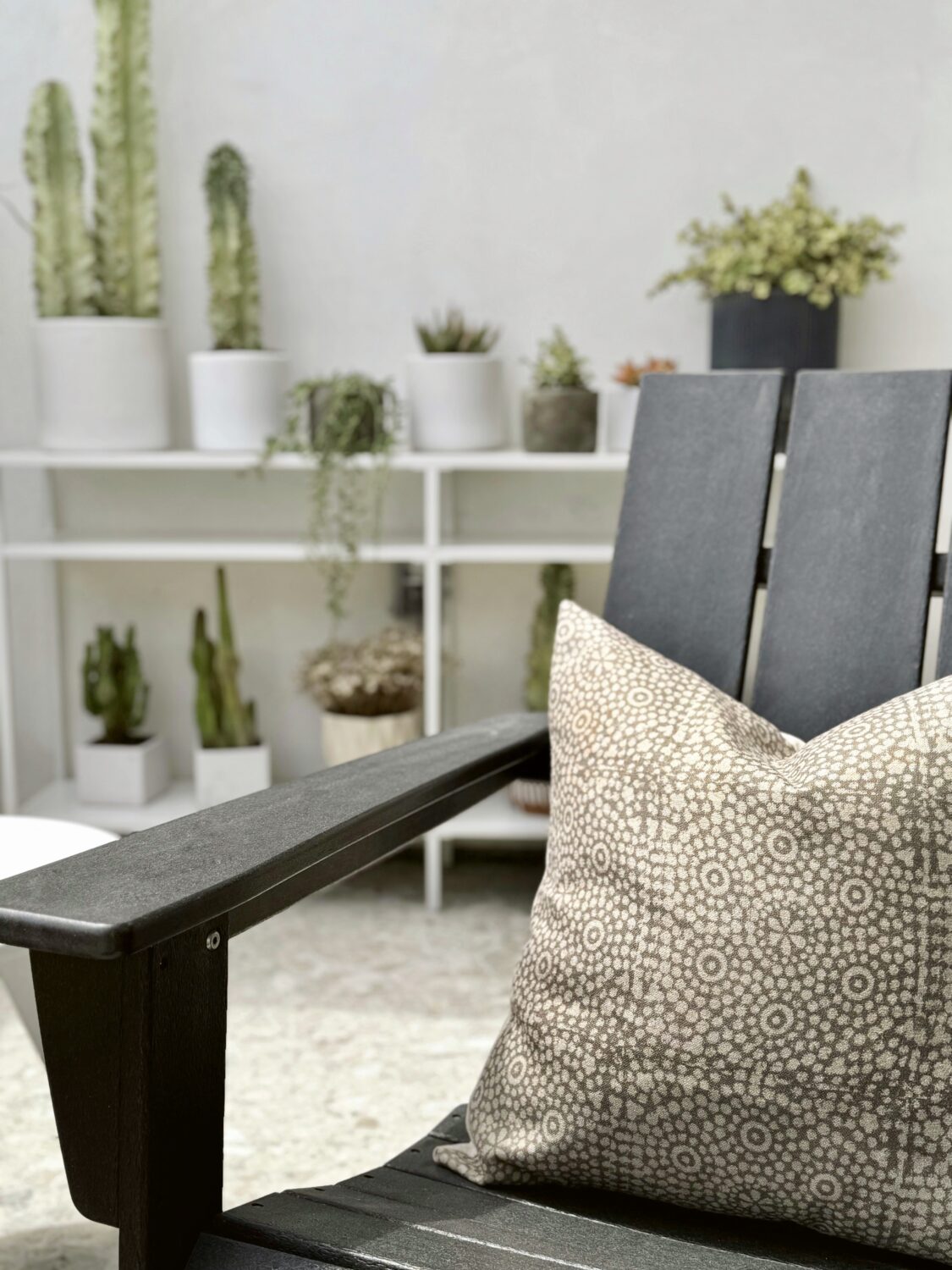
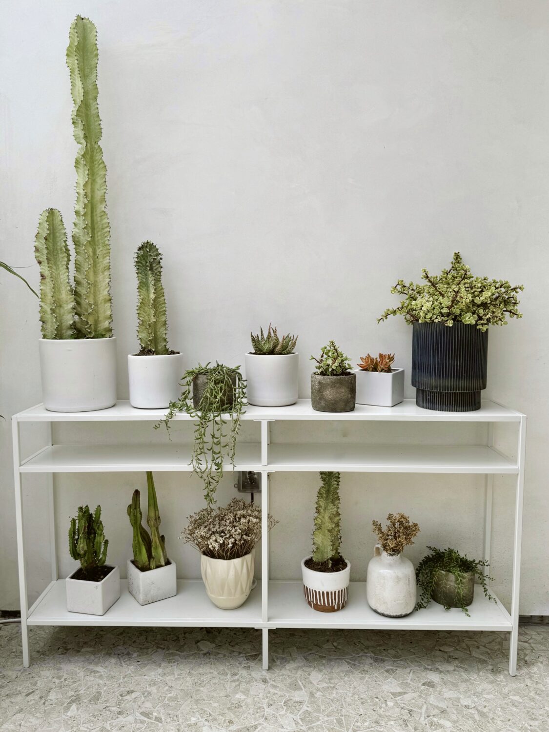
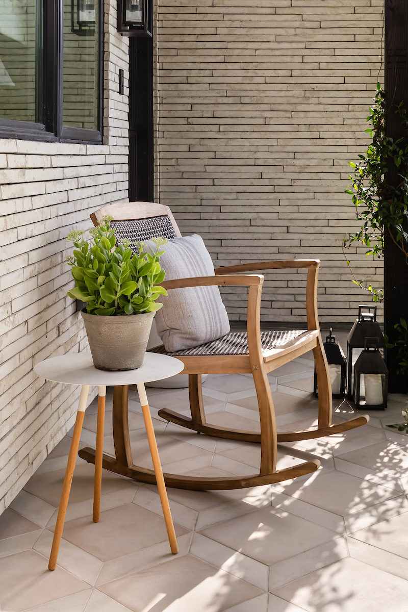
 What was once a small, neglected space behind our house has become one of the most loved areas of our home.